New Additions: May 2015
3rd June 2015
We add hundreds of fonts to the Identifont database every month. Most of these are recent releases, and some are simply new acquisitions from foundries who were not yet represented on our site. Stephen Coles gives his take on the most interesting recent additions.

After spending the last seven years producing large corporate/editorial families like FF Clan, FF Good, FF More, and Lato it’s nice to see Łukasz Dziedzic get back to something scripty. This new release is much less dramatic than his last display face, FF Pitu, yet FF Eggo is as serious about typographic features as any of his other designs, with a very complete character set and plenty of alternate glyphs and ligatures. (Ironically, one of the only letter combos that doesn’t work so smoothly is the ‘gg’ in the name). FF Eggo also has something that scripts rarely have: five weights, each with upright and “italic” styles. Plus, it looks as good in all caps as it does in its connected lowercase. This is an impressive array of capabilities for a mere “novelty” family.
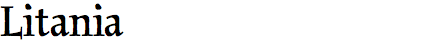
Litania is an unusual hybrid of medieval manuscript styles with roman shapes familiar to modern readers. The feeling is not unlike his Orbe (2008), especially in Litania’s alternate Lombardic capitals, but the addition of the roman caps and lowercase makes this new typeface a much more versatile tool. It’s fun to imagine where Litania might be used — not just for historical texts, but imaginative contemporary work, too. The fact that it was so difficult for me to add other faces to Litania’s “Similar fonts” list shows how individual it is. The most related face is perhaps KLTF Litteratra, but then that’s an effort to romanize Blackletter writing, not Carolingian. There’s really nothing quite like Litania.


There are plenty of digital Bodoni revivals, even those like ITC Bodoni that involved extensive research on location at the source in Parma. Riccardo Olocco and Jonathan Pierini knew that, but went ahead anyway with the compulsive ambition to create “the most extensive family of fonts ever to have been inspired by Giambattista Bodoni”. Surely they have done it. Parmigiano is a grand set of size-specific designs, just like its source, but rather than a facsimile of any specific style it is a unique reinterpretation. The existence of a Sans in this family demonstrates that new approach. Yet they’ve managed to make Parmigiano Sans feel like something Bodoni would have designed by looking to other Grotesque models of the day.

Like his Black Slabbath of 2007, Cinderblock is another Stefán Kjartansson experiment in extremes. Here he’s taking both weight and width to the limit. The base style (50) allows just a sliver of negative space, but it becomes even more reduced as the styles progressively stretch in an almost modular way. The family is obviously perfect for dense, graphic headlines and poster type. An effort to eliminate uneven white gaps does come with a cost, however. Some letters — ‘J, L, T’, and especially ‘7’ and ‘Zz’ — have very odd shapes and widths. These could be either an awkward liability or a stylistic benefit, depending on the use.

First designed in 1998, Sadness is one of the few digital font mashups that isn’t a disaster. Felix Braden started with Fontographer’s amusing but impractical “blend” feature and then refined the shapes into a workable typeface. We can only guess who its two parents were, but I’m betting one of them was ITC Clearface. The name must be a joke, because there is no sorrow here — only a casual, playful warmth.

Like myself, Austrian designer Roland Hörmann is a fan of vintage shop signs, and his hometown of Vienna is full of excellent specimens from the mid-20th century. It was one of these that led to his successful Luxus Brut typeface. Five years later Hörmann returned to the design, adding contrast and reducing the space between letters. While it has the same mid-century personality, Luxus Brut Sparkling is a complete redraw of the original.