New Additions: May 2023
31st May 2023
From the hundreds of fonts we add to the Identifont database every month we chose a selection of the most interesting recent additions, and interviewed the designers about their approach to each design:
![]()
![]()
![]()
![]()
Emmanuel Besse – Rillus (Formagari)
Was Rillus designed for a specific project?
Though it may seem derived from a custom project, Rillus is 100% retail. The main direction comes from a source I found several years ago: Swiss lettering from 1936 designed for an anniversary supplement of Ringier Illustrierte Schweizer Chronik. The lettering is only featured on the cover and the back cover, the rest of the layout remaining more classical.
The main challenge I set myself for this typeface was to draw something display but not goofy or too childish. Hence the difference of rhythm you can observe between an All Caps typesetting and one using lowercase.
Compared to other geometric sans-serif typefaces the most distinctive feature of Rillus is probably the solid circles on the ‘Q’, ‘g’, ‘i’, ‘j’, and ‘r’. What was the inspiration for these?
The main idea comes from the source I found. While doing research, I also gathered several examples of “DIY Futura”: geometrical sans taking various design shortcuts like connecting letter parts where things shouldn’t be connected, or mirroring and copy-pasting forms. I’m very interested in the vernacular and amateurish design choices because the output often looks radical.
In addition, I want the foundry to offer a broad catalogue and that means tackling the classic genres like neo-grotesque, geometric sans-serif, etc. Many great Futura revivals were released this couple of years, so I aimed for something different. The playful roundness of the typeface and the idiosyncratic features you pointed out are a reflection of that.
In Rillus Black you’ve chosen to track the characters much tighter than, say, Futura Extra Bold which is a similar weight. Do you want the words to be seen as individual units?
The blacker the weight, the more display-like it gets! In that sense, words could be perceived as units or wordmarks, you’re right. It’s also inherited from my graphic design practice: I tend to make everything tight, from letterspacing to line height. I also often fill the white space in my typefaces when the weights get darker.
![]()
![]()
![]()
![]()
Paulo Goode – Mutable (Paulo Goode)
Mutable is a flamboyant typeface with a Victorian look to it. What inspired you to design it?
I found myself watching an old Amicus Productions’ movie – Tales from the Crypt, a horror anthology from 1972 – and the title cards were all set in Pretorian. This triggered a memory from my teens when I hand-painted a sign for my father’s business. I painstakingly copied each letter of Pretorian from a Letraset catalogue in order to make it. The film was brilliantly terrible, and the memory of the sign writing was good – it was most likely the very first time I had created something purely typographic. So, Pretorian was in my mind for some time over the winter of 2022 into 2023, and it became an influence on my sketches for what would be my first release of a new chapter in my type design career. While researching more on Pretorian, I discovered Davison Art Nouveau and that too became a point of reference when sketching the embryonic forms of what would become Mutable.
Mutable reminds me of Edward Benguiat’s typeface ITC Tiffany: Compare Mutable and ITC Tiffany. Was that an influence on its design?
Yes, absolutely. You can see that many of the base uppercase glyphs reflect Benguiat’s ITC Tiffany, although I avoided incorporating the design features that make ITC Tiffany so distinctive. I focused more on trying to bring in an Art Nouveau influence by means of adding foxtail terminals to my glyphs, as strongly as I could without being overpowering. I wanted to keep a good balance of flamboyance and respectability, so the standard glyphs are quite reserved and then the typeface really comes alive when you start exploring the flourishes and alternates. Timing is everything when exploring the possibilities of a new type design and it was happenstance that I stumbled across an Instagram post of a version of ITC Tiffany that included some really beautiful flourishes. This small trigger set me off on a crusade to cater for multiple flourish options with Mutable – the typeface ended up with over 500 unique alternates.
Mutable is the first typeface released by your own foundry since most of your fonts were acquired for the Monotype library earlier this year. Does it feel odd to be starting from scratch again, so to speak, or is it liberating?
Oh, it is definitely liberating. I have just started chapter two of my type design career with renewed enthusiasm, and the recent Monotype acquisition was the perfect way to draw a line under my first seven years of exploring type design. I feel like I have completed my apprenticeship, and, while in some respects I am starting afresh, I have a much more elevated status than I had when I started out 8 years ago. So it may take a year or three to build up a new portfolio of type designs, but I am now an established designer with a growing reputation and have achieved some personal goals along the way that only a year ago would have seemed impossible.
![]()
![]()
![]()
Kasper Pyndt Rasmussen – AT Skanner (Approximate Type)
AT Skanner is a sans-serif typeface with a retro high-tech look. What led you to design it?
It started as a quick sketch on my iPad while commuting by train. Danish IC3 trains have a square outer shell with rounded corners – a design language that is mirrored in their interior. Perhaps subconsciously influenced by this, I sketched an ‘s’ and an ‘a’ that incorporated these traits in their design. A square sans with rounded corners and deep ink traps felt fresh to me, which motivated me to pursue the idea further. Being a huge fan of 80s sci-fi myself, particularly the work of David Cronenberg (eg his movie Scanners), I thoroughly enjoyed exploring this style.
As you mentioned in your description, AT Skanner has similarities with Eurostile. Was that a conscious influence on its design, or did it just turn out that way?
To be honest, I believe that most squared-off sans serif typefaces are often compared to Eurostile, simply because this genre hasn't been widely popular with designers in the past. Consequently, Eurostile has achieved a sort of monopoly status. So, in short, no, Eurostile was not a conscious influence, and I didn't draw on any specific traits from it. Instead, I aimed to create a typeface that felt original within the confines of the genre. One significant distinction between the two is that Skanner's horizontals and verticals employ completely straight sections, devoid of curvature.
Although in many respects AT Skanner is a geometric typeface, it has some humanist features; I’m thinking of the tapered ‘K’ arm, and the curved ‘R’ leg. Why did you decide to include these?
While I appreciate the foundational expression of geometric typefaces, they can sometimes feel monotonous to me. One reoccurring “trick" in my work is mixing handmade traits with constructed (or digital) ones to hybridise styles and ways of making. Something interesting tends to happen when you combine two very different modes of thinking.
Did you have any applications in mind when you designed AT Skanner?
I didn’t. I tend to avoid designing typefaces with specific applications in mind, as I prefer not to restrict people's imagination regarding potential uses. The beauty of designing digital typefaces lies (for me) in the loss of control that occurs when they are published, and I embrace that as an unknown variable.
However, I hope that users will prove that a square sans can be used outside the contexts of sci-fi and corporate aesthetics.
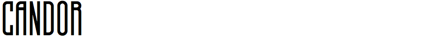

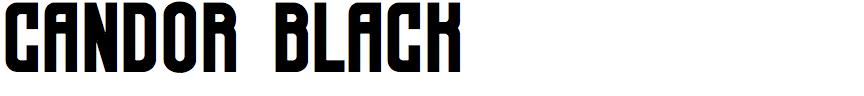
Emmeran Richard – Candor (Troisième Type)
You describe Candor as inspired by 60s/70s retro-modern fonts. Are there any particular ones that influenced you?
Yes, I really liked what The Good Store did with MidCentury, a playful condensed display typeface. First of all, I wanted to play with extremes, designing an ultra-thin condensed and then a powerful and impacting black weight. The idea of a variable font was - indeed - clear from the start. Just like TypeType did with TT Bluescreens, Candor brings narrow shapes, but in a more peculiar way. I like to think that there’s an Art Deco background vibe in Candor…
Candor is a unicase font, but you’ve provided an alternate set of capitals in the lower-case character positions. It seems that these are a bit more eccentric than the ones in the upper-case positions: was that intentional?
That was one of the ideas behind Candor! It needed to look like your “average Joe” condensed font, but once you play with it, odd and wild letters start to appear. I always liked to design with the closure principle (see Anurati), so it felt natural.
As I deliver updates to all of my fonts in progress with Troisième Type, in the future Candor will have more conventional letters, and I’ll keep the eccentric ones as alternates. Also, the font will receive small caps and a rounded alternative family. Trust me, I have a lot of things in mind for this typeface.
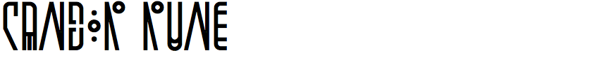
The Candor family includes Candor Rune, which takes the eccentric character shapes to the next level; it reminds me of Linotype Cethubala. Did you base these character shapes on actual runes?
Wow OK, I didn’t know Cethubala until now, so thank you for the discovery! Love the font consistency! Also, the letter ‘I’ looks really nice.
In Candor, some of the characters like ‘Q’, ‘X’, or ‘Y’ (to mention just a few) are very close to runes from the Futhark alphabet, but I really tried to emancipate myself from the basic rune characters and make it my own. So you’ll notice that some characters are very angular, while others are completely round. And I truly love how it matches together.
That idea of bringing a Rune style came from a friend who showed me engraved runes from the Pays Basque. Those rune characters were very condensed so it immediately aligned in my head with Candor.
What sort of applications do you have in mind for Candor?
I have many! As an ultra condensed typeface, I think it helps designing and composing with more info on a smaller format. So why not try designing small objects with Candor?
Otherwise, I’d love to see Candor used by musicians/bands for posters, flyers, tours, shows, etc. And I’m eager to see how creative minds will use the variable effects, especially in terms of web design and video (like v-jaying).