New Additions: March 2017
12th April 2017
We add hundreds of fonts to the Identifont database every month. Most of these are recent releases, and some are simply new acquisitions from foundries who were not yet represented on our site. Stephen Coles gives his take on the most interesting recent additions.
Optimo
Most of Optimo’s fonts are new to Identifont, but the label is certainly not new to typography. Established in the early 1990s by Gilles Gavillet, Stéphane Delgado and (the late) David Rust, the foundry was a bachelor project at ECAL (University of Arts and Design Lausanne). Optimo’s initial output – much of which is no longer available – was experimental and forward-thinking, but not very practical. Two decades later, the range has evolved to become more professional and less artistic, yet many of the typefaces retain a highly conceptual spirit. Along with Lineto, Optimo is one of the original Swiss indies who have gained a global cachet – particularly among art and design students – while resisting mass distribution.
![]()
![]()
![]()
![]()

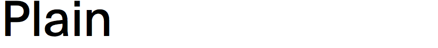
Soon after 2000, Optimo expanded its offering to include work from other designers, many of them associates at ECAL, including Nicolas Eigenheer, Ludovic Balland, and François Rappo, head of the school’s Master in Art Direction. Over the last 12 years Rappo has accumulated a wide array of accomplished families. Most of them are not direct revivals, but all are homages to specific hallmarks of Continental European type. The first was Didot Elder, which – unlike most digital Didots – comes from the early work of Firmin’s brother Pierre. (This brings with it some idisyncracies that will either delight or confound contemporary users.) Rappo followed with interpretations of Rennaissance and Baroque romans (Practice and Genath), the prototypical German grotesk (Theinhardt), the Swiss neo-grotesk (Plain), Clarendon (Clarendon Graphic), and just this year, a Neuzeit-style geometric (Apax) with an usual twist in the ‘S’.
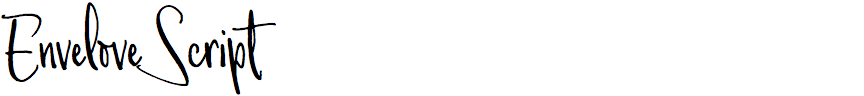
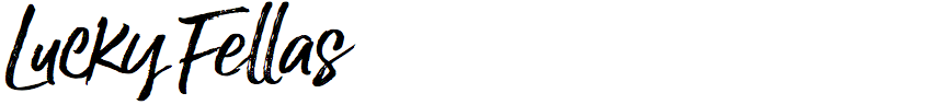
Scripts that mimic contemporary calligraphy or hand-lettering are literally released every other day. While these fonts have generally become more usable and sophisticated, the bulk are not worthy of mention. Envelove Script and Lucky Fellas are two standouts, particuarly because they manage to incorporate the necessary extras to emulate real handwriting without overdosing on swashes and ornamentation. They also retain the casual pen’s irregularity and roughness of stroke while maintaining just enough balance and legibility. That said, these typefaces are best used fairly small, and with ligatures switched on – which is why you can’t judge them from a basic sample or alphabet showing alone. The designers are both relative newcomers to this type tier: Yani Arabena, assisted by Guille Vizzari and Sudtipos’ Ale Paul, hails from Argentina; and Nicky Lantz is a South African who has spent previous years designing kits, templates, and simpler scripts for Creative Market.
![]()
![]()
![]()
![]()
While Helvetica has dominated the spotlight over the last 50 years, there are other mid-century modernist grotesks that deserve attention. Nebiolo’s Forma is one of these that has somehow evaded a digital revival until now. Fortunately it’s the talented and thorough David Jonathan Ross who took it on. Forma DJR is remarkable among this genre in that it has optical sizes – five of them in fact – which art director Roger Black immediately put into use for his redesign of the Hong Kong Tattler. Read much more about this expansive family on DJR’s site and in Font Bureau’s creation story.