New Additions: September 2022
30th September 2022
From the hundreds of fonts we add to the Identifont database every month we chose a selection of the most interesting recent additions, and interviewed the designers about their approach to each design:
![]()
![]()
![]()
![]()
Jan Weidemüller – Siaga (Ultra Kuhl)
Where did the idea for Siaga originate?
In 2015 took my first steps in type design, and the first typeface I worked on was the early version of Siaga. It was specially designed to work as a brand asset for my studio at that time. So the basic idea was that it had to work on the website, in print, on some really nice hot foil stamped business cards, and also had to reflect the identity of the studio. Over the last few years Siaga also got used for the Ultra Kuhl website, and was redrawn again.
It’s always evolving as I refine details. I would say it’s not static like most other typefaces, and will probably never be finished.
You’ve described Siaga as a proportional typeface that pays homage to monospaced fonts. Were there any particular monospaced typefaces that inspired you?
Actually I don’t work with direct reference sources so I couldn’t narrow down one specific typeface. Because there is usually a direction I want to go, something I would like to use as a graphic designer, and something that could serve a purpose; maybe because I have a strong graphic design background in branding. I see a problem and I search for a solution. So instead of building typefaces based on old models, I seek to build them purpose driven for designers and with possible applications in mind.
Like DIN Mittelschrift, its monoweight strokes give it the appearance of a typeface drawn using a lettering template. Was that an intentional aim of the design?
Yes, that’s right. When I was designing Siaga I was obsessed with modular design ideas and how much I could integrate mathematical concepts and geometry in my designs. Even the latest versions got a bit normalised; the modularity is still part of its character.
Given its legibility, it seems that it would be ideal for signage and UI design; are these applications you had in mind when you designed it?
Siaga was initially designed as workhorse for my projects and most of them are web based and had to work on different screen sizes. So yes, there was a strong focus to make them work for a variety of UIs. It would be interesting to see it in use somewhere for signs.
![]()
![]()
![]()
Elena Genova – Peachi (My Creative Land)
You’ve written that Peachi is loosely based on Morris Fuller Benton’s 1914 typeface Souvenir. What inspired you to design it?
The whole vintage and 70s-80s theme in the latest design trends was the initial inspiration. I started looking through old ATF specimens (1924 in particular) looking for something to start with, and saw the original Souvenir there. I hadn't realised that it had been designed as early as the beginning of the twentieth century.
Since it is not a good practice to base your typefaces on anything that is on the market, I decided not to search for the modern implementations of it and go for the pure Morris Fuller Benton version of it as a base.
At first sight there is not much difference between the original Souvenir and ITC Souvenir Light but, if one looks closer, the lower case letters of the latter are more narrow, some of the uppercase letters are wider, and there is a noticeable difference in the tops of the ‘B’, ‘D’, ‘P’, and ‘R’.
One significant change in Peachi is that you've increased the x-height. Why did you decide on that, and what else have you changed?
The taller x-height makes Peachi a good candidate when you need to make a text to stand out - you can place the lines of text close to each other so they form a block of text with less white space.
Also, I wanted Peachi to have more design options. With all the possibilities that OpenType gives, we are now able to add lots of alternates and ligatures, so I did – some letters have up to 4 alternates. Cyrillics were also added later on (with stylistic alternates too).
You’ve provided a generous range of six weights, from thin to black. Did you start by designing the regular and then subsequently add the other weights, or do you work on all weights in parallel?
I started with the light weight that corresponds to the original Souvenir, then added black to see how far it can go. Lastly, after light to black were ready, I decided to add thin which has less contrast and looks more “mono”.
After Morris Fuller Benton’s release in 1914, Souvenir became popular again in the 1970s when Ed Benguiat revived it as ITC Souvenir. Do you think its time has come again?
Absolutely. Obviously, we live in the world when the design trends come and go to return again some time later. The 2020s seem to be rewaking 70s and 80s trends. I think Souvenir as well as Peachi have this vintage feeling we associate with those years, hence its popularity these days.
I am also excited to share that my foundry My Creative Land has been acquired by The Type Founders, a collection of some of the most renowned type foundries from around the world. They allow type designers to do what they do best: draw distinctive, usable, and inspiring type and not to worry about the rest of type design business routine (if they don’t want to).
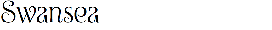
Mott Jordan – Swansea (Mysterylab)
Swansea is an elegant typeface that looks like it might be from the Roaring Twenties. Is it a revival, or did you design it, and if so were you influenced by other typefaces?
It’s an original, not a revival. This design had several conscious influences and probably a number of unconscious ones as well. As far as the fundamentals of stroke taper and serif design, I drew upon one of my long-time favorites: Diotima, by Gudrun Zapf von Hesse (who died in 2019 at the age of 101!). Diotima has been revived and modernized at least a couple of times, but it retains a certain old-world elegance that’s really baked into the bones of the design.
Arguably two of the drawbacks of Diotima are: 1) the very wide lowercase letterforms that can sometimes preclude its use where horizontal space is at a premium, and 2) as a book-weight body text font, it’s a bit light. At 10pt size or less, it can really start to disappear (although Linotype’s version — Diotima Classic — is a more solid book weight). So, as a jumping-off point, I set out to create something slightly akin to Diotima, with a somewhat narrower capitals set, but a substantially narrower lowercase set. The more I worked on it, the farther away from this original inspiration it moved, although you can still see it clearly in the straight vertical strokes and their serifs.
The characters in Swansea range from the fairly conventional, such as the ‘D’, ‘P’, ‘p’, ‘q’, and ‘r’, to the totally eccentric, such as the ‘M’, ‘a’, ‘g’, and ‘y’. Did you sometimes have to reign back your imagination when designing each character?
This question brings me to the topic of the second biggest influence on the design. To keep the ideas flowing, I’ve been snapping screenshots of scans from the pages of old typography and calligraphy books for many years. I couldn’t say what book it’s from, but there’s a scan of an old yellowed page from a type book in my screenshot collection with the word “Elegantes” at the top of the page. It’s hard to identify what language the source book was in, because that word is the same in many European languages. Anyway, there is a beautiful set of quasi-calligraphic Roman capitals exhibiting some very intriguing flourish ideas. I borrowed strongly from many of those capitals, in particular the ‘B’, ‘J’, ‘K’, and ‘M’.
There were only capital letters pictured on that scanned book page, so the lowercase set comes straight out of my sketchbook. After a bit of hair pulling and re-envisioning, I wound up very happy with the lowercase, especially ‘a’, ‘g’, ‘k’, and ‘y’. I think the numerals ‘4’ and ‘6’ are noteworthy as well.
Despite the wild flourishes in many letters Swansea is surprisingly readable. Do you envisage it finding applications such as advertising, book jackets, and web site design?
I think it could work well in all of those contexts, and more: logos, maybe greeting cards, wedding invitations, etc. Initially, I had a vision as I began this font that it would just be a thing of great beauty, and all who gazed upon it would gasp in astonishment and rapture. Seriously though, I did want to create something with a distinct elegance, but also I wanted it to be extremely usable.
Speaking of readability, all too often in my own design work for clients I’ll cast around and maybe purchase a really eye-catching cutting-edge font design, but then end up a bit disappointed because it just doesn’t work in that many contexts, or maybe it has some as-yet unrevealed design flaws too: bad kerning, lumpy curves, inconsistent stroke weights, awkward ligature option glyphs, etc. Bottom line, I wanted Swansea to be a bit visionary and fresh, but very carefully refined, with only the most legible custom ligature glyphs — avoiding weird ones that confuse the eye. I especially wanted it not to stray too far from the fundamental task of communicating an elegant idea in an elegant way. In other words, I wanted it to be a solid workhorse regardless of point size or usage context. By the way, there’s a full Cyrillic character complement in this font… my first ever.
![]()
![]()
![]()
Daniel Haettenschwiller – Metaballs (Maxitype)
The term “metaballs” is a name for a scientific technique originally developed to visualise atomic interactions. What first gave you the idea of applying the metaballs concept to a typeface?
The concept of metaballs is like mathematics, it describes a phenomenon that exists in this world. Metaballs are graphically fascinating, so it seemed like a good challenge to turn these abstract blobby shapes into something readable, constructing an organic looking typeface relying on mathematic principles.
In 2016, after trying different things, we started developing a complete Latin character set with five styles and four OpenType stylistic sets, and published it on Maxitype in 2021.
Metaballs comes in five weights from thin, in which the lines linking the balls are barely evident, to black, in which the balls are fusing together, and the fonts have consistent widths, so you can overlay them for multi-colour effects. You’ve also offered a variable font that allows you to animate this effect. Was the variable font the starting point for the family, or did that come last?
The starting point was the regular weight, where the black and white surfaces are distributed equally, producing a strong optical effect. The other weights and the variable font came in a second phase, leading to more optical surprises by layering the weights. You can also have fun rendering the 2D shapes into 3D!
Were the contours of each character drawn by hand, or was part of the process of designing Metaballs to develop a computer program to calculate the contours algorithmically?
The drawing is based on a circular and modular grid, so it’s mostly copy-pasting one component, and deciding which letter construction looks best within this grid. An automated program could be interesting to develop, not only for typography but also for images; what about a metaballs-rasterizer?
Did you have any applications in mind as you were developing Metaballs?
During the development the main fascination was about the shapes and the “organic rationality”. In hindsight, Metaballs can be used for a biotech company logo, a rave VJ gig by Aladdine3000, a book about Swiss pop artist Sylvie Fleury (see My Life on the Road), or as the title font for Atmos Volume 5, a magazine about ecological and social justice (see Fonts In Use).