New Additions: October 2023
31st October 2023
From the hundreds of fonts we add to the Identifont database every month we chose a selection of the most interesting recent additions, and interviewed the designers about their approach to each design:
![]()
![]()
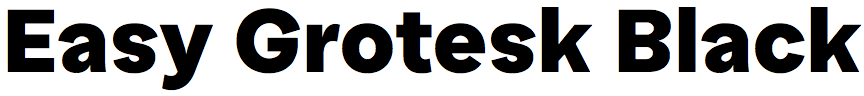
Olivia Wood and Alexander Rütten – Easy Grotesk (TypeMates)
Was Easy Grotesk designed for a particular project?
We were working on a new identity for a tech-startup specialising in AI-powered search engines. It turned out to be difficult to find a suitable typeface, one that would help make it easier for people to read and understand challenging content. Of course it wasn’t legibility we were looking for – that was a given - it was an aura of rationality, friendliness, and curiosity. After checking a number of typefaces that normally would have been a good choice for that situation we still were not happy, and ended up designing one ourselves.
A distinctive feature of Easy Grotesk is the top-heavy balance of some characters, such as the ‘G’, ‘R’, ’S’, ‘a’, ‘3’, and ‘8’, which gives it a slightly cheeky appearance. What led to this design decision?
We were looking for more openness, friendliness, and playful curiosity than we had found in most suitable fonts. We thought of Konrad Lorenz's “Kindchenschema” (Baby Schema) theory that suggests that the large head, round face, and big eyes of babies lead to more motivation in caregivers. It was a long shot, but switching the larger volumes to the top on key glyphs gave the very classic setup a subtle freshness. Also we enlarged apertures to give the font a more open feeling.
The goal was to create a typeface that was not too exuberant to use in a serious context and radiated openness and optimism in a subtle way.
What made you choose the name “Easy”? Is it because the typeface is designed to be easy to read, or that it’s an easy choice for a range of applications?
The name stems from our wish to make not the reading but the reception of difficult or scary content easier. We wanted our typeface to have an optimistic flare, helping the reader to stay open and optimistic in the face of challenge.
![]()
![]()
![]()
![]()
Moritz Kleinsorge – Nomos Slab (Identity Letters)
Nomos Slab is a companion to your sans-serif typeface Nomos Sans. Which came first, or were they designed in parallel?
I started with the sans serif in 2022. After completing it, I continued with Nomos Slab. Some slab serifs seemed to be an ideal addition to my catalogue. In fact, I already have another slab family in the pipeline, a slab serif variant of Flink Neue. But that will definitely take some more time.
You have used the description “brutalist” to describe the Nomos family. What do you mean by that?
The brutalist aesthetic in architecture and design displays the qualities of its materials instead of hiding them or covering them up. This includes the joints between materials – how parts are connected. Classical type design wants to create elegant solutions for these connections. A brutalist approach, on the other hand, stresses the individual character of each part that the letter contains. That’s why in Nomos Sans and Nomos Slab, for example, stems and diagonals meet each other in a blunt, unrefined fashion.
The closest typeface I could find on Identifont to compare with Nomos Slab is Adrian Frutiger‘s classic, Serifa. Was that an influence on its design?
I actually had zero outside references while designing Nomos Slab. As Nomos Sans was finished, I figured it would be a straightforward process since a lot of design decisions had already been taken. I should have been able to just add serifs to my sans, after all. It turned out to be a bit more complicated. The biggest challenge was to retain the characteristics of the sans in the slab variant. The deep joints in letters like ‘A’, ‘M’, ‘N’, ‘V’, ‘W’, ‘v’, ‘w’, and ‘y’ were particularly difficult to transfer. I eventually dropped this feature; it just didn’t look right in the slab. So I had to rethink these elements as a kind of ink trap, making these parts wider in Nomos Slab to get a horizontal bar.
The only time I looked at outside references was when I checked which letters in a slab typeface don’t need a serif. For example, the lower-case letter ‘a’ is exactly the same in Nomos Sans and Nomos Slab. And the ‘O’ and ‘o’ of course. ;)
As well as providing nine weights in Roman and Italic styles, you offer Nomos Slab as a two-axis variable font. Do a significant number of users now choose to buy the variable font rather than individual styles?
Yes, both font families come with a variable font. It is added for free when a user buys the whole family (and vice versa).
At this point, I don’t think customers come for variable fonts explicitly. I released Flink Neue variable earlier and it hasn’t exactly been a blockbuster. The hefty price tag of variable fonts might be a barrier. People probably don’t yet seem to realize what the benefit is of this single file that costs as much as a superfamily with hundreds of fonts (in the case of Flink Neue).
Do you have any plans to add a Nomos Mono to Nomos Sans and Nomos Slab?
The typefaces have only just been released and you are already the second person to ask about a monospace variant! I’m currently finishing another superfamily project and might have to design a custom font in between, but after that, I’ll probably be ready to think about it.
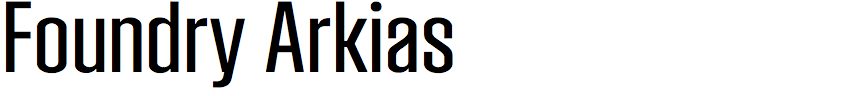
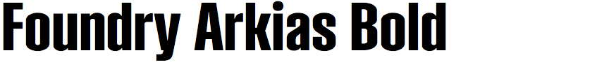
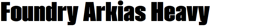
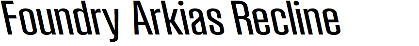
Stuart de Rozario and David Quay – Foundry Arkias (The Foundry Types)
You’ve written that Foundry Arkias was inspired by the typography that Swiss designer Andreas His designed for the pharmaceutical company J. R. Geigy A.G. How did you encounter this work, and what led to your decision to base a typeface on it?
We came across Andreas His’s work many years ago, after admiring and investigating the work of Max Schmid and Amin Hofmann for the Swiss pharmaceutical company. We’ve always admired the Geigy brand's visual identity and lettering style. Not only the work of His, but lesser known graphic artists Herbert Leupin, Jörg Hamburger, and Warja Lavater who also worked at J. R. Geigy A. G. See the photographs on this page: Foundry Arkias.
In some of the Geigy packaging examples by Andreas His, letters such as ‘g’, ‘p’, and ‘u’ are simplified and have no spur, but in Foundry Arkias you retained spurs on these letters. Why did you decide on this approach?
As you’ve stated, in certain examples of the Geigy packaging some letters are simplified and show no stems, but resemble a dome-like form. We loved these alternative shapes as they displayed personality and versatility, and this allowed us to explore this feature in other areas within the character set. We wanted to include all of those diverse glyphs and shapes from the packaging so we included them as nearly thirty alternative glyphs that can be accessed via OpenType features or application glyph palettes.
In addition to the italic you’ve included a back-slanted variant you’ve called Recline. What sort of applications do you envisage for this?
Foundry Arkias is predominantly a display typeface family due to its modularity, narrow proportions, and extreme font weights. However, we felt that it would be different (of us) to try something new (out of the ordinary) that we don’t have in our library: a ‘Recline’ or back-slanted version. This allows the user to have greater freedom and to create bold, dynamic graphic expressions in their designs. It’s also great fun playing with glyphs animating, flipping, and changing directions.
I often use pharmaceutical packaging as an example of how important typography is in conveying trust in a product. For example, would you take an asprin if the packaging used Comic Sans? Did you have trustworthiness in mind as a feature of Foundry Arkias?
It goes without saying, we like to have trustworthiness as a key trait for all of our typefaces and Foundry Arkias is no different – it’s a strong, bold, confident typeface that makes a statement. What you see is what you get. We’ve always set out to make flexible, versatile designs that are meticulously well-crafted, show integrity and honesty, and offer our customers great value.
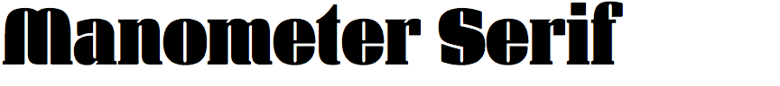
Arne Freytag – Manometer Serif (Fontador)
What gave you the idea of designing Manometer Serif?
Actually, I wanted to extend the sisters Manometer and Manometer Sans by another family, respectively optimising them. It is of course not a didone, but the strong stroke width contrast seemed to me an ideal means to distribute positive and negative forms even better. Of the three Manometer versions this has resulted in the most coherent and also elegant version in my view. Design is always an iterative process and sometimes it takes longer for new ideas and perhaps improvements to emerge.
Although the character shapes are very different, I can’t help being reminded of Futura Black when I look at Manometer Serif. Was that an inspiration?
My inspiration was the reinterpretation of the other two families. These in turn were inspired by all the ultra-bold typefaces that also had a kind of stencil character, including the Kombinations-Schrift by Josef Albers. But of course I wanted to do it differently, and the letters have different shapes. I didn't use many typographic analogies here, such as the size and shape of the serifs, but rather the maxim was to gain as much black space as possible and minimal hairline gaps. So it's more a conceptual and not a typographic approach. For example, the ‘C’ has maximum serifs whose only task is to fill the space. Two hairline gaps are enough to make it readable. With some letters I tried countless versions until it worked.
Some of the letters create the illusion of the separate character strokes using hairline gaps; for example, the ‘K’ and ‘Y’. Did it involve a lot of experimentation to get the right visual effect?
Yes, that's right. For some letters there are also alternatives, eg ‘A’, ‘M’, ‘N’, ‘R’ and ‘W’, and just this experimenting and reducing was fun. (For the ‘g’ it took me the longest, even if you can't see it.)
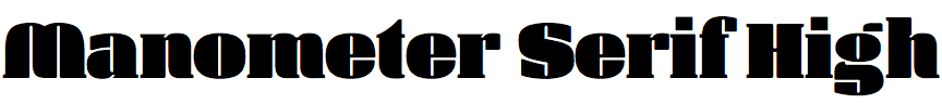
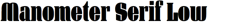
You've provided two variants of the font, Manometer Serif High and Manometer Serif Low, which are tall and wide variants of the normal version. At first sight they are simple geometric scalings of the original, but I assume it wasn’t as simple as that? For example, the ‘i’ and ‘j’ dots are square in all three versions.
Yes the low (compressed version) was more difficult; more details had to be worked out. To make the narrow-fat contrast even more obvious, the compressed weight could have been much narrower, but not legible. It needed to be clear, but still be a pleasing and readable typeface. I also opted for a variable version of the typeface, precisely because it is well suited to setting multi-line, large typography in justified type, such as on a poster, using the variable widths.