New Additions: June 2015
1st July 2015
We add hundreds of fonts to the Identifont database every month. Most of these are recent releases, and some are simply new acquisitions from foundries who were not yet represented on our site. Stephen Coles gives his take on the most interesting recent additions.
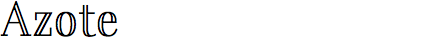

With Azote, young designer Thomas Jockin attempts a concept that was entirely new to most type watchers before Dala Prisma hit the scene last year. Weight is achieved not by thickening the strokes, but by adding additional strokes, yielding three styles: a monoline Light, an outline/biline Regular, and a triline Bold. Like Dala Prisma, Azote is built on a roman serif construction, but Jockin (who initiated the project long before Commercial Type’s product arrived) takes a different tack; the model is a Rational serif, like Bodoni, and there is far less tapering in the lines. The strokes are also sturdy enough to let Azote be used at smaller sizes than you might think. This design approach was clearly a challenge, however — Light has some slightly uncomfortable imbalance in stroke weight and there are areas in the Bold Italic where the overall color appears patchy due to varying space between lines. Still, it’s a worthy and distinctive effort. Jockin has a bright future.
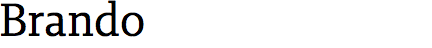
There is nothing flashy about Brando, Mike Abbink’s latest addition to the growing Bold Monday arsenal. Other than the open bowls of the ‘b’ and ‘q’ or the uncommon weight extremes available via the Hairline and Black, Brando just doesn’t have individualistic features to call out. What it is, however, is a solid, accomplished example of a 21st-century text serif. The hallmarks of this new, but increasingly familiar breed are moderate contrast, large apertures, sturdy (nearly slab) serifs, and a broad weight range. It is utterly useful, contemporary but not faddy — and that’s often what one needs in a workhorse.

We’re seeing an obvious trend in the consumer font market for loose, informal scripts. Most of these are bold, brushy or inky (see another new Identifont addition, Redbird, below), but Luba Luft is a mostly monolinear affair, giving it an uncommon look. While I applaud the notion, the execution leaves a lot to be desired. The alphabet at a distance looks pretty good, but lines of text reveal broken/overlapping connections, arhythmic stroke weight modulation, and very uneven spacing. It all adds up to an uncomfortable, jilted experience, not the effortless flow that is advertised. On the other hand, it could be argued that these are desirable characteristics for those wanting to simulate a natural, human handwriting. The problem is that there are so many decorative elements, such as swashes and ornamental letterforms, that it doesn’t really pass as everyday jotting. This is a common dilemma for many of these recent script font releases: too erratic to replace the lettering of trained professionals, and too decorative to replace the writing of normals. Trying to strike a balance between these poles is treacherous, but a few do it ok: Quickpen, Olicana, Dyna, Handsome.

Redbird enters a very crowded field of improvisational, painterly scripts, but the public’s desire for this style seems insatiable at the moment as these faces regularly appear on bestseller lists. I think Redbird does a respectable job of walking the afore-mentioned line between spontaneity and clarity, and — comparing it to earlier work — shows that Carine de Wandeleer is improving as a font maker. I only wish she would deemphasize the swashcurl alternates in her promotional graphics, as they are too frilly for some users and distract from the essential quality of the design. What is more impressive than curlicues is Redbird’s legible-but-lively numerals, or its ability to set clean, readable all-caps — more atypical qualities in this genre.


Full disclosure on this one: I was hired by Production Type to write the foundry’s biography for Trianon. Still, it would top my list of interesting new Identifont additions in any event. Like Parmigiano, It is one of very few families that revives the metal type tradition of optical sizes for the Didone classification, a style that requires it more than any other. With Trianon Grande and Display, big type has the expected high-contrast elegance of a Didot, and the sturdy hairlines and serifs of Trianon Text and Caption let you keep using the family for body copy too. This is the debut typeface from Loïc Sander, a very talented guy who came at type design from an editorial background. Read the rest of his Trianon story in our description at the foundry and his interview at Typography.Guru.

With a hat tip to 1930s metal type like Flash and Balloon, Ahkio references brush-made showcard lettering without any forced pastiche. There are no rough contours or thousands of alternates meant to realistically simulate a signpainter’s strokes, just a humble nod to the casual, slanted lettershapes typical of the craft. While there are many other fonts in this genre — House Slant being a standout — what sets Ahkio apart from most are its five weights. The recently released Kansas Casual has a similarly large family, but each of these two faces has its own flair, and Ahkio includes a lowercase.