New Additions: January 2023
31st January 2023
From the hundreds of fonts we add to the Identifont database every month we chose a selection of the most interesting recent additions, and interviewed the designers about their approach to each design:
![]()
![]()
![]()
![]()
![]()
Krista Radoeva – Aeroko (Monotype)
Where did the idea for Aeroko originate?
I had a clear brief to design a typeface for the sports genre. The biggest challenge was to define what that actually means. What are the shapes that express high energy, power, agility, strength, flexibility? I started by sketching on paper and played around with the balance between squareness and roundness. I wanted to create something solid and boxy, but also expressive, with a human touch.
Aeroko is a squarish typeface with a modern, high-tech appearance, reminiscent of Eurostile. Was that an influence on its design?
A colleague of mine recently described Aeroko as a “contemporary Eurostile with a humanist flavour” and it was actually the first time I realised the obvious resemblance between Eurostile and Aeroko. Seems crazy that I was not thinking about Eurostile at all as a reference for the design. I can see the connection now, of course. But Aeroko has a much softer overall feel, it is less geometric, and has a few little quirks that you only notice if you look very closely, but they contribute to the overall personality of the typeface.
Aeroko has four weights and three widths: condensed, normal, and wide. Are these points on a two-dimensional continuum created by the two-axis variable font, or did you design the discrete styles first?
Straight from the beginning, I planned the design of the typeface around the idea of having extreme widths and weights, but not really thinking about a variable font. I started with the Condensed Black, but very quickly sketched the Wide Black. I wanted to test how the character would work across the width axis. Many of the design decisions, and the way some of the letterforms are drawn, are based on looking at how the shapes are changing across the widths. Once I started interpolating the two extremes I was not happy with the automated results, so I designed the standard width manually as well.
The next step was the weight axis. At first I drew a much lighter weight than the final Regular, but soon decided that the thin strokes didn’t really work well with the bulky, robust character that I had already established as a key feature in the Black. So I decided to keep the Regular as the lightest point.
The Variable font is definitely a great addition to the static styles, but I wanted to make sure we have a simple and distinctive selection of set widths and weights for users.
A distinctive feature of Aeroko is the overhang of the ‘C’, which echoes the ‘G'. Where did the inspiration for this come from?
I admit, it was an unusual solution, but a logical one. Initially the lowercase ‘c’ had the same vertical terminals as the rest of the characters like ‘a’, ‘e’, ‘s’ etc. And that was a good enough concept for the condensed width. But once I started looking at the wide, it was really bothering me that the ‘c’ was too open, with too much white space; it was breaking the overall density and rhythm. I remember thinking: “I wish I could add a serif there...” and then thinking: “Why not just have a different terminal”. I tried a few options and this was the one that filled up the space best. It’s ok to break the rules sometimes — as long as there is a reason behind it and you maintain a certain logic.
You haven’t provided an oblique style; is that something you considered, or that may be added in the future?
I already had a lot of styles to think about, and I wanted to limit myself. But now that it’s finished, I think it would be great to add obliques to it at some point in the future. And hopefully Cyrillics as well one day!
![]()
![]()
![]()
![]()
Fabian Harb – Gaisyr (Dynamo)
Gaisyr is an unusual serif typeface; what led to its design?
Great question. It’s based on a sample in a book that I found. The serif sample was actually created by the 18th Century royal typographer Jacques Jaugeon — he made it for King Louis XIV. You could call it the King’s own custom font. The heavily rational design was based on a grid and has a very geometric construction. I saw the double-sided serifs — we call them “Butterfly Serifs” at Dinamo — and thought they were a great opportunity for creating something interesting; an OpenType feature that users can activate and deactivate.
We started working on an exploration of the design with Fabiola Mejía. Then some time in 2020, Michelangelo Nigra took the project over, and finally unearthed Gaisyr from our drawers for good.
A distinctive feature of Gaisyr is the double-sided serifs on the ascender of several lower-case characters, such as the ‘b’, ‘d’, ‘h’, ‘k’, and ‘l’. What was the inspiration for this?
In the original specimen that we found, there were some letters that already had the double-sided serifs. And spotting those, we realized that we could extend the obscure detail into something that is characteristic of the font; a core feature. The butterfly serifs are very original — you don’t see them in serifs any more. Yet in the 1700s it seemed to be more fashionable. In the monospace version of Gaisyr the butterflies become a tool to fill the space and create a nice rhythm.
The Gaisyr family includes Gaisyr Mono and Gaisyr Semi-Mono. What does semi-mono mean?
Semi-mono sits halfway between being proportional and monospace. When we first started playing around with variable fonts, we created an axis between proportional and monospace, and discovered semi-mono as the proportion that lives halfway between the two extremes. We first used it with Monument Grotesk. It has a really nice balance between being proportional and having a steady rhythm that’s great for the eye, while also having the mechanical, technical feeling of a typewriter typeface.
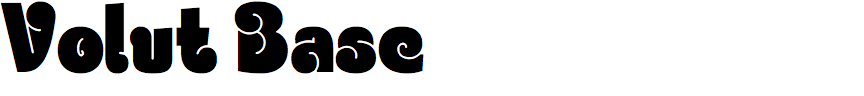
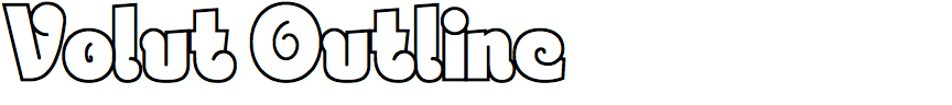

Christoph Ulherr – Volut (jpFonts)
Volut looks like a typeface from the swinging Sixties. Is it a revival of a classic, or is it your original design, and if so, were you inspired by any other fonts?
Yes, you’re right, there’s quite a bit of sixties-psychedelic in it, but honestly that wasn’t my influence when building the font, which is an original one.
Instead the font’s roots can be more found in graffiti writing, the so-called throw-up styles, which are based on rounded letterforms without any real holes in letters like the ‘O’ or ‘D’. These styles are typically sprayed with two colours – one for the fill-in, the other for outlining - and can be usually found at spots where you don’t have much time as a graffiti writer. These letterforms are quite closed, and inner forms are often defined by a simple stroke, as in the ‘O’ of Volut, or the letters are defined with only one single outline, that goes from outside into the inner part of the letter; the ‘B’ of Volut is a good example.
I've been into graffiti writing since the middle of the 90s (but haven’t really been a throw-up guy, haha) and all my love for letterforms in general developed back then. This special access to letters had a big impact on my graphic design and typographic work, which is generally more based on applications with a specific purpose which you don’t have in graffiti, where letters just speak for themselves.
Volut is a family of four fonts: Volut Base, a solid black style; Volut Outline; and Volut Blocks and Volut Outline Blocks which can be layered with Volut Base to create 3D lettering. Did the family grow from Volut Base, or did you plan it as a set of four styles from the outset?
I’m not a person who plans things too much, which has both advantages and disadvantages.
My access to design is quite an arty one and most times I am working very intuitively, no matter what the project is; I just start somewhere and don’t know where I'm coming out. To keep it short: I had no plans at all, and started with a simple outline style. Volut Blocks was made in the last days of designing, because I felt it would be a nice addition, making the whole package more extensive, because otherwise there would be no block style for Volut Base.
How did you work on Volut? Did you start with sketches, or did you draw vectors directly on the computer?
I am not a very technical guy and I hate to learn new software. In relation to Volut, I built the base forms in Illustrator after scanning my sketches. I then started by copying the vectors to FontLab, which was already on my computer from another little font project. A guy I was studying with helped me a little and also told me of Glyphs, and yeah, I have to admit: this program is really easy to learn and is the ideal solution for idiots like me, haha.
Crazy to say, but I started designing the font in 2012 and there were whole years of not continuing in between.
The motivation to finish the font came up during work on Flavoure, a larger font project that Volker Schnebel helped me with (thanks!). After that I was ready to grab the nearly dead Volut again, because most of my problems with it were due to my cumbersome workflow.
Looking back at my original sketches it is clear that over that huge timeline many details have changed for the better.
![]()
![]()
![]()
![]()
Benoît Bodhuin – Gröb (BB-Bureau)
Gröb is like the antidote to the geometric perfection of most professional fonts; was that your objective in designing it?
I was looking for naivety; Gröb is a rough type with little optical correction. The form was inspired by Halbfette Monument (see Halbfette Monument specimen on Flickr).
I’ve seen amateur hand lettering reminiscent of Gröb on some small café and shop signs; were you influenced by any actual examples?
Indeed, and it is that charm that seduced me; Monument is very beautiful and quite surprising by certain unusual shape and irregular thickness. All these particularities interest me, and I wanted to keep them.
Some of the characters are particularly distinctive, such as the ‘B’, ‘S’, ‘&’, and ‘8’. What inspired these character shapes?
I didn't want to make a revival of Monument, which has already been done (see Monument on Forgotten Shapes) and certain shapes like the characteristic ‘n’ led me to this elbow and to rationalize some letters opposing them to the historical drawing.