New Additions: July 2022
31st July 2022
From the hundreds of fonts we add to the Identifont database every month we chose a selection of the most interesting recent additions, and interviewed the designers about their approach to each design:
![]()
![]()
![]()
Miles Newlyn – New Astro (Newlyn)
What inspired you to design New Astro? Was it for a particular project?
New Astro is the result of a collaboration with my friend Hristo Ivanov. It's his first font, though he and I have worked on some logos together. I asked Hristo to think of a logo from his childhood that he loved, and we would make a font inspired by it. He chose the Playmobil logo, which looks like it's based on ITC Bauhaus with the corners rounded.
New Astro has features reminiscent of Aldo Novarese’s 1971 typeface Stop, especially the shape of the ‘Q’ and the ‘S’. Was that an inspiration?
Yes – Stop is a titan. It has visually defined science fiction. It is so deeply embedded in western culture because it takes our eyes into the future. I would love to have been there when Aldo Novarese was bravely drawing it. I'd ask him “Where have you seen an S like that? Are you sure you're going with that G?”
Although New Astro distorts many of the character shapes, it remains surprisingly readable. Did you have to experiment in order to decide how far you could take this?
Over many years of designing logos I've done those experiments and learned a lot. It's readable to an extent – it is a display face and I would only use it at 28px or larger.
New Astro has a high-tech, even space-age look. Was that a conscious design aim, and is that why you chose the name?
Designing a brand for Elon Musk's SpaceX would be a dream job. I've started with the typeface!
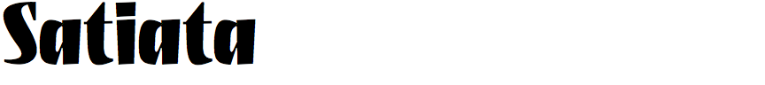
Dušan Jelesijević – Satiata (Tour De Force)
Where did the idea for Satiata originate?
The idea came during a pause between releasing bigger families. From time to time I have a small break from designing constructed fonts, and I do some relaxing work without the pressure of making a commercial release – projects where you can play and try to ignore the rules of traditional typography and fonts. So, Satiata is result of that game.
Satiata is a striking headline font that looks like it was drawn with a brush or pen. Did the design start from paper sketches?
It started as an old sketch drawn in FontLab. I have dozen of folders with ideas I've started, usually with only a few letters. I found some old sketches of a freehand sans design in a heavy weight and started playing with it, adding serifs and ink traps, changing the weight of the stems, making it darker, and making the whole design slightly condensed. It turned out to be an interesting set of letters that worked pretty decently for words and sentences.
As you said, it is purely a headline font that could find applications in package design, posters, or book covers. I would be very happy to see it in use one day, even though I'm aware that Satiata probably won't gain much popularity or publicity.
It’s a sign of Satiata’s originality that I’m finding it hard to find any other similar fonts to compare with it; the closest I can find are Michael Harvey’s Mezz Black and Roger Excoffon’s ITC Banco Heavy. Were there any particular fonts you were influenced by?
There were not any specific influences. Maybe I saw something unconsciously and turned it into Satiata, but not that I'm aware of. It's probably one of my most recognizable fonts by design so far. I'd say that's one of the good things, when you can recognize your fonts among others.
Currently Satiata is in a single style. Have you had any thoughts about creating other widths or weights?
I guess not, because the plan was to release a display font as a single style only. When I release a font I consider it's over, and it's hard to get back to it. Some time usually has to pass before I am able to think about it and work on it again. So, who knows, maybe one day.
![]()
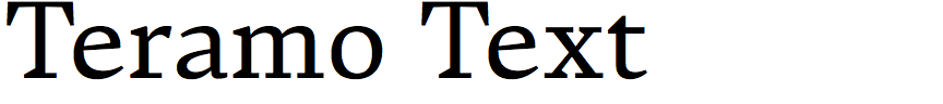
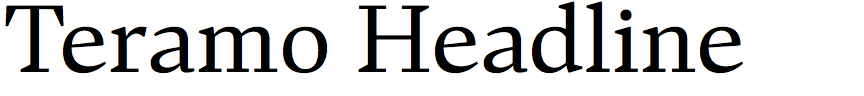
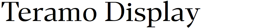
Roch Modrzejewski – Teramo (ROHH)
What inspired you to design Teramo? Was it for a particular project?
The Teramo family was intended for editorial design, mainly for magazines and posters. The main inspiration for these fonts was the beautiful proportions of the 15th- and 16th-century typefaces by Francesco Griffo and Claude Garamond. My goal was to design a type family that will have the liveliness, energy, and elegance rooted back in those remarkable historical works, simultaneously featuring a modern approach to drawing detail and spacing, giving the typeface a sharp contemporary character.
Teramo is a distinctive font, with some unusual features such as the taper where the ‘R’ leg meets the vertical, the asymmetrical serifs on several letters such as the ‘F’, ‘I’, and ‘N’, and the tapered strokes on the digits such as the ‘3’, ‘5’, and ‘7’. What was the inspiration for these features?
There was no particular inspiration for these features; the main idea behind experimenting with these unusual forms was to create a sharp and dynamic design, daring and playful. That is why I was eliminating static and symmetrical features from the letterforms, in order to achieve the feeling of movement in the project. This energetic feeling is especially pronounced in the italics, which have a lot of their own distinct personality and interesting details, and which is why they work so well for display use (especially their bolder versions).
Teramo is a substantial family with Text, Headline, Display, and Poster optical sizes, as well as variable fonts. Did using variable font technology help in managing such a large family of individual styles?
The variable font format is a fantastic evolution in type design, especially for large projects such as Teramo. Using this technology gives many great possibilities for the end user, making the management and choice of styles easier, as well as allowing better precision in terms of choosing the ideal style (weight, stroke contrast, etc.) for the project. However, from my point of view creating a well thought-out and crafted variable font demands additional planning, designing, and generally a more complex execution – but it is definitely worth it! I will use the variable font format for all of my new font families, wherever possible, as the value for the designer cannot be overestimated.
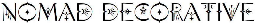
Victoria Strukovskaya – Nomad Decorative (Struvictory Art)
Nomad Decorative is a typeface of capitals decorated with patterns, and you’ve also provided a plain set of capitals in the lower-case letter positions. What inspired you to create it?
Nomad Decorative was meant as a font for creating logos. I wanted to provide an easy way to create a unique logo using only a font. You can write any word in simple capital letters and replace one or two letters with decorative ones – and the logo is ready.
You’ve written that Nomad Decorative is based on bohemian patterns. Did you work from any particular historical sources?
No, I looked at trends in graphic design rather than turning to history. I used the word ‘bohemian’ in this case to mean that the font suits this visual culture and aesthetic. I like to explore the trends of our time in order to create something that has not yet been.
Many of your typefaces are more like beautiful pieces of art than just symbols to convey words. Do you consider yourself an artist rather than a type designer?
I started my career as an artist, but now I feel more like a type designer. And my fonts are getting less ornate and working more as a system than as individual letters. But in general, I just like to create something. Today it's fonts, tomorrow it could be anything else. I do not limit myself to tools; the main thing is the creative process.