New Additions: January 2022
31st January 2022
From the hundreds of fonts we add to the Identifont database every month we chose a selection of the most interesting recent additions, and interviewed the designers about their approach to each design:
![]()
![]()
Muhittin Güneş – Olten (Muhittin Güneş)
What inspired you to design Olten. Was it for a particular project?
Olten wasn't designed for a specific project, but I was planning to design a single-weight typeface with italics for display usage. It came about as a result of my experiments with the small Latin letter ‘a’. After sketching with different ideas and glyph structures, I was left with three main letters that were similar to each other, which are now the OpenType alternates on Olten’s ‘a’. The Olten typeface's anatomy emerged as a result of attempting to apply the diversity of these letter ‘a’s, which have three distinct anatomies, to the entire font.
Olten is quite unusual, and I can’t find anything to give as similar fonts on Identifont. Were there any other particular fonts that influenced you in its design?
I'm happy to hear that because that was my main purpose with this typeface. In general, with Olten I wasn't influenced by any other typeface, and I doubt it has a historical analogue or connection, at least not consciously. I tried to keep its main structure as close as possible to a simple but unusual idea and system.
But I believe the number of similar examples has likely increased in recent years as a result of things like new typographic opportunities, which allow many people to try different experimental works on a more frequent and low-cost basis. We have access to more opportunities for far more people than at any other time in history.
Currently you’ve only released a single weight of Olten. Do you have any plans to extend the family?
Yes, at least I hope so. I had the prejudice that typefaces designed for display don't necessarily need a lot of weight, so with this liberty I decided to spend most of the time trying to achieve visual diversity and uniqueness.
But nevertheless, I also want to rearrange, add new weights, and improve the anatomy of letters in all of the recent typefaces that I have designed. As the letter structure gets thicker, the structure needs to be differentiated, especially in complicated letters. I want to experience this challenge as well. I also like the possibility that the work that can emerge at the end of this effort may go in a very different direction.
![]()
![]()
![]()
Eric Olson – Sculpin (Process Type Foundry)
One of the most distinctive features of Sculpin, especially in the Bold and Black weights, is the sharp-angled stroke ends on letters such as the ‘C’, ‘G’, ’S’, ‘a, ‘g’, and ’s’. Where did the inspiration for this come from?
The initial spark came from Rudolf Koch. I should admit here that for almost 20 years, I wasn’t a fan of his work. I could appreciate it, but I wasn’t going back to it for reference or inspiration. I was a Paul Renner fan so I guess I couldn’t see the other side of the fence. Until of course, I started to!
Sans serifs have so few elements to work with and stroke terminations are naturally a critical personality element of the typeface. I was directly inspired by the backward or reverse terminations of Kabel and wondered why it wasn’t used more. They’re not uncommon in sign painting, but they tend to be context specific and not carried through many letters. Anyway, I started experimenting with the termination and realized it was a helpful design element. It also looks blade-like sharp at large sizes, which I’m not opposed to :)
Sculpin seems to share some of its character shapes with Roger Excoffon’s classic, Antique Olive. Was that a conscious influence on its design?
A friend of mine has pointed this out as well. I must say, no, or at least not consciously. I love Antique Olive, especially how it locks up in headlines and remains friendly, but I wasn’t thinking of it at the time. In the very beginning, Sculpin was a no-contrast sans wrapped around a wider neo-grosteque skeleton. But, I just couldn’t make it pop and have personality. I think this is the hardest part of type design – making something memorable and hopefully useful. I hate being useless, so I tend towards utilitarian, yet I like personality too… oh the struggle :) And maybe this brings everything back to Antique Olive – it’s useful and comes with a fantastic personality. Now that I’ve convinced myself with help from you, I’m getting closer to adding it to the mix :)
Because of its above-average width, Sculpin seems ideal for attention-grabbing headlines. Was this the sort of application you had in mind when you designed it?
Yes, I definitely wanted it to look great in headlines. A close second is text and large text sizes. I love the limitations of sans serifs and I’m always looking for ways to thread the letters together. Sculpin takes this a little further than other releases of mine and uses the reverse angle terminations and cut joins to create a secondary set of shape relationships. They can be obvious in large sizes, but also something subtle and rhythmic at smaller sizes.
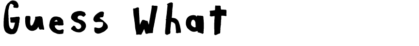
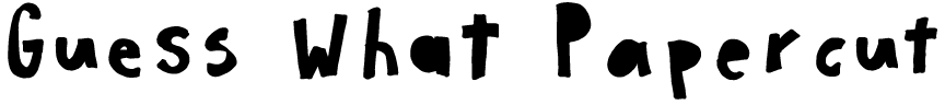
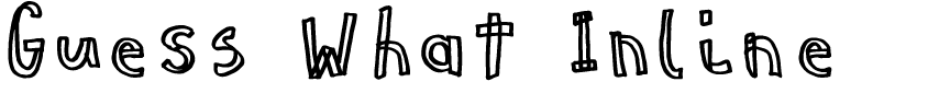
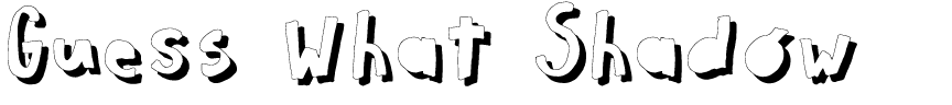
Giuseppe Salerno and Paco González – Guess What (Resistenza)
Was Guess What designed for a particular project?
We were initially contacted by an Italian brand of greeting cards, with funny quotes and hilarious greetings. They commissioned many hand-drawn fonts, so we thought: let’s transform this into a font family. Modern Love, one of our best sellers, had a similar story.
Guess What, and especially Guess What Inline, remind me of the type of hand lettering my children used to draw on cards and posters. Did children help you with the design of the font?
Guess What was inspired by children but sketched by us. We often draw with our nephews, and we noticed how their unskilled hand sometimes drew strange letterforms using geometric pieces, showing some difficulty in creating the curves. The fact that they tried to repeat the same letter but never got the same result was funny and made us (typography nerds) think about OpenType. We found something interesting in their approach and tried to reproduce with this family.
Most of our fonts are initially designed with calligraphic tools, nibs, markers, ruling pens etc, like Shabby Chic and Timberline with a brush pen, Pesto Fresco with a marker, and Parkour with a ruling pen.
With Guess What you’ve used OpenType Contextual Alternates to give it a convincing hand-lettered appearance; for example, in the text sample of “Guess What” the two ’s’ characters are different. How many different alternates are there, and do you have any special advice for using them?
The name of this font is an ode to the advanced OpenType features it offers. It provides four stylistic sets, for uppercase, lowercase, and figures, which allow you to create a rhythm that looks more hand-drawn. Through the OpenType Features window you can choose the set you want to use, so you can use just one or mix the ones you like the most. This feature adds a lot of versatility and possibilities with just one font.
We are expanding many of our fonts with OpenType features; for example, we recently released a new version of Nautica with initial and final forms.
I see that the Regular and Inline styles overlay perfectly, so you can use the Regular to create coloured backgrounds for the Inline. Did you plan a layered font from the beginning?
Yes, it was created with this idea – layering is fun! The initial sketches were drawn with marker and the first font designed was Guess What Inline. Then the rest were designed with Glyphs.
Guess What Regular and Papercut can be used alone or combined with Guess What Inline and Shadow to create colorful letterings. The same overlapping system has been used also in Dolcissimo, allowing a large number of ways to use overlapped fonts.
![]()
![]()
Sofia Mohr – Singolare (Latinotype)
How did the idea for Singolare arise?
I’ve always loved geometric sans-serif fonts. Singolare emerged after investigating and exploring new and alternative forms for this type of style, with the goal of extending its usability.
As the weight changes from Ultra Light to Black, Singolare changes from a conventional geometric sans-serif to a distinctive font with pointed apexes, and some quirky characters such as the ‘J’, ‘Q’, and ‘g'. Did you begin by designing the Black weight and then work backwards from this for the other weights?
Yes, the idea started from its black weight as you mention, which is where this type of terminals can shine. Since these sharp endings didn’t work well on its thinner versions, I programmed a variation that swaps the terminals for more conventional ones only on those specific weights.
Singloare reminds me of Morris Fuller Benton’s all-caps font Eagle Bold, revived as Eagle by David Berlow. Was that an influence on its design?
No, to be honest the fonts that inspired me initially were Baro designed by Julie Soudanne, and Lovelo by Renzler Design. Both are geometric sans fonts that were designed to be used with layers.
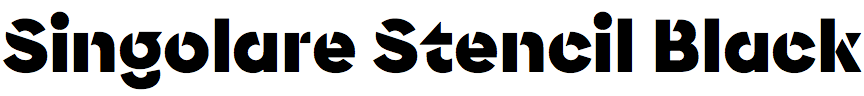
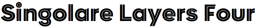
The Singolare family includes a stencil variant, Singolare Stencil Black, and some layered fonts such as Singolare Layers Four which allow you to create nice multicoloured lettering. Were these part of the original plan for the family?
Yes, from its beginning the idea was to design a different geometric sans with overlapping layers. The stencil version was something that appeared in the middle of the process after doing some research and tests with triangular cuts.