New Additions: January 2021
31st January 2021
From the hundreds of fonts we add to the Identifont database every month we chose a selection of the most interesting recent additions, and interviewed the designers about their approach to each design:
![]()
![]()
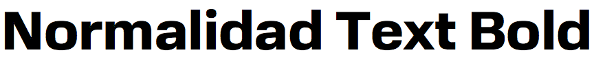
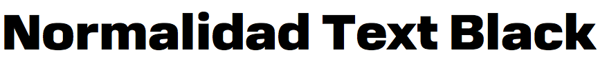
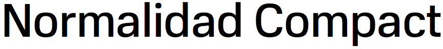
Normalidad – Ilya Ruderman and Yury Ostromentsky (CSTM Fonts)
You say that Normalidad was originally designed for MTS, a Russian mobile network operator. Did they originally require such an extensive family (six weights, five widths), or have you extended the family since the original design?
Originally MTS requested as few styles as possible. They are a huge company with offices all over the country with sometimes very average designers in the regions, so they didn't want to create a complex design system around their future typography, but wanted to have a reasonable amount of styles with wide functionality. We came up with five styles: two were dedicated to display typography and advertising, and three others we focused on UI and their digital products, and could be used in all other materials. It came as a surprise later on when they decided to ignore the exclusivity of the font and allowed us to sell it. We extended the family based on a retail focus.
You have described Normalidad as “a mechanical sans-serif typeface with semi-closed apertures”. What do you mean by “semi-closed apertures”? Can you give some examples?
Our major idea was to have neo-grotesque (which is well known as a sans serif with closed apertures), but with as-much-as-possible open terminals in round shapes as ‘e’, ‘c’ etc. That's what we tried to explain with that phrase.
The closest font I can find to compare with Normalidad is Eurostile, although in Normalidad the squareness of the character shapes is much more subtle than in Eurostile (compare the differences). Was Eurostile one of your influences, and were there any others?
Well. The final directions came out of completely different experiments with much more eclectic ideas, much more display-ish. At the same time there was a direction with a more conservative neo-grotesque flavor, but we decided to continue and mix it with something less obvious: a bit more squarish round forms, semi-open neo-grotesque skeletons etc.
You also both run the font collection type.today. What’s the relationship between CSTM Fonts and type.today?
Our foundry sells the fonts via different distributors, including type.today. I know this may look strange, but CSTM Fonts are mostly known inside the Russian market for logotypes and custom fonts rather than retail fonts. Sooner or later we are going to finish our portfolio web-page – haha. Financially: we are earning with CSTM Fonts and spending with type.today and its Journal :)
![]()
![]()
![]()
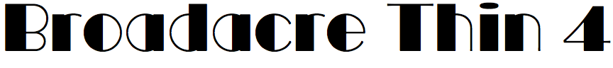
Broadacre – Greg Thompson (Greg Thompson)
Broadacre is a homage to Morris Fuller Benton’s classic Art Deco typeface Broadway, extended with variations in two dimensions. It varies the thickness of the vertical bars from zero in Broadacre 0, to almost half the width of the ‘O’ in Broadacre 4, and the weight of the characters from Hairline, through Thin and Light, to Regular. What originally inspired you to extend Broadway in this way?
Shortly after moving to Las Vegas in 2019, I revisited Hoover Dam, which holds back Lake Mead. This depression-era icon; a scenic 30 mile drive from The Strip, is a favorite of mine. I first marveled, sweaty-palmed, at the precipitous beauty of the site as an 8 year-old on a family vacation, but now I was struck by the Memorial to the dam’s construction. Designer Oskar Hansen used Benson’s Broadway caps throughout. I went home thinking about the bronze castings of the type, mostly set in terrazzo.
A Brazilian friend of mine had contacted me about doing a bottle label for a Brazilian rum, a cachaça, that he wanted to import to the US. I digitized C A H S from photos I had taken of Hansen’s rather rough, bronze inlays and worked up a preliminary label. He was enthusiastic but asked if I could adjust the thickness of the thin strokes. I thought “variable” could be an interesting way to satisfy him, with independent controls for the hairlines and the “deco” infill.
The capitals in Broadacre Thin 4 are almost identical to Broadway (compare the differences). However, in most cases you’ve chosen to redesign the lower-case characters, arguably making them more consistent with the capitals. Why did you decide against adopting Morris Fuller Benton’s original lower-case characters?
Benton’s Broadway was caps only. Sol Hess drew the lower case a few years later. I didn’t care for Hess’s lower case, which lacked the elegance of the caps and is burdened with awkward double heavy verticals; so I drew a new set more in keeping with the caps. A few lower case alternates suggested themselves as I went along, and I added small caps that align at the x-height of the lower case.
It’s interesting that some of the variations of Broadacre match some other classic Art Deco fonts. For example, Broadacre 4 is close to the capitals-only font Philco Plain, and Broadacre Hairline 4 is close to ITC Manhattan. Was this intentional?
Art Deco, International Style, etc. have a fairly limited palette of mostly geometric shapes so there’s bound to be some similarities to other typefaces from the period.
Once a developing typeface accumulates a critical mass of glyphs I let it tell me what its details need to be to fit, not just spacing, but visual compatibility with the other shapes and my overall vision for a particular typeface.
Allow me to say that new font design tools available now are really the heroes here. Being able to develop a multi-axes font within a variable design space using Robofont and Skateboard is almost fun!
![]()

![]()
Neue Radial – Alexander Roth (Neue Foundry)
Was the Neue Radial family developed for a particular project, and what inspired you to design it?
Neue Radial was designed to kick-off the Neue Foundry in 2020. It was our first typeface to be released, hence the ambition to push into multiple dimensions: artistic, commercial, and brand. We wanted to design something we think is missing and be commercially successful with it, setting the mood for Neue Foundry as a source of systemic and utilitarian type design.
We were intrigued by the idea of thoroughly exploring the geometric sans genre. But rather than pre-select and offer one particular solution only, we designed a visual system that unites four of the most popular sans serif genres of recent decades, integrated into the Neue Radial superfamily under the suffixes A, B, C, and D.
Neue Radial A follows the idea of New Functionalism that cultivates the model of the original London Underground typeface in some details, while Neue Radial B exemplifies the roots of a rational grotesque of the late nineteenth century, a continuous success story. Neue Radial C is a contemporary representative of the geometric sans, mechanically constructed to optically appeal to the appearance of a true ‘compass and ruler’ typeface. Avant-Garde-esque elements ensure a smooth transition into Neue Radial D that reflects the tradition of neo-grotesques.
Are there any particular typefaces that you studied or influences you had in the development of Neue Radial?
Neue Radial is neither a revival nor an interpretation of a specific typeface. It is by design a cliche of the geometric sans genre. An image that was drawn from the memory of looking at and making type for almost two decades. Nonetheless, some type designs lent features and sentiment in a disproportionate manner: designs such as Johnston, Futura, Avenir, and Avant Garde.
Neue Radial has four variants, but the differences are so subtle that at first sight you might not notice them. For example, between Neue Radial A and Neue Radial D there are slight differences in the shape of the ‘a’ and ‘e’. Why did you decide to offer these variations?
I consider that the angle of the stroke endings or the construction of joints as a major design decision. Neue Radial A has vertical stroke endings and Neue Radial D has horizontal stroke endings, for example. This alone has a significant impact on the overall look and feel. Since these slight changes affect the design on a meta level I decided to branch out into multiple variants (Neue Radial A to D) instead of having OpenType features dealing with it – which becomes quite confusing pretty fast.
I see that Neue Radial includes a number of useful symbols, including arrows and digits in a circle or square, both normal and reversed white out of black. What’s the best way of accessing these?
Yes indeed, Neue Radial is equipped with five different numeral sets and ten different arrows. You can either use the Glyphs Palette in Adobe applications or activate one of the nine OpenType features. For example, Stylistic Set 01 swaps all regular arrows and numbers to boxed variants.

Eksell Sans – Göran Söderström (Letters from Sweden)
On your website you say that Eksell Sans is a digitisation of a complete alphabet drawn in 1973 by Swedish designer and illustrator Olle Eksell. Did he create it for a particular project, and was it ever published, or was it just an artistic exercise?
It was an artistic exercise; he just did it for himself.
Eksell Sans has a very Seventies feel, remiscent of Bob Newman's Zipper and Aldo Novarese’s Sintex (revived by Canada Type as Stretto), but it's more elegant and has unique features of its own, such as the serifs on upper-case and lower-case ‘V’, ‘W’, ‘X’ and ‘Z’, which are reminiscent of wood type fonts such as Westside. Did he give any information about where his influences came from?
Unfortunately Olle passed away a couple of years ago so we never had a chance to talk to him about it.
How complete were the original drawings Eksell designed? The font includes a Euro symbol which wasn’t designed until 1996, so presumably you had to create this; were there many other characters you had to design to make a complete font?
Yes, he designed an alternate version for most letters and digits, which we also added to the font. The rest we added for the release.
Did Olle Eksell design any other typefaces?
The only other typeface he drew was Eksell Display, which I digitised and released in 2015.