New Additions: June 2016
5th July 2016
We add hundreds of fonts to the Identifont database every month. Most of these are recent releases, and some are simply new acquisitions from foundries who were not yet represented on our site. Stephen Coles gives his take on the most interesting recent additions.

In the 1990s, Jill Bell was a queen of fonts that emulate a professionally handwritten look. Two decades later, that mantle has passed to Laura Worthington, who has already produced nearly 50 families in the six years since she began translating her lettering talents into digital type. Like her earlier Harlean, Worthington’s Caprizant is the kind of casual, bouncy, free-wheeling design that reminds me of Bell’s stuff. What’s changed in the last two decades are the tools now available – both in the font editors and formats – to construct a smoother, more authentic script. Worthington wields these tools deftly, and her skill is especially evident in a design where irregular angle, baseline, and slant are wrangled into a readable rhythm. In the end, Caprizant looks effortless – which shows how much effort went into it.
![]()
![]()
![]()
Georg Trump is one of the more underappreciated type designers of the mid-1900s. While praise is heaped on more prolific and celebrated luminaries like Zapf and Frutiger, Trump is largely unrecognized for drawing more than a dozen of the century’s most original typefaces. Perhaps his work isn’t as widespread because it usually contains a healthy helping of quirk. Schadow-Antiqua is one such oddball, a slab serif with attributes some could call ungainly if seen alone. But somehow all the strangeness works as a whole. The only digital version of the family is somewhat lacking, so it’s exciting to see David Jonathan Ross step in and interpret a design that feels right in his wheelhouse.
Gimlet retains some of Schadow’s quirks, restrains others, and expands it into an ultra versatile 112-style family with three optical sizes. Ross did all this while infusing Gimlet with some of his trademark levity, a quality that is apparent both in the typeface and its online brochure (launched in tandem with his new foundry, DJR). In this case, the marketing copy does not overreach: Gimlet truly is “as funky as it is functional”.
![]()
From the newly launched CAST foundry of Italy comes a correspondence/typewriter-inspired sans serif that first appears reasonably ordinary, but conceals a very unusual construction. If the name didn’t reveal it, you wouldn’t detect that Macho is built within a modular system, with each letter occupying up to 20 modules, and all weights sharing the same dimensions. This structure allows for a kit of snap-on boxes, lines, and dashes which can quickly emphasize or decorate type. See the images on the Typographica review for examples of the attractive effects these extra styles can produce.
![]()
Dieter Hofrichter continues to churn out competent workhorses at a steady clip. Most of them are more utilitarian than exciting, but Taxon stands out. It follows a design concept previously mastered by Gerard Unger in which a compact face is made as open and legible as possible via moderate stroke contrast, wide apertures, outward-facing terminals, pinched joins, and a large lowercase. You can see this in Unger’s DTL Argo, Vesta, and Big Vesta, as well as many of his newspaper-optimized serifs. Taxon differs from these mainly in its italic which is closer to corrected obliques than a traditional italic. Like Unger’s work, Taxon proves that a contrasted sans doesn’t have to feel retro, antiquated, or dainty; it can deliver contemporary, businesslike text, and do it in a very spatially economical way.
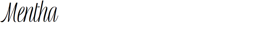
Like Laura Worthington, Guiseppe Salerno comes to type design from a calligraphic background, where he recently received notoriety for his popular Lettering versus Calligraphy project with Martina Flor. In 2008 he co-founded the Resistenza foundry with Paco González, but it’s Salerno’s designs that grab attention because it’s clear that a virtuoso pen is behind them. Mentha is a good example of this, showcasing a style that is closer to lettering than typography. Sometimes it’s clear that Salerno’s familiarity and aptitude is with the former, more than the latter, as the reader can get tripped up by certain letter combinations and spacing inconsistencies. Still, Mentha demonstrates growth from Resistenza’s earlier releases and offers a tight-and-tall option that is rare (see also Frauen) in ornamental scripts.

Also from Resistenza, Mela is another exceptional offering in a category that is becoming all too common: loose, brushy, signpainter styles. Salerno’s calligraphy experience equipped him to bring a new spectacle of thick-thin acrobatics to this trend, injecting a lot of life into the strokes without sacrificing legibility or overdosing on excessive swashes or decorative embellishments. One wish: the font could use just a few more ligatures to reduce the most common repetive shapes (e.g. ‘EE’, ‘RR’, punctuation, and numerals).