New Additions: June 2024
31st May 2024
From the hundreds of fonts we add to the Identifont database every month we chose a selection of the most interesting recent additions, and interviewed the designers about their approach to each design:
![]()
![]()
![]()
Ian Lynam – Vaud Pro (Wordshape)
Vaud Pro is a redrawn and re-engineered version of a typeface you originally released in 2004; what led you to update it?
The original Vaud was too similar to other typefaces that came out around the same time. I wanted to mull it over and redraw it to capture my original intention: to make a typeface family that captures a bit of the clinical aspects of DIN, the awkwardness of Akzidenz Grotesk, and that pulls influence from old Stephenson and Blake grotesks. I wanted to expand the character set and to really tighten up all of the spacing, as well.
You've described Vaud Pro as a Swiss sans-serif. How would you characterise it compared to the classic Swiss typefaces such as Helvetica?
Vaud Pro is inspired by an imaginary Switzerland, the home of The International Style of typography and all things supposedly “neutral” in regards to design, geopolitics, and finances, yet in actuality are mired in controversy and where multiple languages and multiple traditions are upheld in a country that actually isn’t that big. I wanted to explore these assorted contradictions.
You’re promoting the release of Vaud Pro with specially designed socks, which I think must be the first time a typeface has been promoted this way! What gave you the idea?
I own a small shop in Tokyo that sells books and apparel. We just started manufacturing our own socks recently and Vaud Pro was completed around this time. Folks have done some far out stuff as far as type specimens – I’m thinking of Underware’s Sauna book that can only be fully read if you’re in an actual sauna, for example – and I wanted to try my hand at making something that hopefully no one had done before.
Your foundry Wordshape is based in Tokyo, Japan. For your custom work do you mainly work with Japanese clients?
It’s about 50/50 between custom work for Japanese clients and clients in North America. I tend to design the Latin, Greek and Cyrillic characters for a few Japanese foundries to incorporate into CJK (Chinese, Japanese, and Korean) typefaces, and the same minus the CJK parts for foreign clients.
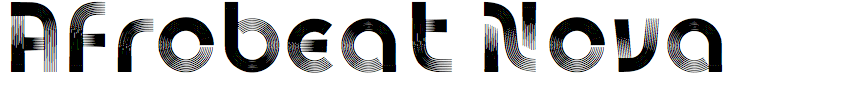
Giuseppe Salerno and Paco González – Afrobeat Nova (Resistenza)
Afrobeat Nova is related to your 2010 typeface Afrobeat. What inspired you to develop a new version?
When we released Afrobeat back in 2010 it was our very first font, and while it was met with appreciation, it had some clear beginner characteristics. The font lacked uppercase letters, and the descenders and ascenders were excessively long. Despite these limitations, it gained a following and became quite popular.
Fast forward to 2024, and we felt it was the perfect time to revisit Afrobeat and bring it up to modern standards. This new version introduces proper uppercase letters and includes a host of additional glyphs that were missing in the original. We also refined the design to ensure better readability and versatility.
In essence, the inspiration to develop a new version stemmed from our desire to evolve the font in line with contemporary design standards while honouring the original's spirit. This update ensures Afrobeat remains relevant and useful for today's designers and typographers.
We have also significantly enhanced our skills in glyph design, evolving far beyond our capabilities in 2010. Additionally, the Glyphs app has advanced tremendously, now featuring many new tools and functionalities that have further facilitated our design process.
Whereas Afrobeat could be classified as an op-art typeface, Afrobeat Nova is more practical; was that the intention behind the new version?
Our classification for the typefaces is “multi-linear”, and Afrobeat Nova absolutely aims to be more versatile and practical. By introducing uppercase letters and refining the shapes of the lowercase characters, we wanted to create a typeface that maintains its distinctive charm but is also more suitable for a wider range of applications, including advertising, logos, and magazine headings. This way, Afrobeat Nova can serve both creative and functional purposes in modern design projects.
The first version wasn't totally useful, even if Reebok liked it.
Each of the characters in Afrobeat Nova is drawn with eight concentric graduated strokes, and drawing these must have required some painstaking precision; did you draw them by hand, or did you develop programming tools to help automate the process?
Drawing the graduated strokes in Afrobeat Nova indeed required painstaking precision, and each stroke was carefully designed by hand, well with vectors. We did not rely on programming tools to automate the process. Instead, we focused on meticulous hand-drawing techniques to ensure each glyph retained its unique character and artistic quality. This approach allowed us to give Afrobeat Nova the precise and polished look we aimed for. We utilised many components to modulate the design process and have a smarter workflow.
What was the original inspiration for Afrobeat and Afrobeat Nova?
The fonts draw inspiration from the mesmerising optical art found in Nigerian tribal masks, which captivated us with their intricate patterns and cultural significance. Simultaneously, we were deeply influenced by the legendary Fela Kuti, the creator of Afrobeat, whose music and spirit infused our creative process. It’s a narrative that intertwines visual art and musical innovation, reflecting the vibrant cultural heritage and dynamic energy that inspired us throughout the design journey.
![]()
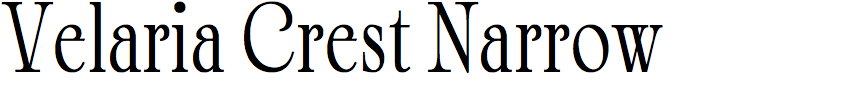
Alfredo Marco Pradil – Velaria Crest (Hanken)
What inspired you to design Velaria Crest? Was it for a particular project?
I had a deep-seated interest in crafting a typeface that didn't just convey words, but commanded attention and evoked a sense of strength and authority. The ornate and elaborate design styles of the Victorian and Edwardian eras often included decorative serifs and embellishments, which added a sense of grandeur and sophistication. It’s about more than just the individual letters; it's about the overall presence and the impression it leaves. The result is a typeface that is perfect for situations where making a statement is key, whether it's for a magazine masthead, a book cover, or a billboard. It's about creating a visual impact that is both immediate and lasting.
I didn't create Velaria Crest with a specific project in mind, but I can imagine using this typeface for a museum project that I am involved in where it would be a perfect representation.
Velaria Crest is reminiscent of ornate typefaces from the Victorian and Edwardian eras, such as Artcraft. Is it a revival of a classic typeface, or did you design it as an original typeface in that style?
I did draw inspiration from Victorian and Edwardian typefaces similar to Artcraft, as you have mentioned. However, it's not a direct revival of any specific classic typeface. I designed it as an original creation that captures the essence of that historical style while incorporating modern touches. My goal was to blend refined and elegant serif elements with contemporary styling, achieving a high contrast between thick and thin strokes.
You’ve created a more condensed version of the font, Velaria Crest Narrow. What applications did you have in mind for this?
When I developed Velaria Crest Narrow, I aimed to create a typeface that effectively uses space while preserving elegance. Narrow typefaces are especially valuable in contexts where horizontal space is limited. They occupy less space without compromising readability, making them perfect for environments like mobile interfaces, narrow columns in magazines, and packaging labels.
Additionally, narrow typefaces stand taller optically, which enhances verticality and gives a sophisticated, modern look. This makes Velaria Crest Narrow ideal for applications like luxury branding, where maintaining a refined and stylish appearance is essential, even in confined spaces. A condensed version of Velaria Crest is very much likely to be developed in the near future.
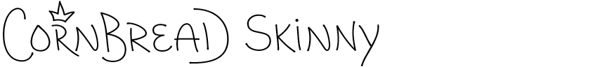


Daniel Haettenschwiller – Cornbread (Maxitype)
Cornbread is a family of typefaces based on the lettering of the American graffiti artist Darryl “Cornbread” McCray. How did you and Darryl come to collaborate on this project?
The first time the Maxitype team had contact with Darryl was by email to buy one of his T-shirts with the elephant. In 2022, several members of the team visited Cornbread in Philadelphia to find out what motivated him to begin writing in the 1960s. We embarked on an ambitious project: the creation of his own graffiti typeface.
Was Cornbread based just on existing graffiti artwork by Darryl McCray, or did he also contribute new lettering for the typeface?
When we visited Cornbread at his home in Philly he drew a lot of words on paper with a marker, and we compiled manuscripts filled with letters, analysing letter combinations and his distinctive handstyle.
How did you go about designing characters, such as symbols, that he hadn’t used in any of his graffiti?
We asked him to draw some of the basic symbols, like the currency symbols ‘$’ and ‘€’. We tried as much as possible to stay true to his handstyle. It was interesting to see his interpretation of some symbols, like the ‘@’ sign that resembles a spiral. Of course we included symbols that he uses a lot like the crown for “King of the walls” and the peace sign ‘☮︎’ from Tity, another graffiti writer and friend of Cornbread.
Cornbread makes use of OpenType features to allow you to customise the lettering. Can you give some examples of the options available?
The main OpenType feature of Cornbread is the Contextual Alternates. Each letter has at least one to five character variants. When this feature is activated, a complex code picks through these variants. The shape of the letter varies depending on its position within a word, whether at the beginning, middle, or end. This helps to translate the organic feel of Cornbread’s handstyle into a digital typeface.