New Additions: May 2021
31st May 2021
From the hundreds of fonts we add to the Identifont database every month we chose a selection of the most interesting recent additions, and interviewed the designers about their approach to each design:
![]()
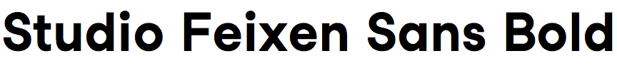
Studio Feixen Sans – Felix Pfäffli (Studio Feixen Fonts)
Studio Feixen Sans manages to be both inconspicuous and distinctive at the same time. At first glance it’s a neutral sans-serif, like Helvetica, but it has several idiosyncratic features, like the extended ‘G’ bar and ‘Q’ tail, and the schoolbook-style ‘y’. What inspired these features?
In our designs it’s almost everything about the feeling. I have always designed with gut instinct. Next to designing fonts we create visual languages for companies worldwide, and most of the time it’s not about the look of the shapes but much more about the feeling a shape is communicating. With Studio Feixen Sans I aimed for a font which is friendly, slightly contemporary, and very basic at the same time. The extended ‘G’ bar and ‘Q’ tail add some naive twist which I really liked. And the schoolbook-style ‘y’ is my personal favourite - it’s just so much friendlier than the classic ‘y’. Since we decided to add some twist, some humour, to the tail of the small ‘g’ the schoolbook-style ‘y’ felt like a good companion for it.
It’s nice to hear that you describe it as both inconspicuous and distinctive at the same time, since that was our main goal when we designed this font. Studio Feixen Sans should not be too over-designed and loud since we planned to use it to accompany our own designs, which are very attention seeking already. But it should have character and communicate our naive love for the feeling of shapes.
I’m finding it difficult to find other similar fonts to compare it with on Identifont; the best I can find is Proxima Nova Alternate. Did any particular typefaces influence you in its design?
Studio Feixen Sans has a very strange history. First I designed an incredibly condensed and grid based font for myself, based on the simplicity of Alpin Gothic. The idea of this font was to be able to make poster compositions very fast. Later we translated this font into a non-condensed font and Studio Feixen Sans was born. Compared to its origin, the sans is based on the square like a classic geometric font. But if you look very closely you will realise that the character comes from all the thousand details where we decided to ignore the rules.
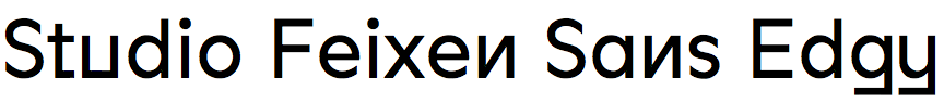
The companion typeface Studio Feixen Sans Edgy ramps up the idiosyncratic features, giving it a playful, almost alien, appearance. Do you envisage them being used side-by-side for particular effects?
Hahahaha! Alien appearance - I like that. While designing our fonts we simply stumble upon a lot of very interesting letter shapes and alternative options which sometimes are hard to ignore and let go. With the Sans Edgy we somehow opened a door for ourselves to have a small playground of other possibilities which will grow over time.
Actually I thought people would use it mostly in big sizes as a display font. But when I saw the corporate identity of Konow (see Studio Feixen Fonts In-Use) I thought that was an even better use.
What are your future plans for the Studio Feixen Sans family?
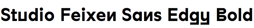
In about half a year we will update the Sans family and I still haven’t really sorted out what would be the best decision with Sans Edgy. At the moment it looks like Edgy will stay as its own font and get its own strange alternates. But it’s still not totally clear.
![]()
![]()
![]()
Lexik – Thomas Hirter (Binnenland)
What was your original motivation for designing Lexik, and what applications did you have in mind?
I started working on a new serif typeface in 2014 while doing a redesign for a magazine that is primarily aimed at men, and is published quarterly in a small print run. Since we decided to switch from black and white to color printing, I was searching for a rough typeface with a strong presence. The first version of the font was really very sketchy and bumpy, but since it was such a small target group and a low budget project, I took the liberty of treating the font as a work in progress: for every issue I updated the font, which was of course ideal because I was able to review the typeface in offset printing so often.
You’ve described Lexik as an “up-to-date interpretation of a humanist antiqua”. Were there any particular earlier typefaces that influenced you?
My intention was to design a sharply cut text typeface that works well even in larger sizes. There were several typefaces in this genre that inspired me, like Stanley, GT Sectra, Gza, or Noe to name a few. After the first few issues I expanded the family with a display version that pushes the radical character and the sharpness even further to the limit. These cuts are also still in use in the magazine but are not yet ready to be released.
One of the distinctive features of Lexik is that the curves are not smooth, but have kinks as if they were drawn with a pen nib. Did you draft the characters on paper using a pen, or do you design straight onto the computer screen?
Basically, and in retrospect, I worked with the computer too early. Even though I made some sketches with a broad nib pen, I mainly worked directly in Glyphs. Because of that, and also because I was able to revise the typeface every three months, I got lost in the details quite often. That’s when my friends from Binnenland came in and helped me to focus on the overall picture again. On their advice I took a closer look at some serif classics such as Garamond, at how the diagonal stress is positioned or how the rhythm of the typeface is established. I realised that letterforms achieve legibility when they are drawn correctly.

Bork – Luisa Leitenperger (Harbor Type)
Bork seems to incorporate features of heavy blackletter typefaces like New Bayreuth, with chiselled typefaces like Michael Harvey’s Mezz Black. What was your starting point in designing it, and were you influenced by these types of fonts?
My starting point was a calligraphy exercise I did in a blackletter workshop taught by Julian Waters in February 2018. We were given a book filled with a ton of examples of work by him and other artists. One that particularly caught my eye was an exercise by Ernst Schneidler, so I wrote a page of text trying to emulate it. Between that class and starting Bork (around late 2019, early 2020) I worked on other projects, including another, still unreleased, blackletter typeface. I researched lots of other blackletter typefaces for it (a big help was the book Fraktur Mon Amour), and that must have had some indirect influence, but I don't think I looked at blackletter type for Bork.
I really wanted to instill the liveliness of calligraphy, so I didn't want any perfectly straight strokes or identical shapes. In that sense, one big inspiration, particularly for the uppercase, was Burbank from House Industries. I love how bouncy and fun it looks with all the irregularities and alternates. I also looked at Rocher (also from Harbor Type), especially details like its punctuation. If you look closely at the double quotes for instance, you'll notice each one is slightly different from the other. Now that you mention it, I see that kind of vibrant, energetic quality in Michael Harvey's work too, which is what makes me a huge fan of his. I wasn't consciously thinking of any of his typefaces but just in general he's a big influence for sure.
Do you sketch the characters on paper first, or do you work straight on the screen?
Generally yes, I do lots of sketches, but for some reason this time I went straight to the screen. I guess I already had a strong enough idea from that calligraphy exercise that I didn't feel the need to develop it much further before going to the computer. And even though that exercise only had lowercase, the rest of the characters flowed quite naturally and I didn't do much, if any, sketching for them either. I mean, obviously lots of iteration happened on the font editor, but with a well defined sort of mental image, it was more like tweaks.
Did you have any particular projects or applications in mind as you were designing it?
I actually really didn't. I knew it would be a display typeface – even though I'm very happy with how the texture turned out I doubt anyone will be setting long texts with it – but I couldn't think of any specific uses. From basically the start of my design education, calligraphy and type design have always been my main focus, so graphic design isn't really my strong suit. It was Henrique Beier who worked on all the promotional materials, and I think he did a great job fleshing out potential uses for it: logos, headlines, packaging, etc. I'm very excited to see how people use it in the real world.
![]()
![]()
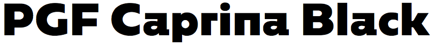
PGF Caprina – Pedro González (PeGGO Fonts)
Was PGF Caprina originally designed for a particular application or project?
It was designed for winter sports applications, such as snowboarding, skiing, mountaineering, and alpinism.
A distinctive feature of PGF Caprina is the square shape of several of the lower-case letters, such as the ‘a’, ‘h’, ‘m’, ’n’, ‘r’, and ‘u’. What inspired these features?
These were inspired by the hard and brave temperament of the ibex (mountain goat) and by the hard shapes of its environment, like the mountains, rocks, and ice, all elements associated with winter and snow sports.
I understand PGF Caprina is an updated version of a typeface you originally designed for Los Andes in 2017. Are there many changes between the two versions?
Yes, it was a great experience and honor to work with them at that time.
The new version has expanded the font from 534 to 739 glyphs, the main extensions being: support for more than 220 Latin-based languages, complete scientific and fraction notation number sets, and symbols such as arrows, bullets, and numbers in circles and squares. These extensions are designed to make our fonts meet the needs of professional design studios.