New Additions: May 2017
8th June 2017
We add hundreds of fonts to the Identifont database every month. Most of these are recent releases, and some are simply new acquisitions from foundries who were not yet represented on our site. Stephen Coles gives his take on the most interesting recent additions.
![]()
![]()
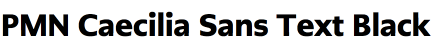
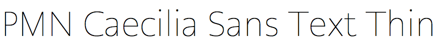
PMN Caecilia is an early example of a Humanist Slab Serif, a classification that was virtually unknown when Petter Matthias Noordzij began the design in 1983. Its open shapes, simple serifs, and clean strokes with low contrast make it a very legible face, especially for screens, and Amazon chose PMN Caecila as the default text font for their first iterations of the Kindle. 17 years after the slab release comes a sans serif companion. It’s remarkable how fresh PMN Caecilia Sans looks, despite being based on a 1980s design – but of course its source has held up very well too. Besides mirroring the styles from the original Caecilia, PMN Caecilia Sans adds more weights, an oblique (slanted) alternative to the italic, and an optical size variation for compact headlines.
![]()
![]()
![]()
XYZ Type, run by Jesse Ragan and Ben Kiel, launched last month with three families. The first is Cortado, a script they released without a label in 2014. The other two are Export (below) and Aglet Slab, a substantial family advertised with the tagline “confident & well-rounded”. It’s an appropriate description, given that type with bubbly ends often has a jocular attitude, while this one manages to avoid frivolity. It’s a workhorse that (unlike most) is not too serious, yet stays well tempered in its casual demeanor.
![]()
![]()
Export has the look of shipping container stencils, but with a slightly handmade finish. Like a well-used cardboard box, some lines are slightly askew; some bulge; others are concave — as if they are cut from paper. Yet, none of these quirks prevent Export from a certain industrial sturdiness inherent in this category. It’s a heavy lifter with personality. Don’t miss the ‘Q’ with its cleverly lifted tail, allowing lines to stack solid.
![]()
![]()
![]()
Magnetic joins a small parade of recent monospaced typefaces (e.g. Gintronic, Operator, Spot Mono) which depart from the conventional typewriter or computer roots. These designs are not immediately recognizable as monospaced, yet they use the width constraint as a creative catalyst, resulting in type that feels decidedly new, despite the category’s usual retro references. Magnetic introduces a stone-cut angularity to the category, and it’s mostly successful, although there are some distracting irregularities in the Black (e.g. compare density of ‘a’ and ‘e’).
![]()
![]()
![]()
Monotype’s Carl Crossgrove has plenty of experience with the typographic interpretation of informal handwriting. His work on Segoe Script and Print – a series that successfully combines legibility with a natural written look – surely informed Cavolini. This new design is among many Monotype faces designed specifically for the screen, particularly those embedded in hardware devices. As such, Cavolini has a very large lowercase, and quite simple forms. Still, it doesn’t lack the human quality found in Crossgrove’s other work. It’s a utilitarian handwriter with swing. The Condensed styles are handy in a category which usually lacks width variations.