New Additions: November 2021
30th November 2021
From the hundreds of fonts we add to the Identifont database every month we chose a selection of the most interesting recent additions, and interviewed the designers about their approach to each design:
![]()
![]()
![]()
![]()
Syncro – Fabio Furlani (Out of the Dark)
How did the design of Syncro come about; was it created for a particular project?
Syncro was designed during my internship at Out of the Dark – to be added to the foundry's type catalogue. At the beginning, we took a week on research to find a style that matches.
Syncro has the flamboyant serifs of old-style typefaces like Ronaldson Bold and ITC Tiffany Demi. Were these or other similar fonts influences on your design?
Yes! Syncro Book and Syncro Bold are pretty much a revival of Ronaldson Clarendon by Alexander Kay for L. Johnson & Co (1885). We found it in an old specimen book by American Type Founders. Cut in metal, the size-specific cuts revealed quite different characteristics. Syncro captures the spirit of the small type sizes (6pt, 8pt, 10pt) and translates it into a scalable modern design. The Italic, Mono, and Mono Italic cuts were designed completely from scratch.
You’ve created a monospaced version, Syncro Mono, but presumably this isn’t intended for computer applications such as programming editors or terminals? What was your motivation for including this in the family?
The idea was to build a family that rejects the idea of linear (interpolated) styles from thin to bold but still offers convenience in mixing type within editorial projects. That is why we ended up with adding a Mono and even Mono Italic cut. Each cut also has its own characteristics in detail. For example Bold isn’t just a bolder version of Book. It's bolder, more extended, and has even more expressive serifs.
What applications would you like to see Syncro used for?
We like to see Syncro in all kind of applications! It was designed to have an expressive look at big sizes, while the distinctive modulation and rhythm within the design still offers a highly readable typeface for editorial uses.
![]()
![]()
![]()
![]()
Neptun – Fabian Dornhecker (La Bolde Vita)
You’ve written that Neptun is inspired by Venus, published by the Bauer Type Foundry in 1907. Would you describe Neptun as a revival of Venus, or a reinterpretation, and what inspired you to create it?
Whether Neptun is to be classified as a revival or a new interpretation depends largely on the definition of the terms. But for me a revival has a certain claim to the original design; one should try to empathize with the type designer and continue their thoughts or translate them into the present. I did not have this claim during the development of the Neptun family, neither were any letters traced or particularly extensive research done specifically for Venus Grotesk.
The reason why Neptun Nord is strongly based on it is more of a personal one. Venus was one of the first historical specimens I came in contact with – and it has happened to me again and again and left a lasting impression with its lively yet functional character. When I wanted to use it a few times in designs, I noticed that it just doesn't look contemporary. So I tried to use the functional and characterful peculiarities as a basis and enrich them with modern details and inspiration from other German typefaces from the 19th century. This reinterpretation ultimately led to two different approaches, which are now available as the Nord and Süd variants.
In Neptun Nord you’ve retained many of Venus’s quirky features that make it instantly recognizable among other more neutral sans-serif fonts. I’m thinking of the long, high, ‘G’ bar, the high ‘K’ and ‘R’, and the curl on the ends of the strokes of letters such as ‘C’ and ’S’. Are these features that attracted you to the idea of creating a font inspired by Venus?
Absolutely! I think these features are still contemporary today and a useful contrast to the more serious and omnipresent neo-grotesque fonts. And when leafing through early font designs from this period, Venus clearly stood out from many others. I think the reason for this is that the features were applied comprehensibly and consistently and thus give a clear concept. I was happy to take up, translate, and expand this working concept for the Neptun Nord family. In contrast to this, these quite noticeable deviations from the standard in form and proportion have been largely eliminated in the Neptun Süd family. A sympathetic effect is conveyed in a rather subtle way: through sometimes playful basic shapes such as ‘a’, ‘r’ or ‘y’, or slightly exaggerated proportions in the vertical and the expansion of the widths.
You’ve also provided a variant called Neptun Süd, which replaces some of the characters in Neptun Nord with more familiar modern shapes: Compare Neptun Nord and Neptun Süd. Do you intend Neptun Nord and Neptun Süd to be used side by side, or do you see them as alternatives for use in separate applications?
As already written, the Neptun Nord and Neptun Süd families emerged from the process and have branched out. Because of the same origin and a fundamentally similar vibe, the two families can definitely be combined. Due to the many styles, also in different ways: For example, a bold cut from the Nord family for headlines paired with Süd Regular or a wide cut from the Süd family for titles and quotes with condensed cuts from the Nord family for running texts.
But, and that of course also plays into the decision to publish two different directions of Neptun, it also gives the user more freedom to choose. My font designs are often very expressive and therefore incompatible for most applications. In the meantime, I always try to deliver at least a slightly more adapted version, in case the font shouldn't dominate the entire design it is used for. Therefore you are definitely invited to choose the right style for yourself and only use Nord or Süd.
![]()
![]()
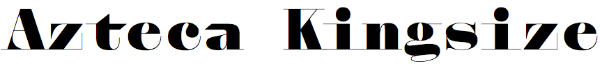
Azteca – Ian Party (Newglyph)
What inspired you to design Azteca? Was it for a particular design project?
The idea and inpsiration behind Azteca was a personal challenge. For a long time I’ve been interested in the idea of combining a didone and mono. Combining these two particular styles brings up some design challenges, like how to fill the white spaces. It’s definitely an interesting design playground, and involved a lot of trial and error. Ultimately the combination of these two styles I played with generated lots of surprising design solutions. This font is a formal experimentation of these two styles.
Azteca is a bit unusual in that the characters are all the same width, apart from the ‘m’ and ‘&’ which occupy two character widths. Why did you decide to make most characters the same width, and then why did you make a few exceptions?
When designing a font like this I could have made more exceptions, but it was a question of balance and finding the right rhythm in the font. With the ‘m’, unlike with the ‘w’, I didn’t find any visually appealing solutions within a mono structure. So I decided to widen the possibilities; same with the ‘&’. I didn’t feel the need to make many exceptions; I felt it would have taken away from the visual rhythm and structure of the font.
Azteca seems to have elements of Bodoni Poster in its DNA. Was this an influence on its design, and were there any other influences?
I didn’t focus on a particular font when designing Azteca. But we can say that it was the vertical, mechanical, and rigid structure of the didone fonts of the late 18th century that inspired me. It’s particularly interesting to combine this structure with a mono style.
Azteca Headline and Azteca Kingsize are variants of Azteca with progressively finer serifs. Are their dimensions otherwise identical to Azteca Text?
Yes, their dimensions are identical to Azteca Text; the only thing that changes is the stroke contrasts.
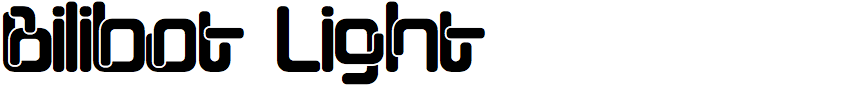
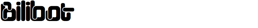
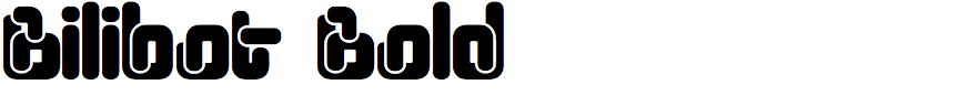
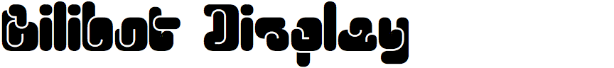
Bilibot – Benoît Bodhuin (BB-Bureau)
Bilibot is an unusual but surprisingly readable display font, with characters that look as if they are constructed from sections of bent wire. Where did the idea for it come from?
The idea comes from cartoons: when two shapes overlap, it leaves a border. This led me to multiply the overlaps and find a design that matches with the cartoon idea. The ‘e’ came naturally, followed by the ‘n’ that also came naturally, as well as all other letters with a junction. Letters (like the ‘o’) without a junction took more effort to figure out where and how to add this overlap. Readability comes from the size of the letters, allowing the void to signify the letter and create space between the noise caused by the overlaps.
It's a sign of Bilibot’s originality that I’m finding it hard to suggest any similar fonts to show on Identifont. The closest I can get is LL Rephlex, or perhaps your earlier font Pipo. Were there any particular fonts that influenced you?
I really enjoy looking at typography; what other type designers are doing or have done. Sometimes I'm admiring, sometimes a little jealous, but I'm not inspired by it. I can be inspired by many things; an idea is a meeting that must be seized, it is a somewhat mysterious way. The point of departure of my work comes most of the time from my own work: desires born from a previous work that did not find its place.
Bilibot looks like it would be ideal for children’s toys, or perhaps food packaging. Did you have any applications in mind when you designed it?
I never work on my typefaces for a particular use. It may sound pretentious, but it's a bit like fundamental research, the goal is research, it's a game, and other researchers find applications. Here, it is only typography, but it's the same, I leave it to the graphic designer to find uses, with the risk of making unusable types.