New Additions: December 2023
31st December 2023
From the hundreds of fonts we add to the Identifont database every month we chose a selection of the most interesting recent additions, and interviewed the designers about their approach to each design:
![]()
![]()
![]()
![]()
Connary Fagen – Cygnet CF (Connary Fagen)
Cygnet CF is a sans-serif typeface with an unusually large x-height. What inspired you to design it?
As with some other projects like Quiverleaf CF, it started with some freeform experimentation on an older MacBook with limited internet access, allowing for more focused and intentional work. I didn't set out to create anything specific; instead, I had a Glyphs file that I would come back to over the past few years, designing a bit then forgetting about it, coming back months later and picking it up again. This cycle eventually turned into enough of a cohesive design to pursue, and that became Cygnet.
In some ways Cygnet CF reminds me of Roger Excoffon’s Antique Olive, another typeface with a large x-height. Was that an influence on its design?
It was not a direct influence, though it is a lovely typeface. As with all design, however, we absorb the things we see and love, so I'm sure elements of Antique Olive were floating around my mind as I worked. I think there are also echoes of ITC Serif Gothic in there.
One characteristic of Cygnet CF is the variation in width of the letters; for example, the ‘C’, ‘G’, ‘O’, and ‘Q’ are almost square, whereas the ‘E’, ‘H’, ‘N’, ‘T’, and ‘Y’ are narrow. What was your thinking behind this?
Thank you for noticing! I wanted to experiment with the visual rhythm or cadence of words when they were set in Cygnet. I love a good geometric circle, but I also love the look of condensed glyphs. So I combined the two, with circular letters getting the extended look and the letters based around capital ‘I’ being narrow. It creates a bit of visual interest that would be less welcome in a text face, but I find it pleasant in here.
Cygnet CF not only seems ideal for headings and display text, but also for logos and emblems. Did you design it with these the sorts of applications in mind?
I did! There is a quiet confidence in a wordmark with minimal adornment, but the letterforms need to be interesting enough to stand on their own. At the same time, it still needs to be legible, especially in poor conditions, so a balance should be struck. Before Cygnet I had been doing a lot of body copy type design like the two Novaletras, plus the massive undertaking of Greycliff Japanese CF, so it was refreshing to change gears and be a little less formal with a display face like Cygnet.
One of the most distinctive characters in Cygnet CF is the lowercase ‘g’. What was the inspiration for that?
Yes, the lowercase ’g’ is my favorite glyph in the font, and Cygnet is not the first time I've taken an unusual approach to that letter. The original version of Criteria CF had a somewhat similar idea, but I ended up hiding it away in an OpenType alternate. Cygnet is more playful than Criteria, so I've made sure to use ‘g’ a lot in the type specimen images so people can see it. I also finally let myself design a lowercase ‘e’ with a tilted crossbar, which always felt too cheerful in my other typefaces but I love it in Cygnet.
Also, the name Cygnet was a perfect match – for one, I love constellations and I have always thought Deneb/Cygnus was beautiful, and I simply like the imagery of swans in general. That lowercase ‘g’ has a swanlike movement to it, so the name stuck.
![]()
![]()
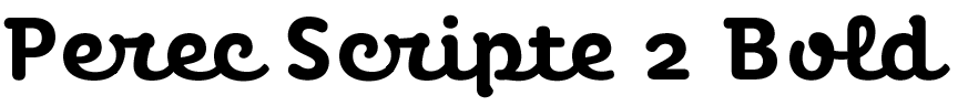
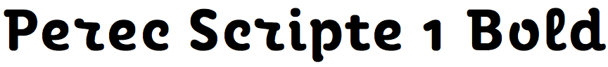
Alejandro Lo Celso – Perec Scripte (PampaType)
Perec Scripte is a vertical script font with rounded stroke ends, part of the Perec and Perec Ludique family. What inspired you to design it?
This is an ongoing project, a family that is growing gradually. In other words, it is like a serial or multi-style typeface. I started it in 2009 as a tribute to the work of Georges Perec, a French writer that I admire very much and who dabbled in virtually all genres of literature, as well as film, music, crosswords, and more. It seemed to me that such a varied work called for a family of forms with a wide diversity of styles. The challenge was to ensure that these styles could be combined, for example in the same text.
This challenge is key in this case because Perec belonged to the OuLiPo (Ouvroir de Littérature Potentielle – Potential Literature Workshop), a group of mathematicians and writers led by Raymond Queneau and Francois Le Lionnais, who pursued a radical innovation of literature by employing imaginative methods based on the idea of self-imposing constraints. I followed that same idea and imposed on myself the constraint of designing a family that included styles that were divergent in principle, but that once harmonized could be used together.
Users will be the judge of that. But, of course, each type style stands on its own and nothing demands that they must be used together. It was simply a design challenge. And the truth is that it's very rewarding to go through it, plus it's a very learning path. I think it's always good to set new goals and try not to repeat yourself.
You’ve provided two versions of Perec Scripte that share the same capital letters, but Perec Scripte 1 has separate lowercase letters whereas Perec Scripte 2 has joined lowercase letters. Did you design it with two versions from the outset?
Well, the original scenario was to design three styles: one fully connected, one fully disconnected and a third one self-managed that would connect and disconnect itself, depending on the context. After years of programming, testing, and tweaking, I realized that the auto version was not so visually different from the fully connected version. This is because I added many alternates and ligatures to solve the cases of less harmonic letter encounters. I then decided that it would be clearer to users if there were only two base versions: connected and disconnected. The uppercase letters are the same in both styles, with and without swashes, just as the lowercase letters have final, flourished versions in both connected and disconnected styles. Both styles include the extended Latin set as well as a good amount of typographic goodies.
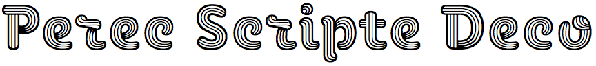
A third style, Perec Scripte Deco, features characters with a three-dimensional, sculpted appearance. Where did the inspiration for this style come from?
Well it is already a foundry practice to add decorative, titling, or display versions to the typefaces we make. It is part of a taste for offering a wider palette of styles than what is predictable. This puts us to the test as designers: would the same design idea originated as a text font work in a titling version, in a decorative version? Would it work within a more graphic, even hypnotic tone? And fonts that are complex to draw, we are passionate about. I hope it's inspiring, and that designers like to use it.
This Perec Scripte Deco is quite singular, I think. We don't use any algorithms or scripts or anything AI when drawing the fonts; we draw each character on the creen entirely by hand, and that's part not only of the pleasure of designing a font, but also to achieve a result more linked to the handmade, to the human, something that we believe is warmer in the eyes, in the words, in the text. At the height of the AI boom this seems an absurd goal, but precisely, for us it is important to offer this other look, diverging from the common designers who only feel comfortable using geometric fonts, all similar, homologated, boring. For us it is significant to deploy expression and creativity within the limits of reading comfort.
You’ve written that Perec is a tribute to the French writer Georges Perec (1936-1982), whose works often feature experimental writing and word play. Was Perec Scripte designed with experimental writing in mind?
It's more the case that a similar self-imposed, experimental challenge guided the spirit of the family, which is part of the fun of this craft. We talk about all this in the Perec Scripte article. Read our articles; we try to convey interesting content in them, not just talk about our own designs. We celebrate being able to articulate language and ideas behind our designs, and to be able to share it with other designers and users who also care about reading, thinking, reflecting a little about the world.
![]()
![]()
![]()
![]()
![]()
Kaj Lehmann – Synt (Dinamo)
What led you to design Synt? Was it for a particular project?
Synt was initially designed for zweikommasieben, a Swiss magazine about contemporary sounds and club culture. It was my final project at the Master Type Design Programme at the École cantonale d'art de Lausanne (ÉCAL). I had co-designed the magazine for many years and wanted to use the opportunity to create a custom font for a specific issue. I picked up a typeface that I had studied before – a modern era typeface from the De Vinne Press – and introduced the two topics “rhythm” (unit-system) and “speed” (turbo-slant) to the design, in order to fit the context of the music magazine.
After the issue was released, I was contacted by Johannes Breyer and Fabian Harb, who had seen the magazine and asked me to continue the project for their type foundry Dinamo. This was back in 2018, and in the following five years Synt has developed much further thanks to their expertise and their team of font engineers; shout out to Robert Janes, Renan Rosatti, and Hugo Jourdan.
You describe Synt as a reimagining of 19th Century modern faces, and the closest typeface I can find to compare it with is Cyrus Highsmith’s Escrow Light. Were you influenced by any particular classic typefaces?
Yes, Synt is influenced by a typeface from the De Vinne Press that was used in the body text of the 1900 book “The Practice of Typography”. Theodore Low De Vinne had many typefaces created exclusively for his printing press, sometimes only in one specific size. According to Irene Tichenor, a specialist on Theodore Low De Vinne and the former president of the American Printing History Association, the typeface from “The Practice of Typography” comes from the company’s vast, serviceable roster. If there’s somebody out there who knows more details about this typeface, please reach out to me!
An unusual feature of Synt is the slight bulge in the vertical strokes of letters such as the ‘D’, ‘O’, and ‘Q’. What inspired this feature?
Synt has a unit-based rhythm underlying its vertical stems. To underline this technical “beat”, the counter-shapes of the round letters have long straight segments. To control the transition from these straight segments into the horizontal stroke, I often placed an extra bezier-point in places where you usually wouldn’t find one. This detail is an important part of the DNA of Synt.
You’ve provided three different italics with Synt: a true Italic, Slant with a 16° slant, and Turbo with a 32° slant. What applications do you envisage for these alternative italics?
I see the true italic style most likely in books, where you read longer paragraphs. The true italic fits nicely into body copy and is suitable for highlighting words or sentences. The 16° slant is really a technical slanting of the regular letterforms. It works for highlighting paragraphs, without standing out of the body text too much. I am happy to see the 32° turbo-slant on posters or title pages in magazines. Especially when set in all-caps. But I myself have also used it for highlighting words in the body text in zweikommasieben. Such an exaggerated slant in body text is admittedly not really beautiful, but in specific contexts it might be just what you want.
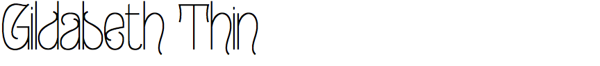
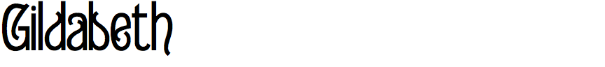

Ray Larabie – Gildabeth (Typodermic)
Unlike many of your typefaces which have a futuristic, high-tech look, Gildabeth is distinctly historical in appearance. What inspired you to design it?
My inspiration for Gildabeth emerged from a dual fascination. Initially, my intrigue with Carole King’s Tapestry album cover led me to Telemachus in early 2023, a font inspired by the obscure title font. Gildabeth represents a further exploration in this vein. It's not merely a historical revival; it's designed to withstand scaling extremes, accommodating modern design needs. The second inspiration came from observing a generational shift towards maximalism. There's a noticeable scarcity of decorative typefaces robust enough for scalable interfaces, and Gildabeth seeks to address this gap.
You’ve described Gildabeth as a font in the Edwardian style. Were you influenced by any particular classic typefaces?
Indeed, the Edwardian style of Gildabeth draws its essence from a 19th century font I stumbled upon in old metal type catalogues. Although I can't recall the original font's name, it closely resembles the RMU Pittoreske revival. My previous works like Carouselambra and Hedgerow, also Edwardian-era inspired, echo this theme, drawn from the unique transitional space between Art Nouveau and Art Deco, imbued with a subtly sinister undertone. They lack the naturalistic forms of Art Nouveau and the elegant geometry of Art Deco and have an eerie decorative vibe.
Many of the characters look as if they were made of wrought iron; for example, the ‘J’, ‘h’, ‘u’, ‘3’, and ‘9’. Was that what you had in mind as you designed it?
The wrought iron appearance wasn't a direct intention, but rather a by-product of the design process. The stroke modulation in Gildabeth compensates for the added complexity of the curls. The objective was to balance the ornate letterforms with strokes that appear dull and utilitarian, contrasting the neo-grotesque style with the flamboyance of the characters.
Are you anticipating a trend away from minimalism towards more ornate typography?
As we enter 2024, I believe we're approaching the culmination of the Neo Nouveau era in display lettering. While these styles continue to enjoy popularity, I anticipate a shift towards less austere, more maximalist designs. Gildabeth's release, coinciding with the Barbie movie that features a logo reminiscent of the 1975 version's curly, old-fashioned letterforms combined with contemporary strokes, may indicate a broader trend entering the cultural zeitgeist. I'm fascinated by the way Gen Z, and Gen Alpha are rejecting minimalism and austerity — it'll be interesting to see where we end up.