New Additions: June 2023
30th June 2023
From the hundreds of fonts we add to the Identifont database every month we chose a selection of the most interesting recent additions, and interviewed the designers about their approach to each design:
![]()
![]()
![]()
Nina Faulhaber – Aeroplan (TypeTogether)
You’ve written that Aeroplan was inspired by a typeface you found in a 1916 book about aircraft engines. Is Aeroplan a revival of that typeface, or just inspired by it?
Aeroplan was created as a revival based on a historical source. I drew the very first version during a revival project in university in 2019.
Digital type design was a relatively new thing for me back then so I was taking the assignment really seriously. I was researching, analyzing, and comparing as far as possible at this time. The first draft of Aeroplan was very close to the original source. This was important for me to understand the structure and essence of the typeface and gain confidence in designing new letterforms. The original typeface had a very unique character and it was important for me to keep it, but also add something personal.
When I started working on Aeroplan with TypeTogether as part of the Gerard Unger Scholarship 2021 the typeface evolved a lot. The help of the whole team and intensive mentoring sessions gave me the confidence and skills to make Aeroplan into a complete typeface family that meets today’s demands for a text typeface. With the years passing the design became more my own and matured into a contemporary typeface which nevertheless shows its roots.
Although Aeroplan is based on a typeface from 1916 it has a very modern appearance. What changes did you make to achieve this?
Of course the process of translating printed type into a new medium involves many innovations and adjustments. It was important for me to show in the design that it was created with today's digital tools. I simplified the letterforms, modified widths and contrasts, and gave it just a little more edge but in a careful way. Now the shapes have a certain digital sharpness that, combined with the somewhat awkward, peculiar charm of the original source, creates a vibrant and modern feeling.
The italic is distinctive, more like lettering handwritten with an italic nib than a classical script italic. Was it also based on samples from the book?
It is indeed loosely based on samples from the book. However italic was rarely used in the text (mainly for subheads or for emphasizing single letters) so I had just a handful of lines to start sketching on. I took some of the distinctive characteristics from the original (very special shapes, strong in- and out-strokes, etc) and drew my very own expressive italic. In the book, it was clearly visible that the upright and italic were not designed as a family. For Aeroplan I wanted to have a strong italic that could stand on its own but also build an interesting union with the upright and not disturb it.
You’ve also released a version of Aeroplan as a variable font. Did you plan the typeface as a variable font from the outset?
No, that happened rather during the process. The Aeroplan family started as a single font and grew slowly over the years. At some point during our feedback sessions the TypeTogether team suggested adding a variable font. In terms of design it did not involve many adjustments to the regular workflow with several masters, so adding a weight-axis felt quite natural.
![]()
![]()
![]()

Dušan Jelesijević – Operandi (Tour De Force)
Operandi is a sans-serif typeface with a 1920s look to it. What was it inspired by?
I was watching the 2022 Elvis movie with Tom Hanks and Austin Butler, and there were many scenes featuring different titles on stores, windows, pastry shops, and neon lights etc, and I liked that feeling of vintage typography and how it was blended into a movie from 2022. So, it provoked me to create a sans-serif family with elements of retro design.
Some of the character shapes in Operandi are reminiscent of Bernhard Gothic and ITC Bauhaus, both typefaces from the 1920s. Were these influences on its design?
Not directly. I analysed Bernhard Gothic a bit some time ago, and a couple of others like P22 Art Deco Chic and Mostra One, before working on Operandi. I'd say Operandi is more based on modern sans designs with retro interventions, just like the Elvis movie I mentioned – you can see it's modern even it tends to give the impression of another period. If I had to classify it, it would be under art deco sans-serif families.
When you’re designing a new typeface do you find that one or two characters take a disproportionate amount of time? For example, it always seems to me that the ‘Q’ has the most room for creativity.
I guess it depends more on the design style of the typeface. ‘Q’, ‘f’, ‘t’, ‘K’, and ‘R’ are probably the ones that gives you a bit more freedom in design. But it also depends on the typeface weight. Some thicker weights can give you an extra opportunity to make something characteristic.
On the other hand, in last couple of years there's a trend among new designers to publish typefaces that are on the edge of readability in order to offer originality. Almost every letter in that kind of typeface looks like it's overdesigned for my taste. My challenge is to offer a distinctive enough typeface while keeping some traditional values in the design of its letters.
![]()
![]()
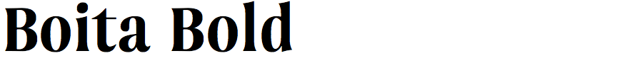
Mariya Lish – Boita (Inhouse Type)
Boita is an elegant condensed typeface with small triangular serifs. Did you design it for a particular project?
Boita did not originate from a specific project but rather emerged as my second serif typeface. My intention was to push my creative boundaries by crafting an exquisite and intricate design. At the time, the Glyphs app introduced a novel corner feature, which intrigued me and prompted me to incorporate it as one of the innovative techniques in my work. Reflecting on the past, Boita was born out of a motivation to blend pioneering tools with a fervent desire to broaden my knowledge and skills.
The closest typefaces I could find on Identifont to compare with Boita are Beaufort Condensed and ITC Quorum. Were you inspired by these or any other typefaces?
Before I embarked on the project, I took a close look at a favourite classic, Bodoni. I made a detailed study of the design and even experimented with the shapes closer to a Didone aesthetic. The corner feature allowed me to easily reshape the serifs during this stage of the design process. The choice to go with the small triangular serifs was a tentative one and reflected my cautious approach to the serif design process.
The Boita family includes five weights, from light to extra bold. Do you have any plans to add an italic?
I find the idea intriguing and I'm inclined to invest time into developing true italics for Boita. Knowing me, it's likely that I would also incorporate some experimental shapes into the mix, offering an alternative character set.
![]()
![]()
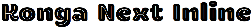
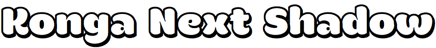
Rodrigo Araya Salas – Konga Next (RodrigoTypo)
Konga Next is an update of your 2015 font Konga, and you’ve now added inline, rough, and shadow versions. What prompted you to update the typeface?
The truth is that I reopened the 2015 file and realized that it could be improved a lot, that it had many errors such as drawing, kerning, and the typography could be enhanced with a good redesign. So I contacted my friend and typographer Bruno Jara and told him that I wanted to collaborate with him on the redesign, and Bruno and I communicated from time to time to discuss the improvements, until it was completed in 2023.
You’ve also changed some of the character shapes, such as the ‘W’, ‘i’, and ‘j’. What was your motivation for these changes, and are there any others?
The main motivation was to improve what we have, and develop OpenType alternates for some characters; for example there's an alternate ‘g’ and ‘&’ that I really like, the accents are much more expressive, and the new ‘K’ is simpler and less crude.
Konga Next is a friendly-looking font with no hard edges, and it looks ideal for toys, food packaging, and entertainment. Did you design it with these sorts of applications in mind?
Yes, in fact there was an even earlier version from 2013 which began as an idea for an entertaining typeface that could be used in logotypes in an informal or friendly way.
The Konga Next family also includes a dingbats font, Konga Next ZDingbats. How did that come about?
The dingbats were inspired by the work of the illustrator Stefania Ahumada. Stefania used the 2015 version of Konga in one of her works and I liked how they looked, so I asked her if we could include dingbats inspired by her work with Konga Next. She gave permission, and is credited as a co-author.