New Additions: October 2021
31st October 2021
From the hundreds of fonts we add to the Identifont database every month we chose a selection of the most interesting recent additions, and interviewed the designers about their approach to each design:
![]()
![]()
![]()
![]()
Otterco – Adam Ladd (Adam Ladd)
At first sight Otterco appears to follow in the tradition of ITC Avant Garde, with characteristics such as a large x-height, a circular ‘O’ and ‘Q’, and circular bowls on the lowercase letters such as ‘b’, ‘d’, ‘p’, and ‘q’. However, Otterco combines this with a greater variation in the widths of the characters, with a relatively narrow ‘A’, ‘D’, ‘M’, ‘W’, ‘a’, ‘c’ and ‘m’. What inspired you to take this approach?
In the case of Otterco I wanted to see if I could push this style of a varying character width typeface a little bit further in the hope of creating an interesting visual rhythm. The intent was for it to still feel relatively neutral and familiar, but have touches of unexpected widths throughout. Though, the width changes needed to be consistent by having a system and not feel too random or unthoughtful.
The Display styles of Otterco takes the contrast in character widths a step further: the circular uppercase characters and lowercase bowls remain the same, but the narrow characters are even narrower. Was your intention that the Display styles were for use at larger point sizes?
Yes, the Display styles were created for large settings and give the typeface more distinction. The mellower styles are for smaller text settings but are still interesting enough to be used as a display face. I hoped to provide a family that can really catch attention but not be so dramatic that it’s unusable for supporting text when needed.
Otterco’s eccentric character widths probably make it an unlikely choice as a text font, but it seems ideal for heading or display use, such as in style and fashion magazines and advertising. Did you design it with any particular applications in mind?
Advertising and magazines were some of the applications that I thought were appropriate. It is a little bit avant-garde, so any brand, product, or communication that needs to express that may find it useful. To me, I wanted to have both retro and modern tones. So it feels like you’ve seen it before but is current. Packaging and labels were part of the aim as well.
![]()
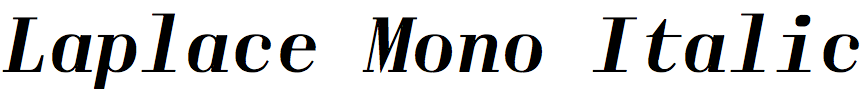
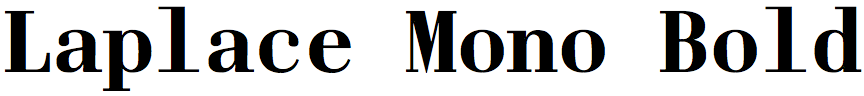
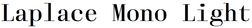
Laplace Mono – Anton Koovit (Fatype)
In your description of Laplace Mono you say it was influenced by Justus Erich Walbaum’s German Didot typefaces from the early 1800s, known as Walbaum. Why were you interested in designing a typeface inspired by these?
Back when I was studying graphic design in the Estonian Academy of Arts, while playing with Didot and Bodoni in layouts, I felt that setting a good running text was quite challenging. Of course I was also unexperienced, but in such situations Walbaum seemed to work better. The German classic, with its pragmatism, seemed to me like a better model to explore further.
Most monospaced fonts are designed for applications that need the characters to have the same width, such as programming editors and computer consoles, but presumably Laplace Mono isn’t intended for these. So why did you decide to make it a monospaced font?
Monospaced typefaces create a different feeling which designers can use as an additional toolset in their palette. They don’t have to be limited to technical applications. Monospacing is a constraint that often tends to make typefaces look clumsy, but also to work under challenging conditions. For example, I find typewriter fonts thrilling. I was interested in creating an experimental typeface which would balance between the clumsiness of monospace and the elegance of the Didone style. Exploring the interplay between these two polarities was rewarding, and gave me freedom to let my fantasy run free.
Laplace Mono deviates from its Walbaum model with some quirky features of its own, such as the extended bar on the ‘J’ and ‘j’, the diagonal stroke on the ‘Q’, and the slash through the zero. What led you to include these features?
These details stem from the nature of monospaced fonts. A very narrow ‘J’ needs to fill the same amount of space as the widest uppercase ‘M’. Thus, I tried many different ways to fill the emptiness with exaggeration. The ‘Q’ initially had a wave shaped tail, but it kept on colliding with other glyphs while I was testing the font.
![]()
![]()
![]()
![]()
Hurme Tek – Toni Hurme (Hurme Design)
Hurme Tek is a family of four styles, each in a range of nine weights. Did you conceive of the four styles from the beginning, or did the family grow from an initial style?
Initially, I had an idea about horizontally cropped character shapes.
During a meeting with a client long ago I noticed some old machinery in the corner of the meeting room. It had a nice logo on it, with what seemed like cut-off curves. Maybe it was like that by design, or because of the moulding it was produced with. I didn't have a chance to take a picture or take a closer look what machine it was but the idea stuck with me.
It seems that one way of thinking about each style in the family is as a set of constraints. For example, Hurme Tek No. 3 is “straight lines, only horizontal or vertical”. Is this how you planned each style, or did you have a different approach?
Imagine character shapes so big they don't fit between X-height and baseline, but are cropped instead. This was the starting point, which became Hurme Tek No. 1. Taking that idea further, if you scale character shapes enough vertically in that cropped space, they appear almost straight. This became Hurme Tek No. 3, consisting of only vertical and horizontal lines.
Rather than a set of constraints it was more like a method to apply design across the character set. I also found it a convenient way to describe the typefaces.
My process usually involves making a lot of variations of a single theme. Whatever the “idea” is, I like to explore it further and see how far it can be stretched. After this initial phase, I take the most promising explorations to production, which are then released as numbered subfamilies. Numbering also leaves an option for the future, if I have time to come back to revisit the sketches and extend the collection.
Although some of the styles in Hurme Tek seem original, for others there are historical precedents. For example, Hurme Tek No. 3 is similar to P22 De Stijl, which revives lettering created by the Dutch De Stijl movement (1917-1931). Were you inspired by any historical designs?
Not really. With that experiment I described above I happened to arrive at similar solutions to the De Stijl lettering.
I did do some research after initial sketches, looking at not only De Stijl but also pixel fonts and photos of machinery, technical drawings, and all sorts of random content. I think this order was important as I didn't want other designs to influence the original idea. It is more fun to try first myself.
For example, characters with diagonals, such as ‘V’, were tricky to distill to horizontal and vertical shapes. I wasn't happy with my first sketches and found out there are really only two ways to do it: one includes different kinds of “pixelations” along the diagonal, and the other one uses slabs to distinguish it from ‘U’.
For each of the four styles of Hurme Tek you’ve provided nine weights, going between extremes from Thin, which is almost hairlines, to Black, in which the counters have become hairlines. How did you approach creating this wide range of weights?
From the beginning, this was meant to be a display typeface that would benefit from a range of choice in weights. Looking at the design, where vertical strokes leave very little white space between them, this was perfect for that extreme black weight. I drew the first master quite bold already, to get a sense of the right proportions and how wide the characters should be, before drawing the black master.

P22 Torrone – Tracy Sabin (IHOF)
As well as designing fonts, your work includes package design and book design. Did you originally create P22 Torrone for a particular project?
I did. Each year my wife and I produce a baked good to send to family, friends, and clients during the holidays. My wife oversees the baking and I design and illustrate the packaging. In 2020 we made turrón, a Spanish nougat confection with toasted almonds and hazelnuts. I was hoping to find a chunky font with a bit of flair, similar to fonts used historically on European packaging during the deco era. I wasn’t able to find exactly what I was remembering and I ended up going a different route with the typography. But that unsuccessful search prompted an exploration and eventual creation of the font I had been looking for. I called it Torrone, which is the name for the Italian version of turrón; for more information see P22 Torrone Font Project.
Was P22 Torrone inspired by any existing lettering?
It was inspired by typographic experiments from the European Art Deco 1930’s era. Perugina’s “Baci” letter mark for their classic hazelnut and dark chocolate kisses, which originated in 1930’s Italy, is a precursor. Another example is Halloren Schokoladenfabrik’s “Mignon” letter mark, back when the German company was called Mignon Schokoladenwerke AG, again from the 1930’s. For these examples see P22 Torrone Font Project. The original Agfa logo is a third example. Similar fonts were created in other European countries during the deco period.
Torrone has the appearance of lettering drawn in ink with a brush. Do you work by sketching the characters by hand on paper first, or do you design directly using Bezier curves on screen?
I did some pencil sketches of a few of the characters to start out. The lowercase letters are fairly geometric, so once I had the letters ‘a’, ‘i’, ‘n’, ‘p’, and ‘v’ I was able to extrapolate the rest in Adobe Illustrator. The uppercase are more brush-like but there are themes that run throughout, with ball endings on many of the strokes, and exaggerated thick/thin swirling shapes. The ‘M’ from the Mignon logo was the primary inspiration for the direction the uppercase letters took.
You can see more of our holiday package designs, and recipes, at Seafarer Baking Company. A handful of my font designs have come from the Seafarer Baking Company projects.