New Additions: January 2019
2nd January 2019
We add hundreds of fonts to the Identifont database every month. Most of these are recent releases, and some are simply new acquisitions from foundries who were not yet represented on our site. Stephen Coles gives his take on the most interesting recent additions.
![]()
![]()
![]()
![]()
For his Font of the Month Club, David Jonathan Ross has issued a surprisingly complete font (or family of fonts) every 30 days. While I don’t expect this trend to continue forever, the complexity of these typefaces seems to be increasing with each new release. This was certainly true of September’s font of the month, Bradley DJR. Not only is Ross’s design the first comprehensive revival of a very popular metal type, but it includes optical sizing, either as separate fonts or a single variable font with a size axis from 6–60pt.
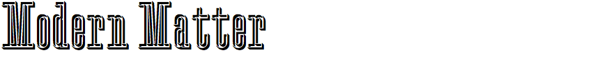
Some of the most interesting typefaces of the 20th century were never actually fonts, but rather alphabets or templates that were simply reproduced photographically one letter at a time. Modern Matter is based on a set of caps used by Herbert Matter on book covers such as Giacometti (on a solid form) and his own portfolio booklet, Symbols Signs Logos Trademarks. After spending time with Matter’s cut letters and logo designs in the collection at Letterform Archive I can see how this particular alphabet synthesizes so much of his aesthetic – a combination of sophisticated geometry and individual style. The source material didn’t include a complete alphabet, so François Rappo filled in the blanks, including a complete lowercase and dozens of ligatures.
![]()
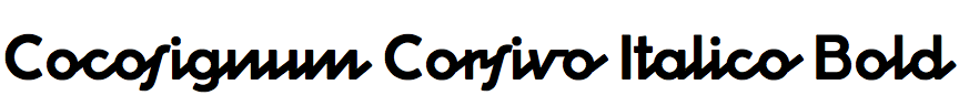
In Cocosignum Corsivo Italico a diagonal line strings together circles and straights to make a crisp Art Deco script. Cosimo Pancini’s idea is not entirely new; similar shapes can be found in late 19th- and early 20th-century typefaces like Master Script and Adonis, or in a more recent and elaborate design, Orion MD. Yet one can admire the simplicity of Cocosignum, which is successfully carried through an impressive five weights. (The sixth weight, Heavy, doesn’t leave quite enough white space for the concept.) Some glyphs could use alternate forms: the ‘s’ awkwardly interrupts some of its neighbors, the ‘v’ and ‘w’ connectors feel unresolved, and the ‘U’ is just a ‘V’. Still, this is a delightful typeface, and especially exciting for anyone who loves the Vibram logo and wishes it was a font.
![]()
![]()
Secession is an example of how a typeface can evoke a time and place with just a few unusual lettershapes. The clean, monolinear strokes could be mistaken for something very contemporary, but one glance at the the flat topped ‘A’, the diagonals in letters like ‘CGPcge’, or the extending swashes on ‘VWXvwx’, and you’re immediately transported to the Art Nouveau period – more specifically to Vienna in 1897–1905, the height of the artistic movement which gives this typeface its name. Secession was first cast in metal around 1898. This digital version is not a direct revival of the original’s four styles; instead it starts with the halbfett (Bold) and derives three weights and obliques from it. Other digital typefaces in this style include ITC Stoclet, Text Gothic, and Kolo.
![]()
![]()
![]()
![]()
James Edmondson is on a tear over the last three years, consistently producing original and innovative fonts since he opened his one-man label OH no Type Company in 2015. I’m surprised and embarrassed that I haven’t yet featured his work here. Might as well start with 2018’s Beastly. The release is perfectly in line with his Hobeaux, Eckmannpsych, and Blazeface, continuing his streak of reinvigorating 1890s/1960s styles, embuing them with his singular expressive voice, and wrangling them into cohesive and functional families, often with optical sizes. His work is courageous and delightful.