New Additions: March 2022
31st March 2022
From the hundreds of fonts we add to the Identifont database every month we chose a selection of the most interesting recent additions, and interviewed the designers about their approach to each design:
![]()
![]()
![]()
![]()
Mott Jordan – Solingen (Mysterylab)
Solingen looks like lettering drawn with a dip pen, such as a Speedball pen. Do you work by drafting on paper first, or do you design directly on the computer?
Agreed. There’s a dip pen quality to many of the letters. A number of the glyphs have ball finials that are shaped rather like that big drop of thick ink that you sometimes get at the end of an ink stroke; the kind of drop that stays wet for half an hour and dries shiny. Although I’ve used pen and ink to create custom lettering work in the past, this one never went through an ink stage, and I was no more than one pencil sketch into the process before I went straight to the computer to move it forward. At that point, I created enough characters to see if this was a promising design, and it felt like it had decent potential.
Solingen seems to have similarities with the 1970s font University Roman: compare Solingen and University Roman. Was that an influence on the design?
Quite correct. University Roman was the single strongest influence on the Solingen family. I believe that font came out near the beginning of the ‘80s, and I remember it becoming popular quite quickly. At the time I was a struggling custom lettering artist and occasional sign painter, and computer design was years away, so I used to buy those rubdown lettering sheets from Letraset to make mockups. There was one custom lettering job for an album cover where I created a variation on University Roman, but bolded it up and finished it out in a beveled metallic gold effect using an airbrush. It’s perhaps the most ‘80s looking thing that you could imagine. It’s been in the back of my mind to go back and make an original multi-weight font that sits somewhere in that design niche. I believe that University Roman itself was strongly influenced by another long-time favorite of mine: the very elegant Carlton by Fritz Helmuth Ehmcke.
University Roman has some real quirks to it. If you ignore the adornments and look just at the skeletons of the letterforms you see some unusual relationships. For example, compare the lowercase ‘e’ to the lowercase ‘m’. How many character sets feature an ‘e’ that is as wide – or wider – than an ‘m’? Also take a look at the very narrow ‘E’, ‘F’, ‘H’, ‘M’, ‘h’, ‘n’, and ‘w’. It’s a very unusual range of width features, and at the moment, the only other similar font I can think of offhand is the excellent Hacky Sack NF by Nick Curtis, which is even more extremely quirky in its approach to relative widths. Nick is one of the most talented – and supernaturally prolific – designers working today, in my opinion. For Solingen, I backed off a bit on those kinds of extreme width relationships to create a certain balance that I had in mind. For the italic, I mainly just went with obliquing all the characters, and only redesigning the ‘a’ and the ‘g’.
Another unmistakeable influence that has crept into Solingen (and the world of type design at large) is the work of the Indonesians. Although Indonesia officially uses the Latin character set today, one can perceive echoes of traditional calligraphic Javanese script shapes in the work of certain designers from that region, and it’s quite beautiful. The work coming out of there sometimes goes absolutely hog-wild with two-character ligature alternate glyphs. Sometimes it’s successful, other times it just doesn’t work at all to my eye, and creates a legibility train wreck. With Solingen, I tried to limit my two-character alternate glyphs to only the most balanced and legible options, and to avoid shoe-horning incompatible characters together into an unrecognizable glyph.
Many of your typeface designs, such as Kaleidoscope and Summer of Love, wouldn’t look out of place on Sixties album covers. Is that a period of design that particularly interests you?
Absolutely. Although I was about a decade too young to be part of the Woodstock generation, I did grow up in the San Francisco Bay Area surrounded by groovy poster art, hip record stores, head shops, and concert venues. At an impressionable age, the center of my visual world was the work of Rick Griffin, Victor Moscoso, Wes Wilson, Stanley Mouse, and Alton Kelley. Also, those Dover edition books helped me fall in love with the Art Nouveau forerunners of psychedelic hippie typography, so that’s where some of the deep roots of my designs grow from. I used to hand-letter all kinds of things, and eventually bought a silkscreen kit to make t-shirt band logos and designs. I think there are still many psych designs yet to be created and that the genre is by no means dead. If 1960s art and typography was a 1900s revival era, maybe the 2020s will become known as a second revival. Stay tuned for more super groovy fonts that I have in the pipeline, and don’t forget to kern your apostrophes.
![]()
Matthieu Salvaggio – Emeritus (Blaze Type)
Since the Identifont Blog changed to the current interview format in July 2020 Emeritus is the first blackletter font I’ve featured, which is perhaps a sign of how rare blackletter releases are. What led you to design it?
You're right – blackletter fonts are a rare breed nowadays. We've always wanted to design our own interpretation of the blackletter genre, and our goal was to combine the ancient design with calligraphic shapes, thin strokes, and elegant endings.
You describe Emeritus as being in the rotunda style, and the closest typeface I can find to compare it with is Karlgeorg Hoefer’s San Marco. Were you influenced by that, or any other fonts?
Not really. The design of Emeritus started with the lowercase letter ‘a’, and based on the different modular shapes it contains we designed the rest of the font family with a simple fraktur/rotunda ductus sheet.
A distinctive characteristic of Emeritus is the calligraphic flourishes on the terminals of most letters, which makes them look very dynamic. Was that an original aim of the design?
Indeed it was – we wanted to mix the strong and cold structure of fraktur with elegant calligraphic shapes.
Blackletter fonts are now most widely used for invitations, greetings cards, and official documents. Did you have such applications in mind when you designed Emeritus?
As with all our fonts, we try to picture them in a design context. For Emeritus we thought mostly of its uses for posters, music industry, and official/legal documents.
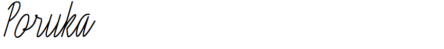
Dušan Jelesijević – Poruka (Tour De Force)
Poruka is an unusually tall cursive handwriting font, with a monoline stroke. What led you to design it?
Sometimes I look at our font catalogue and think about what should be our next release. So, I thought about one simple script that could either be used as the primary font, or paired with some contrasted font. It would be tall and narrow, in a single weight only, and monoline which gives the ability to make some design parts smoother. For example, if I want to make letters for the swash OpenType feature, it gives more space for experimenting with the design of loops.
Is it based on your handwriting, or was it inspired by other fonts?
My handwriting is very ugly, not even close to Poruka. It’s been captured in the Dusan Script family which I designed back in 2009 for Ascender Corp. Poruka was inspired by the same category of script fonts, but I’d say visually less sweet and more constructed than similar fonts. Letters like ‘a’, ‘b’, ‘d’, ‘g’, ‘p’, and ‘q’ have very similar bowls, so it differs from common script font philosophy. At smaller sizes Poruka looks a bit strict, like some technical letters, but it still contains a dose of freely driven lines, enough to make a fine balance and rhythm among letters.
How do you go about designing a font like this? Did you sketch the characters on paper, or was it designed on-screen?
I used to design fonts directly on-screen, but as time goes by I use paper more and more. It's probably because I started making drawings and illustrations on paper, so it led to me drawing letters as well. With Poruka I initially sketched a few letters, and then traced them to see what happened.
Poruka looks ideal for greetings cards and restaurant menus; are those the sorts of applications you had in mind?
Yes, greetings cards, restaurant menus, wedding invitations, slogans, product descriptions, or maybe a book of modern poetry. It includes swashes, two stylistic sets, and discretionary ligatures that are a few predesigned words, such as "yes", packed in cool shapes. I had a lot of fun designing them!
From the hundreds of fonts we add to the Identifont database every month we chose a selection of the most interesting recent additions, and interviewed the designers about their approach to each design:
![]()
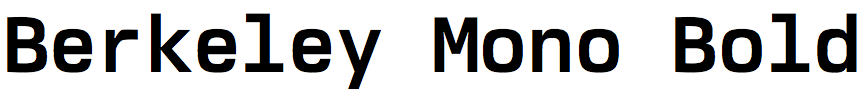
Neil Panchal – Berkeley Mono (Berkeley Graphics)
You describe Berkeley Mono as “engineered for reading and writing code”. What inspired you to create a coding font?
From military stencils to K&E lettering templates, when typefaces are optimized for a particular use case, they undergo a trade-off process and the designer's judgement plays a crucial role. The typographer has to use experience, observation, and good judgement in identifying: (a) key factors important for a given use case, (b) which trade-offs must occur, and (c) the severity of trade-offs. Is this an objective process? Not at all. It is a mix of intuition, careful observation, design-of-experiments, and trial-and-error. In the end, it must converge into a highly performant typeface.
Computer programming is an area where this process is pivotal. The act of writing and reading source code hinges upon the typesetting or formatting. Code must meet the syntax requirements of a programming language. Not only is it difficult to read code that isn't formatted, but it is impossible (it won't compile) to write code that does not meet the expectations of the grammar of a programming language. Simply put, coding typefaces enable the programmer. They facilitate reading and writing code. We, software engineers, spend an inordinate amount of time analyzing code and a good typeface is indispensable. So, I implored myself to work on it, not knowing that I'll end up with a folder full of Excel sheets comparing glyph ratios, a box full of red-inked specimens printed on cheap copy paper, and an acute nagging sense of seeing typefaces everywhere. One thing I won't trade off is the privilege and the pleasure of designing typefaces.
Berkeley Mono has a squarer appearance than other popular coding fonts, such as Source Code and DejaVu Sans Mono, that makes it reminiscent of the line printer fonts of the mainframe computer era. Did you reference any other computer fonts when designing Berkeley Mono?
The squareness was inspired by technical typefaces of the past. Eurostile (and Microgramma) have been a staple of technical applications for many decades. From the Porsche 911 instrument cluster to TOSHIBA user manuals, Eurostile is used in applications where technical sophistication is conveyed through vertical movement and horizontal contrast. Then, there are machine readable typefaces that exemplify extreme trade-offs, sacrificing human legibility for machine readability. OCR‑A and OCR‑B come to mind. These typefaces signal important information on a document that must not be altered or tampered with; they echo the discipline required in computer programming – missing a single semicolon is a compilation error. Berkeley Mono coalesces functional aspects, aesthetic form, and historical context of technical lettering into a high-performance typeface that stands on the shoulders of giants.
In the default version of the font you’ve made the zero indistinguishable from the capital letter ‘O’, although users can choose a zero containing a dot, black slash, or white slash, to distinguish it. Why did you decide on this approach?
There isn't a default font per se; users can choose the stylistic zero as per their needs. That said, there are applications (such as credit cards and phone numbers) where there is no expectation for anything but numbers and a plain zero is desirable for those applications.