New Additions: March 2015
31st March 2015
We add hundreds of fonts to the Identifont database every month. Most of these are recent releases, and some are simply new acquisitions from foundries who were not yet represented on our site. Stephen Coles gives his take on the most interesting additions from February.

Eduardo Manso describes his Ciutadella Rounded as “not only a font with soft corners, it has a real rounded terminal across all the weights.” What he means is that each stroke ending is a half circle rather than soft corners and a flat line. Think VAG Rounded as opposed to Museo Sans Rounded. This treatment tends to emphasize the geometric aspect of the face, while the softness keeps it on the warmer side. The drawback is that an optical illusion makes creates a bump in some of the stroke endings, especially in heavy weights. This effect is corrected in faces like FF DIN Round (a distant relative of Ciutadella) where terminals were painstakingly tapered for a smooth transition. That aside, this family is a well drawn and appealing follow-up to Ciutadella. See also Manso’s Geogrotesque.
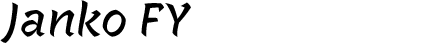
While many brush scripts are soft and flowing, Janko FY is sharp and edgy. It is also not a connected script, which brings it closer to a casual sans serif, though the forms are unmistakably derived from writing. Its energy offers something new in the ever more crowded script genre. I’d like to see what designer Joachim Vu does with additional weights; the flaring terminals and tapered joins are well suited for bold and black styles, though maybe some of the little flags at the end of strokes in the denser letters (E, K, k, x) would have to go. One letdown: the name is awfully close to another French signmaker script from 2012, Jaakko.
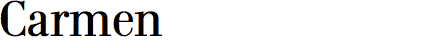
Carmen is a charming crowdpleaser which made our Typographica list in 2008. Andreu Balius subsequently expanded the family including Carmen Fine, a very light display version with hairlines meant only for the largest titling situations. This style also demands larger samples, which unfortunately cannot be found on the foundry site or FontShop where the Display fonts are not available. Let’s all prod Balius to update his online presence!

Dieter Hofrichter is on a tear, releasing several new families every year, most of them very well considered and produced. They could be accused of being a tad dull, but it’s clear that utility is his prime objective; he makes type to be used. Carnas is about as expressive as he gets. This addition to the spurless sans category has soft ends and a square build, not unlike FF Max which preceded it by 12 years. The difference is that Carnas is less idiosyncratic and thus, as Hoftype tends to be, a tad more boring and versatile.

Many excellent free and inexpensive fonts do exist, but sometimes price truly is an indicator of quality. Quincy CF ($10 for 16 fonts), is one such example. The clear influences are warm, book serifs of the late 19th and early 20th centuries, but it is as if the designer had all of them in his head at once and tried to tack on every beloved quirk and detail into a single typeface, from unresolved teardrop terminals (f, s), to twee tails (l, n). The result is a haphazard affair that is nether balanced and spaced for text, nor elegant enough for display. Perhaps Quincy could work when referencing vernacular, hand-rendered serif lettering, but in that case why not go for Los Feliz which is more obviously wacky and has a more interesting provenance. For those who need a more professional, text-worthy design in this genre, take a look at Shift or Domaine.
![]()
Fixen FY is a typeface I can’t quite figure out. It’s a Glyphic design, with strokes that flare into tiny chiseled serifs, inspired by inscriptional lettering much like Alverata, Albertus, or Friz Quadrata. But in some letters it goes a step further and emulates the three-dimensional shading of stone carved letters as well. This is most apparent in the caps, which appear to be part main stroke, part shadow. It’s an odd, surprising effect, and it doesn’t always work (like Avant Garde, Fixen works best when setting the word FIXEN), but I have to hand it to Yannick Fischer and the Fontyou Team for trying something very different.