New Additions: April 2016
6th May 2016
We add hundreds of fonts to the Identifont database every month. Most of these are recent releases, and some are simply new acquisitions from foundries who were not yet represented on our site. Stephen Coles gives his take on the most interesting recent additions.
![]()
In the last five years, South America (and Portugal, in the case of Aria) has yielded a bumper crop of high-contrast display serifs. They all emphasize sweeping curves, swash appendages, and flamboyant terminals in an effort to crank up the fancy factor. Tenez, from Brazilian up-and-comer Rodrigo Saiani, can easily be placed in that group – it has glamour to spare – but it demonstrates a steadier hand and more refined drafting. It is a dazzler with discipline. This allows it to be invited to a wider variety of parties without being a show-off. (It can grace a page without dominating it.) A caution, however: the hairlines are so thin and details so delicate it has to be set fairly large. I’d love to see a lower-contrast addition to the family with slightly looser spacing and tamed lettershapes (e.g. ‘R’ and ‘a’) to extend its potential use cases to the 16–36pt range.
![]()
When you produce a straightforward industrial eight-sided slab like Kairos, it just makes plain business sense to chop off the serifs and offer a sans companion. So I can’t blame Terrance Weinzierl and Monotype for adding Kairos Sans. This brings the complete squad to a daunting 103 styles in total. That’s impressive, but Kairos is not the only octagonal player out there. It’s hard to think of reasons to use it over the proven, rugged athleticism of United or the retrodigital flair of FS Sinclair or Wim Crouwel’s Gridnik. Perhaps it’ll be picked up by devotees of the Hip Traditional look: Kairos has an older, more hand-wrought feel than these other faces, inspired as it was by 19th-century wood type. If the antique “Grecian” style is what you’re seeking, the hulking Acropolis should be the first stop on your itinerary, but the variety of weights and widths of the Kairos family may be your final destination.
![]()
Unlike most dotted fonts which are derived from dot matrix printers, LED stadium displays, or early computer screens, Tanja goes for weightlessness and elegance. It acheives this not only by following the light and graceful path of Commercial Type’s earlier Marian 1554, but by adjusting the size of the dots ever so slightly to reflect the subtle variability of stroke weights in proper type. Tanja comes equipped with small caps, italic, various figure styles and swashes. It is a stunner at every size down to 30pt.
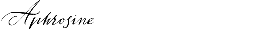
Graphic designers these days often want to add a handwritten look to their work. For many of them, the first thing they do is look for a font to do the job, when what they really need is actual handwriting. That’s why I redirect these folks to lettering artists, not typefaces. Yet there are cases when type is required: dynamic text on a website, for instance, or variable printed material. In these situations, if you really want to emulate pen on paper, there’s no excuse not to use a font that does the job convincingly. Well designed, feature rich scripts simulate the irregular but natural flow of human writing, and avoid repeating lettershapes and mechanically consistent connections. Alexandra Korolkova and Alexander Lubovenko understood this when they designed Aphrosine. The required contextual forms and alternates are all there, and the samples look as authentic as any handwriting emulator I’ve seen. Most notably, the family’s three “weights” are actually completely unique typefaces derived from different pen nibs. I admire ParaType for taking on this sizable effort: Aphrosine’s antique style won’t be nearly as popular as the myriad contemporary scripts, but there aren’t many typographic equals in this vintage vein.
![]()
![]()
It’s rare that a typeface is wholly unique in its category. That can truly be said for Andy Clymer’s Operator. There really is no other monospaced design like it. The classification is filled with typefaces trying to be businesslike or technical or typewriterish, but very few occupy a fixed pitch with a wink and a grin. Yep, Operator’s simple shapes seem to open wide and smile. Its fantastic italic – this one loosely inspired by typewriter scripts – loops and prances. Behind all this fun, it’s a surprisingly serious family with five mono weights and nine proportional. Even small caps! It’s been fun to watch the Hoefler & Co. faithful immediately put this crazy wonderful thing to work in settings ranging from blog captions to code editing.