New Additions: December 2020
31st December 2020
From the hundreds of fonts we add to the Identifont database every month we chose a selection of the most interesting recent additions, and interviewed the designers about their approach to each design:
![]()
![]()

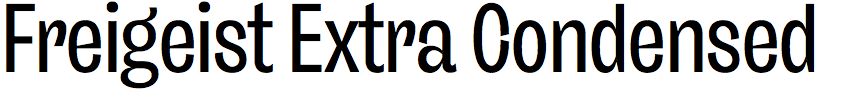
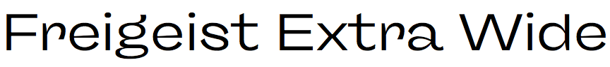
Freigeist – René Bieder (René Bieder)
Freigeist is a comprehensive family of six weights and five widths, in Roman and italic, with a mono and variable fonts, making it almost a superfamily. What inspired you to embark on this major project?
When I started the work, I didn't plan to end up in such a large project. Originally the family consisted of 12 styles (six Roman plus italics) and had a reverse contrast inspired design. The draft had been sitting in the drawer for almost a year at that point, and I was hoping to get back into it to do some finishing touches. This obviously never happened.
You write that Freigeist was inspired by classic Grotesque typefaces. Are there any particular ones that you were influenced by?
Definitely! The family is strongly influenced by various historical models such as Caslon's Doric or Stephenson Blake's Grotesque variants. The long crossbar of the ‘G’ goes back to Venus, of which I own an original type specimen book. Basically, I didn't want to make a copy of these typefaces, but to interpret the overall impression and appearance of these wild grotesques in a modern way.
The character of Freigeist really becomes apparent in the bold and black weights, with features such as the wedge-shaped junctions in the ‘a’ and ‘e’, and the tapered tail of the ‘Q’. Was the design of the heavier weights conceived at an early stage in the design process?
Exactly! I concentrated especially on the heavy weights at the beginning of the process. Here the character could be defined best, because the wedge-shaped junctions unfortunately become more and more unclear with decreasing stroke width. Also the number of masters have varied again and again. In the beginning there were four (thin, regular, bold and black). Then for a long time only two (thin and black), in order to translate the temperamental curves from the black weights to the mid weights in the best possible way. I ended up with three masters for each width, of which the Black masters are the most important.
Since launching Freigeist earlier this year I understand you’ve issued a comprehensive update to the design, Version 2.0, particularly the italic. How has the italic changed, and has anything else significant changed?
Yes, I think this was the most extensive update I have ever released. Originally it was only supposed to be a few adjustments to the Cyrillic characters, because there were problems with the interpolation in the variable fonts. But little by little I discovered more and more details that I wanted to rework. Almost everything changed. I re-evaluated and reworked every character in the Romans. When that was done, the italics didn't match the Romans anymore. So everything had to be redone here as well. Now the italics are much more dynamic and sharper. And some completely new characters have been added too. I am glad to have taken this step.
![]()
![]()
![]()
![]()
Bogart – Francesco Canovaro (Zetafonts)
What originally inspired you to design Bogart? Did you have a particular project or application in mind?
Since the first sketches, the idea for Bogart was to create an homage to the iconic look of the old-style fat faces of the early 19th century, with some influences from art nouveau and vernacular historic typefaces. We thought we would dedicate the name to the Hollywood icon Humprey Bogart, aiming in a way to embody the moody spirit of vintage typography, from film noir aesthetics, to the pop culture reference, from joyous swash titling and logo design to strict, balanced text typesetting.
Seeing Bogart Black I’m immediately reminded of Cooper Black, a font from 1922 that became a hit in the 1960s with famous uses such as The Beach Boys Pet Sounds album cover. Was the design of Bogart influenced by Cooper Black?
Who doesn’t love Cooper Black! Together with Goudy Heavyface – with its iconic boldness and low-contrast – they are two of my inspirational typefaces for this project.
The regular and light weights of Bogart have several distinctive features, such as the slanted right-hand legs of the ‘m’ and ‘n’, the slanted center serifs of the ‘E’ and ‘F’, and the curved right-hand strokes of the ‘w’ and ‘y’. Were there any other typefaces you referenced that inspired these features?
I love adding very classic, art nouveau, vernacular, odd features to our typefaces. Usually, we dedicate a lot of time in research between historical specimens and with the team, we decided also to include influences from Windsor – another idiosyncratic American old-style typeface of the same period – quoting its sloping shapes and quirky solutions like its inclined shapes and bizarre appeal.
You’ve also provided Bogart Alternate, with subtle differences to some of the character shapes, notably the ‘Q’, ‘g’, and ‘y’. Why did you decide to provide an alternate?
As a designer, I suffer when I have to decide between all the designs we developed for a single letter. For Bogart, since it was very characterised by its bizarre and typic solutions of the historical period, we have chosen not to compromise and to create a more moderate alternate version, more oriented to text contents. We can say that the alternate is the domesticated version, to add flexibility for editorial usage.
![]()


![]()
Compiler – Moritz Kleinsorge (Identity Letters)
Did you design Compiler for any particular project, and what applications do you envisage for it?
I started designing Compiler last year, without any particular project in mind. As I was working on launching my new website, it became evident that I might as well use this design as my own corporate typeface. I was using Suisse Int'l and SangBleu Republic by Swiss Typefaces at the time. These are excellent typefaces, but I always felt that, as a type designer, I should use my own typefaces for branding.
My business is mainly digital, and the digital environment is where Compiler feels at home. (That’s why I included some icons for web design in the fonts.) As the serifed letters are very distinct, Compiler is a great choice for corporate design, as well. Here, the original Compiler fonts can be used in display sizes, whereas Compiler Plain can pitch in for longer documents.
You’ve written that Compiler is inspired by console typefaces; what gave you the idea of starting from fixed-width programming typefaces to design a general purpose typeface?
When I started Compiler I was editing some HTML code in a text editor. That’s when it struck me that reading code and reading text are different kinds of reading. Both make use of the Latin alphabet (for languages with Latin-based alphabets, that is). However, reading texts is mainly unidirectional, whereas coding means lots of jumping back and forth in a given document. Fonts for coding support this kind of reading. Having evolved from the technical constraints of early computers with fixed-width text interfaces, they are now intentionally developed as monospace typefaces with certain distinguishing features. Their characters are very distinct to aid finding individual expressions. This makes for an overall impression of great clarity. However, monospace fonts are less than ideal for reading texts; that’s why many copywriters use monospace fonts for composing, but switch to proportional ones for editing. With Compiler, I wanted to bring some of that clarity into a typeface whose main purpose was to set text, not code.
Compiler is almost a monoweight font, apart from the taper on the stems of letters such as ‘a’, ‘b’, ‘d’, and ‘u’, and the spurs on the ‘g’, ‘m’, ’n’, ‘p’, and ‘q’. What inspired these features?
Except for the serifs on the letters ‘f’, ‘i’, ‘j’, ‘l’, and ‘r’, Compiler is a typical sans serif. The tapered stems and spurs helps define the technical character of the typeface. I think they fit in quite well: their strictly angular construction feels mechanical, adding to the ‘retro’ look of the typeface.
You’ve designed two variants of the typeface: Compiler and Compiler Plain: Which came first, and why did you decide to provide the choice?
The original design with the “terminal font” look is what you find in the original Compiler fonts. However, I understand that the conspicuous serifs are not always desirable. Thus, I created some alternates for a toned-down look. Depending on the use case, this can be easier on the eyes.
I designed both variants within one file, but decided to export a second set of fonts withe the toned-down alternates activated as Compiler Plain. As the glyph set is identical, I don’t charge for the Plain fonts when someone buys the complete family. You might as well toggle the respective Stylistic Sets in Compiler to achieve the Compiler Plain look and vice versa, as both variants contain all alternates. In some situations, though, having a separate font file is much more convenient than fiddling about with OpenType features.
One final general question: I see you’ve recently launched your new website Identity Letters, built with the ecommerce platform for independent type foundries Fontdue.com. What has your experience been, and would you recommend this route to other independent font designers, rather than building your own shop site?
First of all, I recommend any type designer sell their work via their own website. Otherwise, the rate of your distributors really cuts into your margin, ranging from 30% at the lower end to a whopping 70% (typically, you share fifty-fifty). In theory, your income can be doubled when you have your own shop.
The upfront cost is chilling, no doubt! But in the long run, you can only win. Fortunately, new options for type-focused online stores have been introduced in recent time. Besides Fontdue, there are now Lettershop, Elefont, and FoundryCore.
After consulting different providers about this kind of online store, I settled for Fontdue by Tom Conroy. I designed my website and left it to Tom to realise the web development and implementation of the Fontdue modules. Tom and his team are always developing new tools; once finished, those will be available to all Fontdue users. That’s a great benefit for sure. Next year, there’ll be lots of improvements that’ll make Fontdue – and thus, my online shop – even better and more versatile. Last but not least, Tom is super nice to work with as a business partner.
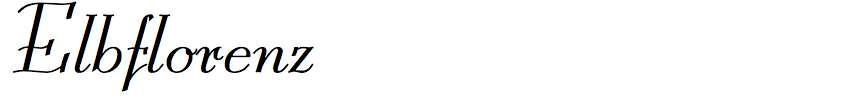
Elbflorenz – Ralph M. Unger (RMU)
Elbflorenz is a digital revival of Miami, designed by Albert Auspurg for Schriftguss AG Type Foundry in 1934. Is this the first time it has been available as a digital font?
Yes, I guess that it is the first time this font has been digitized. I had never seen it before in any kind of printing.
How did you discover this typeface, and were you able to go back to original drawings, or did you work from printed character-set samples?
Personally I didn’t discover this typeface. It was in a small brochure of font samples that Stephen and Timothy Quay, the stop-motion animators and set designers, dug out of their treasure trove of books rather by chance one day and sent to me.
The closest other typeface I can find to compare it with is Bernhard Script Light, designed by Lucian Bernhard in 1925. Do you know whether Auspurg was influenced by this design?
As in each period of time, there is a certain trend in design. Now, after so many decades, it is hard to tell if Auspurg was influenced by the works of Bernhard. Who knows?
Presumably a modern digital font is expected to contain many glyphs that you wouldn’t be able to find on a historical character-set sample, such as international characters, and of course the Euro symbol! What guides you in designing versions of these that will be consistent with the original typeface?
Before starting to redesign a typeface, I take a long look at the characters available and try to get acquainted with the font. I do this because in most cases some glyphs are lacking in those font samples, and secondly, as you mentioned, I have to design additional glyphs like currency symbols or diacritics.
Thanks to you we now have digital versions of many historical typefaces that would otherwise have remained undiscovered. How do you decide which typefaces to revive?
First of all, it must catch my eye. The font should have a pleasant overall appearance which, I admit it, is rather a question of my personal taste. Then, what is important too, is its usability nowadays. It wouldn’t make any sense to revive a font which no one can use in one way or another.