New Additions: June 2022
30th June 2022
From the hundreds of fonts we add to the Identifont database every month we chose a selection of the most interesting recent additions, and interviewed the designers about their approach to each design:

![]()
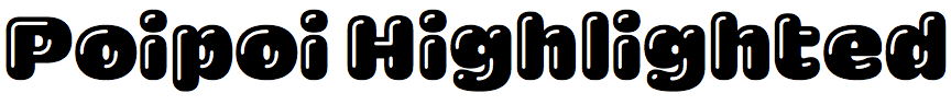
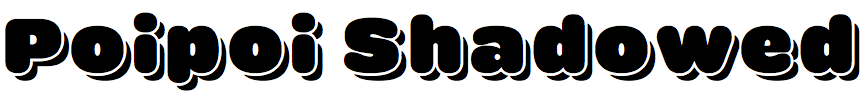
Ryoichi Tsunekawa – Poipoi (Dharma Type)
Poipoi is a friendly bold rounded font to which you can add shadows and highlights. What inspired you to design it?
I'm interested in Japanese pop culture, particularly Manga comics, and many of my fonts are inspired by the heavy titling lettering they use. Rounded heavy fonts are not special in Japan – they are orthodox and civilized. Some examples are: Doraemon, Ranma ½, Dr. Slump, and Puella Magi Madoka Magica.
Poipoi follows in the tradition of my earlier fonts Dr Slab, Mighty Slab, and Piepie. The concept of these fonts is heavy, charming, and easy-to-use. The reason why they are heavy is because heavy fonts get attention: they're more eye-catching.
Poipoi is similar to the classic Letraset font Frankfurter, although Poipoi is wider, and also less geometric. Was that or any other font an influence on its design?
I know Frankfurter has a similar rounded, heavy, and highlighted effect, but the root is totally different. In Asian countries, especially in Japan, rounded heavy lettering is often used in many situations. In addition, Frankfurter is not sophisticated enough for me. I thought I could make a better rounded, heavy font…
Poipoi Highlighted makes text that looks almost good enough to eat. Did you have applications like food advertising and packaging in mind?
Yes, it's ideal for packaging, titling, and logos. But in Asian countries, especially in Japan, rounded heavy lettering is often used in many other situations: public signs, advertising, book covers, and so on.
![]()
![]()
![]()
![]()
![]()
Andreu Balius – Brossa (Typerepublic)
You've written that Brossa evolved from a commission for Fundació Joan Brossa in Barcelona. How did you approach the project?
Fundació Joan Brossa is a multidisciplinary creative space to preserve the legacy and memory of the poet and artist Joan Brossa (Barcelona 1919-1998), and to become a centre where contempory art is practiced and exhibited. The commission was for a typeface to be used for communication purposes (both paper and screen), for signage at the Fundació Joan Brossa, for publications, and so on.
Designing a neo-grotesque type is not easy, taking onto account the large number of revivals and recreations of types similar to Helvetica. There wasn't any point in doing yet another recreation. So instead I analyzed the sans-serif typefaces used by Joan Brossa as images and illustrations in some of his printed poems, or simply as typefaces for his text compositions. He liked the simplicity of sans serif. I avoided looking for (or getting inspiration from) contemporary typographical references, since I wanted to get away from them.
The work was closer to a simple exercise of style, more formal than conceptual, since it is based on the typographic models used in Brossa's work, and these letter shapes are well recognizable.
Can you give some examples of particular classical typefaces that Joan Brossa used in his visual poetry works?
He used the typefaces that were available at printing shops in Barcelona. They range from the super-thin Helvetica, to more interesting models such as Venus, Folio, or Akzidenz Grotesk, without forgetting Futura that we can also find in some of Joan Brossa's visual poems. There were also some sans-serif woodtype shapes I could not identify.
From Futura I took the regularity of the line and the geometric shapes, from Folio and Akzidenz Grotesk I took the roughness and strength, from Venus its elegance, and from Helvetica the vulgarity and coarseness.
Brossa has two idiosyncratic features that make it recognisable among other similar sans-serif typefaces: the rather striking bar of the ‘Q’, and the almost vertical leg of the ‘R’. What inspired these characteristics?
I looked for simplicity. And having a recognizable ‘Q’.
For the letter ‘R’ I designed two versions: the default one with a little curve in the tail (a bit more playful), and a straighter one as an alternate.
Brossa includes two variable fonts; were these the starting point for building the family of 108 styles?
My commission was just to design the most basic styles of width and weight. Nevertheless, I found it interesting to complete the family with some more styles. The styles of the family have been extended to the maximum – like chewing gum – to facilitate different possibilities of use. In addition, I then created variable fonts as an additional step after designing all different styles.
![]()
![]()
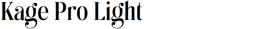
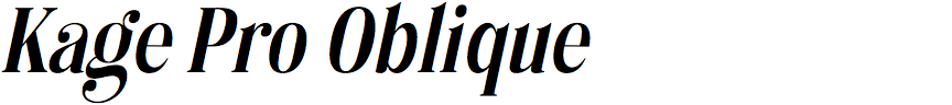
Bill Natih – Kage Pro (Balibilly Design)
Kage Pro is an expanded version of your earlier sensuous typeface Kage. What inspired you to design them?
Kage was my debut in making an elegant font family with consistent characters. At the same time, I was also familiarising myself with the Glyphs software, which I had chosen as the software to use for designing fonts. It was confusing for me to switch between exploring the features of the software, and focusing on creating letterforms from scratch, so I decided to make an experimental typeface with minimal OpenType features, avoiding areas of the software that I was not yet familiar with. The result was the first version of Kage.
In the two years since I released Kage my experience of designing fonts and using the software has increased. I felt ready to add advanced OpenType features and a new oblique sub-family. I have also reshaped many of the characters for better consistency.
Kage Pro has a greatly extended character set compared to Kage. Apart from the old-style figures, what are the other main additions?
For numbering, old-style figures is just one of the additions. There are also superscripts, subscripts, numerators, and denominators.
Every character comes with stylistic alternates, including swash variants, and there are standard and discretionary ligatures.
The characters of Kage Pro have a very calligraphic appearance. Do you sketch the lettering on paper with a pen before committing it to curves in a font design program?
At first I sketched a few characters, but Glyphs gave me the convenience of playing with the pen tool directly in the software. For me, it is easier to make calligraphic shapes without having to sketch them manually.
An unusual feature of Kage Pro is the shape of the lower vertices of characters such as ‘U’, ‘V’, ‘W’, ‘v’, ‘w’, and ‘y’. Where did the inspiration for these come from?
Broadly, these characters and several other characters with a similar stroke shape are inspired by the European fashion world and Neo-type styles that were created during the Enlightenment in the 18th century. I was also inspired by the Japanese fashion designer Rei Kawakubo because of her radical and deconstructive styles, which make the fashion world more flexible and dynamic. Fashion and this typeface mirror each other.
![]()
![]()
![]()
Lisa Fischbach – Edie & Eddy (TypeMates)
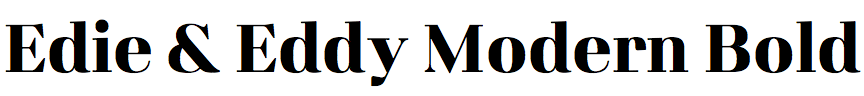
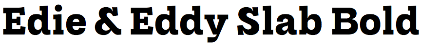
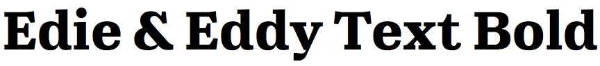
Edie & Eddy is a family of three compatible typefaces: Edie & Eddy Modern, Edie & Eddy Slab, and Edie & Eddy Text. Did you plan the family with three separate typefaces from the beginning, or did it evolve that way?
It evolved that way. I wanted to create a modern typeface, as I had the idea of breaking the classical treatment of the ball terminals through something with quite an edge. I also always appreciated the high contrast of Didone typefaces like Walbaum, Didot, or Bodoni. The edge then got a bit softened and that raised the question of how to add something new and fresh to a release. This led me to the concept of a contrast shift from modern to slab.
In the beginning the idea was to have two families that work with each other and are equally treated; neither one was supposed to be the sidekick of the other. In reality, it took me quite some time to get the Slab to the equal counterpart it is now; it looked more like a no-contrast version of a modern.
Edie & Eddy Slab is similar to an Egyptian slab-serif like Egyptian Slate, but with a hint of reverse-contrast about the strokes making it look less geometric and more organic. Was this a conscious design aim?
As the aim was to have Modern and Slab both individually strong, but at the same time belonging together, the high-contrast cuts in the Slab were the features that were inspired by the high contrast of the Modern. The slightly bulky, inconsistent contrast was not planned, but evolved into the reason I liked the Slab. By not growing the Slab mathematically from the Modern, but rather having a look at them separately, I was able to turn it into something that has a place on its own.
They do have different x-heights to look good in mixed texts, to have the Slab not appear too small beside the Modern. But even though the slab is always a bit wider in its letter forms, some letters needed to become much wider or narrower to suit the rest of the letters of the slab and thus lose the purely derivative treatment with the Modern. I think that’s why they accompany each other quite well. Modern is more logical and what you might expect from a classical modern typeface, and the Slab breaks that quite often.
Edie & Eddy Modern is a Didone-style typeface; perhaps closer to Didot than Bodoni. Were you inspired by any particular classic typefaces?
I did look at Didot more for some general proportions and ideas in the beginning, but then was quickly led by my own sense of proportions and likes that I would like to see in high contrast typeface. But I guess one can never really shake off the classical materials we are all familiar with.
Is Edie & Eddy Text a higher-contrast version of Edie & Eddy Slab, or a lower-contrast version of Edie & Eddy Modern?
It is right in the middle of both of them. The Text family came into existence when I tested some interpolations to see how it would work out with the serifs in the ‘s’. And I was surprised how well they worked together. Thus, I decided then that there must be a Text version as well, to connect the family further. While working on it, I noticed that the irregular contrast treatment in the Slab Black, to make the Slab work, made the darker styles of the Text a bit too spotty. Then I added a Text Black Master, to correct that. But other than that, it’s a true intermediate style out of a variable font family.
Finally, I’m curious: who are Edie and Eddy?
One day I stumbled across a post about Edith Windsor, known as Edie, a woman who fought for LGBT marriage rights in the US. I loved the name and was impressed by the person. Inga Plönnings once wrote on Instagram about her font family Zetkin: “I can’t name streets, buildings, initiatives or awards after great women, but I can name typefaces after them”. I loved that idea, and then wanted to combine Edie with an Eddy. While searching I came upon Fannyann Eddy. She founded the first Sierra Leone Lesbian and Gay Association.
I don’t know if they knew of each other, or interacted with each other. I just like that the inspiration comes from very impressive people who fought for their circumstances to change, and hope that Edie & Eddy will give voice to some interesting conversations, no matter the topic.