New Additions: March 2023
30th March 2023
From the hundreds of fonts we add to the Identifont database every month we chose a selection of the most interesting recent additions, and interviewed the designers about their approach to each design:

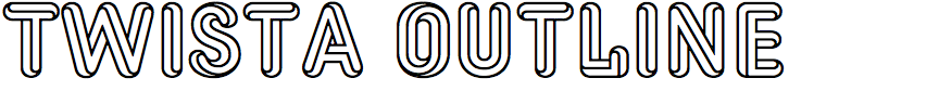

Viktor Nübel – Twista (Viktor Nübel)
Twista is a 3D wireframe typeface in which every character is like an impossible object optical illusion. What gave you the idea of designing it?
Although the first idea of inspiration might be the graphics of M.C. Escher, the original starting point for the design of Twista was totally outside of this world. Some years ago I found a typeface called Pluto and Pluto schattiert (Pluto Shaded) in a specimen book with alphabets for phototypesetting. This typeface caught my attention because it came with some gradient shading which I had not seen before. During a longer design process and further playing with the shapes and sketching, the typeface came to the stage of impossible constructions and crazy perspectives.
Twista was then influenced by other typefaces with an similar approach, like Macula by Jacques Le Bailly and Priori Acute by Jonathan Barnbrock. And I just recently (after the project was already finished) learned about the typeface Zelek by Polish designer Bronisław Zelek, which is also very similar to my design. I've written an article about the design process and also the genre of Escheresque letters for those who are interested to read more: Twista — Escheresque Letters.
It looks like it must have been a headache to design. Did you draw it by hand on the computer, or did you write programs to help with some of the work?
Yes… no, I very often thought about a script solution, at least as a starting point, and I also did some research about it, but very soon realised that this was beyond my capabilities. I used scripts for the production process, checking the width of the letters across different layers or deleting outlines to create the background layer. But the drawings were all made by hand in many, many, many meditative hours…
By default the characters appear to twist in alternate directions, but the lower-case character positions have each character in an alternative orientation. Did you plan that idea from the beginning?
All the characters come in two versions. While designing and playing with the false perspective I realised that for some letters there are more than two ways to create these twisted shapes. Twista is an upper-case typeface, and it was clear that the lower-case letter positions will also have upper-case letters. I decided to create at least one alternate version for every letter, and then went on with this concept for all the characters.
Did you have applications in mind when you designed Twista?
No; it is a display typeface, most suitable for short words, logotypes, or headlines. But be careful of what you set in Twista, it might be read with a little twist!
![]()
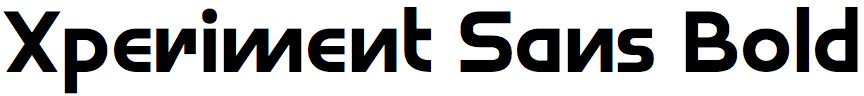
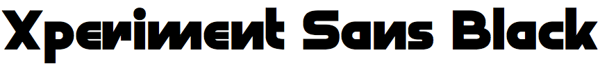
Dušan Jelesijević – Xperiment Sans (Tour De Force)
As its name suggests, Xperiment Sans is an experimental sans-serif typeface. What inspired you to design it?
I wanted to have a typeface in our catalogue that goes beyond certain boundries, as we usually don't design this kind of typeface – where we push the design of the characters beyond standard or common shapes. I had worked in the past on a couple of similar concepts, but never completed any of them, but with Xperiment Sans I felt it could look interesting with all its distinctive features.
Did you design Xperiment Sans directly on the computer, or did you start by sketching characters on paper?
For the last couple of years I have been starting each typeface with sketches on paper. Before that I used to work directly in FontLab, drawing everything in digital form, but I found it works better and much quicker for me when I draw something on paper first. Paper gives me possibility to quickly explore all the ideas, while the digital method would take me a bit more time for the way I work.
Xperiment Sans is reminiscent of ITC Bauhaus Light in its experimental approach. Was that an influence on you?
Now you mention it I guess there are certain similarities between them. I didn't have ITC Bauhaus Light in mind while I was working, but now I can say Xperiment Sans could be a kind of new version of Bauhaus. The influence was in my notebook when I was looking through some old doodles of lettering.
Even for an experimental typeface some of the characters are decidedly eccentric, such as the ‘J’, ‘Y’, ‘g’, ’n’, and ‘r’. So perhaps the typeface will be most appropriate for applications such as avant-garde magazines and art installations. Is that what you had in mind?
The idea with Xperiment Sans was to be a typeface for modern projects and people who would like to try something different from their competition. To have a certain dose of guts to be different and unique. Like uncommon IT companies, brands that work with specific modern products like hi-fi, appliance, and consumer electronics manufacturers, album covers for electro genres of music, and all contemporary usages where Xperiment Sans would be great creative support.
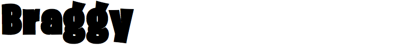
Emmeran Richard – Braggy (Troisième Type)
Braggy is an ultra black typeface with a bouncy, hand drawn appearance. What led you to design it?
I was creating a corporate logo for a client with super thin-shaped letters and thought it would be interesting to go the complete opposite way, with extremely bold letters. The design didn’t go as far as what Braggy looks right now, but the idea grew on me.
I really enjoyed the concept of big, warm, kind of convivial letters opposed to slim and cold industrial type design.
The closest thing I can find to compare it with on Identifont is Burbank Big Condensed Black by Tal Leming. Was that an inspiration?
In the process of making Braggy, I was searching for fonts with a human/hand-drawn feeling. Burbank was definitely an inspiration, alongside Fatta by Los Andes Type for its genuine and welcoming look. The design concept of Braggy was also nourished by fat-cap graffiti writing and sign-painted storefronts, which had a big impact on how I see and approach type and graphic design. I basically tried to infuse that artisanal, crafty and intuitive “hand movement” energy to the letter design.
Collecting photographs of sign-painted facade for more than a decade incredibly eased the research work!
Braggy is about as black as you can get while still being legible. The strokes of letters such as ‘S’, ‘U’, and ‘a’ actually touch, and the counters in the ‘A’, ‘B’, and ‘e’ almost disappear. Was it difficult designing the characters to keep them legible?
The concept behind Braggy was to push the design on the verge of legibility. That’s why, next to the ones you already listed, some of the letters are going even further, like the uppercase ‘N’, ‘Y’ and lowercase ‘s’.
From the beginning I knew I had to make the narrowest strokes and counterforms I possibly could. Then I found a font called Stanix by ActiveSphere and the construct of Braggy instantly took form in my mind. I had to make the minimum of compromises. It had to be the boldest, the braggiest. That’s where the name of Braggy became obvious.
Go big or go home, right? Haha.
Your foundry’s policy is to sell early releases of your fonts, with free updates to later releases. Do you have any further enhancements in mind for Braggy?
Very good question. Yes, I do!
Much like Future Fonts, I work on version-based typefaces and make them affordable on early releases, so that graphic design students as well as communication agencies can use them. As well, the idea of having feedback on my fonts is truly rewarding and I find most people from the type community to be benevolent and caring.
For the final version of Braggy, I’m working with a local sign painter, Vincent Delion. He is painting every glyph of the font in order to create a second style, which will have a brushed texture. He already painted a couple of letters and the result is wonderful. I’m really looking forward to it!
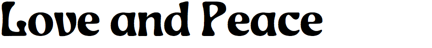
Emil Bertell - Love and Peace (Fenotype)
Love and Peace has a hippie look about it, as its name suggests. What it designed for a particular project?
It is indeed a 100% hippie energy font. It wasn't designed for any particular project.
It looks as if it could be a classic typeface from the Sixties. Is it a revival, or is your original design?
It's original. I’ve been playing around with Jugendstil/Art Nouveau shapes recently and I decided to make a full typeface from them, whereas previously I’ve only added some influence to certain letters.
The closest font I can find to compare it with on Identifont is Eckmann, by Otto Eckmann. Was that an influence?
Haha well yes, its designated theme is a “Sixties style revival of Jugendstil”. The comparison is correct, I’ve used Otto Eckmann’s Eckmann-Schrift from 1900 as a starting point, but stripping the stern archaic features and rubbing it down to softer and friendlier. Also I see a lot of earlier blackletter influence in the original Eckmann Schrift which I didn’t want to include.
I really like the specimen posters you've created for Love and Peace (see Love and Peace Font on Behance). Where did the ideas for those come from?
Thanks - I spent several days creating the illustrations for those. While the main theme is pretty much based on the Yellow Submarine animation film, the one with title Fantastic Voyage is an homage to Milton Glaser with the woman from his California-themed cover for Time magazine as Raquel Welch.