New Additions: April 2022
30th April 2022
From the hundreds of fonts we add to the Identifont database every month we chose a selection of the most interesting recent additions, and interviewed the designers about their approach to each design:
![]()
![]()
![]()
![]()
Andrea Leksen – Mr Gabe (Leksen Design)
What led you to design Mr Gabe? Was is developed for a particular project?
When I met Roger Black at ATypI Amsterdam in 2013, he offered me a mentorship with David Jonathan Ross at Font Bureau, working on a project of my choice. I chose several of my favorite typeface characteristics – low x-height, ball terminals, high contrast and ligatures. The ball terminals are not the typical circular shape, but more like a teardrop, which makes them unique. And my love of ligatures turned into an extensive ligature study to see how many legible pairings I could create. I ended up with two sets of ligatures – more normal ones with contrast, and a set with thin hairline connections. I like the ones with contrast better, but my design group, Design Dish, liked the hairline connections better because they felt it was more legible, so I kept the second set in.
The closest font I can find to compare it with is Rudolph Ruzicka’s Fairfield. Were you influenced by that, or perhaps any other classic fonts?
I'm not familiar with Fairfield, so that wasn't an influence. I really just started with some of my favorite characteristics and went from there. I do admire the creativity Zuzana Licko had with the Mrs Eaves ligatures, so it was a little ironic that I had already named this font Mr Gabe, which is named after my son.
The shape of the ‘Q’ tail is quite distinctive, the way it’s terminated with a ball. How did that come about?
I think the ‘Q’ is one of the letters where you can have a little extra fun, so I did! I do remember having a difficult time choosing between several ‘Q’s I designed. My background is in graphic design, so I throw in creativity where I can, while keeping consistency within the type system.
Mr Gabe looks suitable for use both as a text face and, in the larger weights, as a display face. Did you have any applications in mind when you were designing it?
Mr Gabe is definitely a display face. While the design could lend itself to a text face with some alterations, the hairline strokes are a bit too thin for legibility at smaller sizes, along with the low x-height. If Mr Gabe sells well enough, I would love to create a Mr Gabe text face in the future.
My previous font release, Nordique, has continued to be popular, and I'm guessing it is because of the distinctive Scandinavian ornaments over several alternate characters. Sans serifs tend to sell better than serifs, so I figured I would need to pack Mr Gabe full of goodies so designers would have a palette of things to work with – ligatures, ornaments, borders, small caps and proportional figures. The cherry on top is the tango video to promote the font! Tango is one of my loves, and it felt like it paired perfectly with this typeface – sophisticated, complex, and full of drama.
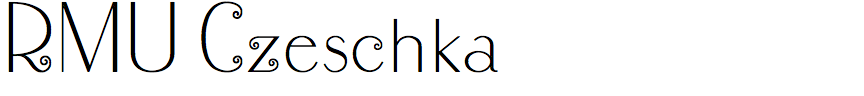
Ralph M. Unger – RMU Czeschka (RMU)
RMU Czeschka is a revival of a beautiful sans-serif script with an art deco appearance. How did you discover this typeface?
It was in the Genzsch & Heyse catalogue that Stephen and Timothy Quay, the stop-motion animators and set designers, dug out of their treasure trove of books and sent to me one day. Prior to that I hadn’t heard anything about Carl Otto Czeschka or seen a sample of this font. And since I digged afterwards into his biography, it seems that it was one of the only two fonts he created. I personally think that it’s a very beautiful and charming font.
What original materials did you work from to digitise this typeface?
Mainly from this scanned Genzsch & Heyse catalogue. It seems surprising that no more original material is available.
The original version of Czeschka Antiqua had an archaic long ‘s’ (see Fonts in Use). Did you decide that the typeface would be more usable for today’s applications with a modern ‘s’ shape, and did you have to make any other changes?
My version of this font comes with the round ‘s’ as well as with the long ‘s’ and its ligatures. Implemented into this font are two elements with which you can build a frame, and there are four flower elements in it. Finally I gave the swirls a consistent diameter to increase the font’s optical stability.
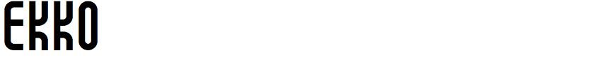
Jérémy Ruiz – Ekko (L'île Foundry)
What was the inspiration for Ekko? Was it designed for a particular project?
The real project for which Ekko was designed is Ekko itself. Through it, I formed a graphic playground in which I was able to carry out different experiments. Playing is taking pleasure and pleasure is liberating because it brings lightness, desire, and curiosity; it keeps mind and eyes wide open, and makes you want to see elsewhere, and differently. The typeface was thus created as experiments and discoveries were made, gradually, and empirically.
The starting point was to design a vertically monospaced typeface where each letter, lowercase or uppercase, with or without accent, has the same uniform height. This allows a very low line spacing, which is often impossible to do when the text contains letters with an accent. From poetic texts, I was able to experiment with different line spacing, even reducing it until the lines were touching, were placed on top of each other. By observing the result, I noticed that links had been created between the different lines: vertical links, which echoed the rhymes of the poems, by forming real visual rhymes. From there came the idea of creating authentic vertical ligatures.
Ekko was conceived and designed as a toolbox that everyone could use, play, experiment, discover, in order to design new and different graphic compositions.
Were the characters constructed according to a set of rules, or were they each designed individually?
The characters were constructed according to a set of rules, first because Ekko is both a horizontally and vertically monospaced typeface. The idea was to draw letters as simple, clean, and homogeneous as possible: with horizontal and vertical lines, with curves, without any diagonal. In that spirit, the same design can represent several different letters, depending on the horizontal or vertical flip: for example, a = e = g, t = f, s = z, b = d = p = q, etc.
I then drew different widths for each letter as alternate glyphs, in order to facilitate and multiply the potential horizontal alignments between the different lines, necessary for designing the vertical ligatures.
I’m finding it hard to come up with any other fonts on Identifont to compare with Ekko. The closest I can find is Linotype Seebad. Were you influenced by this or any other fonts?
Not by this one. I was interested in fonts containing horizontal ligatures, such as Le Plus Léger by Alex Chavot, in order to reinterpret horizontal ligatures into vertical ligatures. Even if there is no direct link with Ekko, I also really appreciate the work of Benoît Bodhuin, his taste for experimentation and his ability to surprise.
I understand that Ekko contains a number of alternative glyphs, including horizontal and vertical ligatures. Can you explain how you use the vertical ligatures?
Horizontal ligatures work in the classic way: a single glyph corresponds to a ligature.
On the other hand, to create a vertical ligature, you have to combine two alternate glyphs between them: the first on the line above, the second on the line below. It is even possible to create vertical ligatures on 3 or more lines, by combining horizontally aligned alternate glyphs.
Ekko contains more than 1300 alternate glyphs. So there are many ways to design vertical ligatures, and there are also many ways to associate these vertical ligatures with each other. Creators of playful deformations and visual breaks, these vertical ligatures can bring rhythm, dynamism and musicality to each composition. You can see them in pictures on our site at https://www.studiolile.com/ekko.
![]()
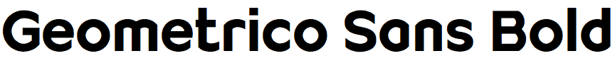
Filippo Salmina – Geometrico Sans (FS Design)
Geometrico Sans has an unusual combination of straight lines and circular arcs. What led you to design it?
The intention was to create a constructive typeface based on the circular shapes. The typeface Futura by Paul Renner served as a reference. Many so-called geometric fonts are designated this way just because they contain certain geometric elements (mainly circles). However, their shapes are more organic when you take a closer look. A compromise, somehow. This is not the case with Geometrico Sans. Here you can literally speak of a geometric-constructed typeface. Compared to the original from the Bauhaus, due to the relatively small capitals and the reduction in form, it has been possible to incorporate even more circular elements into the alphabet. And this even in the capital letters. On the other side the design of the minuscule ‘a’, for example, is unique in its reduction, as far as I know. Even in the relatively angular letters ‘v’, ‘w’, ‘y’, and ‘u’ it has been possible to integrate a round element (an arc).
The typeface is almost modular in construction, with many letters constructed from the same building blocks. Was that a conscious design decision?
Indeed, the typeface was built modularly. This was done intentionally. Optical corrections were applied with restraint so as not to impair the geometric perfection of the circular forms. Similar details were solved in the same way as far as possible. The stroke widths or the ink traps have been adjusted where absolutely necessary (mainly in the bold weights),
Geometrico Sans looks ideal for giving corporate logos and product identities a high-tech feel; are those the sorts of applications you had in mind for it?
In fact, a logo was the starting point for the project. The logo design seemed to offer the potential for wider usage. I therefore decided to develop a font family from it and add the missing characters. This might be the reason why Geometrico Sans is quite suitable for logo design. The characters are very iconic, and this improves the distinctiveness and recognition of a logo design (even a purely typographic one). They are based on geometric shapes, appear constructed, and offer a rather technical appearance. Geometrico Sans is probably suitable for the field of technology, however, it has also been also used for example in architecture. The large selection of weights allows a creation that range from filigree to very black. Furthermore, the typeface seems to offer more potential. Clients have used it as a headline font, for quotes or short paragraphs, or even for typographic staging.
After releasing Geometrico Sans I also developed a version of the font family with slab serifs, Geometrico Slab. A free trial of both font families can be found at www.geometrico.ch.