New Additions: February 2021
2nd March 2021
From the hundreds of fonts we add to the Identifont database every month we chose a selection of the most interesting recent additions, and interviewed the designers about their approach to each design:
![]()
![]()
![]()
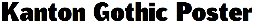
Kanton Gothic – Fabian Dornhecker (La Bolde Vita)
Your latest typeface Kanton Gothic follows in the footsteps of many venerable gothics, including Chauncey H. Griffith’s Bell Gothic (revived by Font Bureau as Griffith Gothic), and Morris Fuller Benton’s Franklin Gothic. What inspired you to design your own take on these classics?
In recent years I have several times experimented with using somewhat warmer and more lively type designs, in the direction of Bell or Franklin Gothic, instead of neutral neogrotesque fonts. Personally, I just like the playful style and think it can still be used for contemporary projects and combined with more recent designs.
But there are nowhere near as many new interpretations as in other genres, which surprised me as a graphic designer and ultimately also limited me. So I started sketching right away and tried to create my own style within the genre.
In reinterpreting these gothics you’ve made a few interesting changes, such as the straight tails on the ‘Q’ and ‘y’, and greater stress in many characters, particularly noticeable in the ‘R’, ‘M’, ‘8’ and ‘9’. What were you aiming for in making these changes?
The first letter I sketched was the ‘r’ in a very bold cut, without curves and with an almost geometric appearance. That was a bit too blatant and too far from the original, but it went in the right direction: more digital, sharper, and a bit more grown-up without becoming neutral. The formal language can still clearly be seen in the ‘r’ in the lighter cuts as a high-contrast, sharp terminal, and in the bold cut with a 90° angle between stem and terminal. The curves were added later to make the overall feel less aggressive.
This specific terminal was then derived for other letters and is most visible in characters such as ‘Q’, ‘R’, and ‘K’, retaining its strong contrast.
In Kanton Gothic Poster you’ve extended the range of weights beyond anything that the original gothics provided. Were you inspired by any other heavy-weight typefaces in designing this?
The poster weight is actually not far from the weight of ITC Franklin Gothic Heavy, but that was not a reason for choosing this design space. The initial analogue sketches were based on a very bold style, which made it easier to define the characteristics on the possible extrema of the final typeface. Eventually a classic distribution of weights and styles were chosen to allow for a broader range of usage. To maintain some flavour of the original sketches I decided to do the additional Poster cut. But I didn't really have an inspiration for it, rather than pushing the characteristics to its extremes.
Did you have any particular application areas in mind when you designed Kanton Gothic?
As you can see from the weights and styles, Kanton Gothic is a classic font family – especially in contrast to our other releases, which with their eccentric shapes are primarily suitable for display use. I wanted to create a more diverse family here that could be used for all sorts of branding or editorial projects; still with a lot of character, but a bit more restrained. A point that was not planned in this way, but turned out during the process: the font is also very well suited for digital use and can still be read perfectly at small sizes.
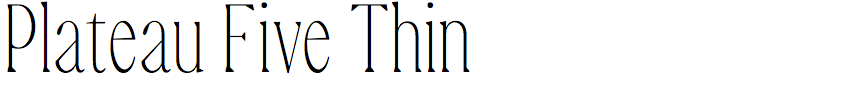
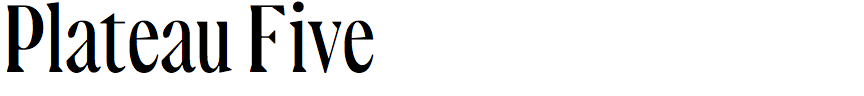

Plateau Five – René Rieger (Road to Venice Type)
Was Plateau Five developed for a particular project, and what inspired you to design it?
The typeface indirectly incorporates ideas and problems encountered in my communication design work. The main concept matches the increasing facilitation of generative rules in design. As far as possible, a rigid structure was applied to the letters while preserving a serif text face. The rule itself, even distribution, in this case of optical widths among the letters, goes back to the social ideas of the 1920s and 1930s.
Were there any particular typefaces that you studied or influences you had in its design?
Rather than single typefaces, it was influenced by two particular time periods. While drawing the first sketches I looked a lot at specimens from the futurist era and noticed how pragmatic classical forms were treated by type designers back then. This served as the component of the grid structure. It is contrasted by features from the transitional period.
Plateau Five has quite a few quirky features, such as the flattened bowl on the ‘a’, the asymmetrical upper serifs on the ‘M’ and ‘W’, and the asymmetrical lower serifs on the ‘A’ and ‘X’, and these give it a distinctive personality. Was it a conscious decision to include these?
The quirkiness of the ‘a’ is probably a result of the pronounced human hand that was introduced to break the rigidity mentioned earlier. At the outset the ‘n’ resembled one from textura type, but that dominated the overall appearance too much. The asymmetry of the serifs, which some see as an influence of textura on roman type, and some as solving problems of spacing in typesetting during the Renaissance, juxtaposes the underlying rigidity as well.
Finally, why the name Plateau Five?
In essence the name is referring to how in most cases typefaces carry a multiplicity of points in time in them, features from several periods, reinterpreted from another perspective, and together they are forming something new.
![]()
![]()
![]()
![]()
Every – Anita Jürgeleit (Anita Jürgeleit)
Some of your earlier typefaces, such as Mireille and Famosa, are elegant display typefaces, definitely not for text use, but with Every I feel like it could work equally well as a display or text face. Did you provide the optical sizes, Micro and Text, with that in mind?
Every was primarily designed to be a text face. However, there is no reason why a text face cannot offer a certain elegance that is appropriate for the display size. For this reason, it has been given a Headline size in addition to Micro and Text.
It’s a sign of the originality of Every that I’m finding it hard to find any similar fonts to compare it with on Identifont. Were there any particular typefaces that influenced you in its design?
Thank you for this compliment. When I was designing Every, I had seen some of those fancy super spiky serif fonts and wanted to capture a bit of that flair. I can’t remember which one it was - it could have been Bizzarrini, Swear, Messer, or any other typeface with those hot, pointed serifs.
Where did the design of Every begin?
I felt like it was the right time to design a real text face. The design process was all about these points: Spiky elegance, legible text face, uniting contradicting design.
I was forced by the pandemic to act. Being unable to work for an uncertain while, I released the four roman styles of Marilka in spring 2020. Its design basically provided all I wanted to achieve: a highly readable elegance with partly quirky shapes. But it failed its designation as a text face by a short character set and missing italics.
Believing in the design and concept I picked up the design after a few months, eliminated and reworked a few design issues, and added all the characters and features that a text face actually needs to fulfill its intended purpose. I designed the italics four times until I got the style that fits its roman counterparts. I merged it into three optical sizes and printed the hell out of my laserjet to optimize them. The micro size in particular was challenging to develop.
This is how Every was reborn in 2021 with its final design.


Gikit – Benoît Bodhuin (BB-Bureau)
Your fonts are almost unique in not following any typographical conventions. What inspires you when you design a new font?
My main source of inspiration comes from my own work: either ideas that reached fruition, or ones rejected during their previous conception. Also, from my work as graphic designer, looking for expressive solutions. Which does not prevent me from looking at what is happening around me, on social networks for example, but rather graphic design. Another source of inspiration is how graphic designers use my typefaces.
With Gikit were the characters constructed on a grid, or did you design each character as a freehand drawing?
It is a grid which supports the type, quite fine vertically allowing me to vary the thickness to affirm a shape or to vary the width of the letter. Horizontally the grid is more restrictive, which explains the crushed design of the accented letters. The grid is part of the glyphs :)
Your fonts are especially popular in the areas of art and fashion; for example, your earlier font Pickle-Standard on Fonts in Use. Do you have particular application areas in mind when you design them?
I think that the choice of type reflects the ambitions of the user. The more conventional areas need a more consensual writing (it's a bit like TV ratings, the more the channel is watched the more it must cast a wide net and the more the discourse erases any roughness). My expressive typefaces are naturally used in fields which correspond to them. And that pleases me a lot, it corresponds to my ambitions and my convictions. But in reality I almost never design type thinking of its use but rather (selfishly) to meet my desires. The only time I care about use is for custom fonts.