New Additions: June 2021
30th June 2021
From the hundreds of fonts we add to the Identifont database every month we chose a selection of the most interesting recent additions, and interviewed the designers about their approach to each design:
![]()
![]()
![]()
![]()
West – Daniel Perraudin (Fontwerk)
I understand that you originally started work on West in 2013, designing it for the wall lettering at Dresden’s ‘Gemäldegalerie Alte Meister’ permanent art exhibition: see Old Masters, New Typeface. Has the typeface evolved much between then and its release by Fontwerk this year?
It has! West started off with little more than uppercase letters, arrows, and the icons needed for the signage. Later on I added lowercase letters, and additional numbers and glyphs. The seamless interpolation between the styles and fine tuning the design’s characteristics from West Hairline to West Black especially took quite some time.
But to be honest, in the past couple of years there have also been times when the typeface was just sitting on my hard drive without any work being done. And then, as with every design that has been neglected for half a year, you suddenly see things you haven’t seen before – and you need to change the design again. So quite some work happened underneath what’s visible.
West has several idiosyncratic features that give it a unique character, including the stepped ‘W’, the narrow ‘a’ and s’, and the ‘f’ pedestal. What inspired these features?
Although West follows in the tradition of early 20th century geometric sans I didn’t want it to be just an reinterpretation. So I experimented with the construction of letters and possible alternatives. That’s how the stepped ‘W’ or the ‘a’ came into being. Other features, such as the pedestal ‘f’ for example were inspired by more DIN-like constructed typepaces such as Simple by Norm.
In the end, I guess, West might be a little too extravagant for some to use as a substitute for their favourite geometric Sans, but that’s also what makes it unique and interesting…
![]()
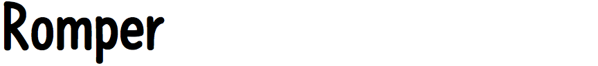
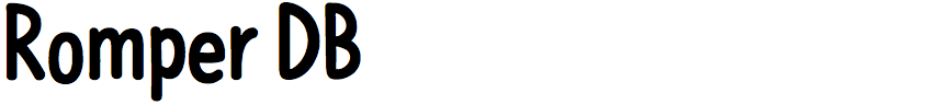
Romper – Veneta Rangelova (DearType)
Romper is a friendly sans-serif font that looks like it was handwritten with a black felt-tip pen. Do you work by drawing the letters on paper first, or do you create the characters directly using Bezier curves on screen?
If I want the font to have a more casual feel, and especially if I'm designing a script, I always start by drawing the letters by hand on a tablet. It is very easy to switch between brush styles and test what works best. Romper was done by hand and then vectorized and polished on the computer. However, I find it much easier to draw sans-serifs and serifs directly in the font program.
Romper is narrower and more neatly written than other popular felt-pen fonts, such as Comic Sans and Apple Casual. Were you consciously trying to get away from the jokey style of those fonts?
Yes, I was definitely going for a more streamlined look. I love the cute appearance of felt-pen fonts, but since they might come off as a bit less serious, I tried to do something in the middle. Like a mix between a narrow sans and a handwritten font. The Romper DB (dancing baseline) version still adds a bit of that fun, jokey feel, though.
Did you design Romper with any particular projects or applications in mind?
I usually try to make fonts that I myself could use for different design projects. Romper was designed as an alternative to the fonts used in comic books, since not much of these have Cyrillic. Also, it turns out that I don't have many fonts for a younger audience, so I ended up with Romper, which was really fun to design.
![]()
![]()
![]()
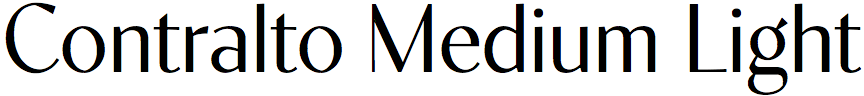
Contralto – Jan Tonellato (Synthview)
What inspired you to design the Contralto family. Was it created for a particular application?
Before fully switching to type design I worked as a graphic designer for more than 15 years. I was always looking for an elegant sans-serif, something that could be a contemporary Bodoni. So, I've started to dig into sans-serif high-contrast types.
However, I was unhappy with the available designs. Some looked too retro, vernacular, or simply unbalanced. Others were fine, but with very limited weights choice. Therefore, I decided to draw the contemporary high-contrast sans-serif I would always like to have in my graphic designer toolbox.
The elegant look was achieved by sourcing from what I consider to be the most elegant style in type, the didones - in other words, high-contrast. For the contemporary side, I remember I was at a type conference in Paris almost ten years ago. A Swiss designer said that he was trying to let people feel the vectors in his designs, as vectors are the design tool of our times.
This idea stayed in my head for ten years before I applied it to Contralto's design. In fact my design has a very humanist approach and several optical compensations, but also some very sharp and digital looking lines and cuts, such you can see in the ‘G’.
Contralto has similarities to Britannic, and also Peignot’s capitals. Were these influences in the design, and were there any other fonts that influenced you?
Actually, the design I decided to take as a starting point was my successful previous font release, the neo didone high-contrast serif Operetta.
I've kept the same vertical metrics and min-max weights, to make the two fonts mix well together. Of course I did not cut the terminals of Operetta but completely redrew the letters' skeletons. In fact, serifs are crucial to balance form/counterform when contrast goes high; that's the reason it's so hard to draw a good high-contrast sans. You have to think “mass” and “counter space” much more than in other designs. You can easily understand my approach comparing the ‘S’ in Operetta and Contralto. They're totally different, not because of some arty decision, but because without serifs, I had to make the fragile parts of ‘S’ as small as possible, and reduce the counter-shapes as much as possible too. That gave a very vertical and compressed ‘S’, compared to a Didone.
For each weight you’ve provided four optical sizes: Extra Small, Small, Medium, and Big. How do the character shapes change across the optical sizes, and what applications did you have in mind for each optical size?
As for Didone fonts, the main idea is to keep the thin strokes as thin as possible, but still visible at different sizes. The first and most obvious adjustment is looser spacing and wider counter-forms at the smaller optical sizes.
The second is the adjustment of a design feature I made to counterbalance an optical illusion generated by the brain. If you draw a thin line, your brain will mix its end with the empty space after it, producing a false perception of a fading line. To counterbalance this effect, I've drawn these thin lines a little bit thicker at their ends, which makes them look sharper. Also, screen renderers add some blackness to the last pixels of these strokes, making them look as if they were hinted more effectively. As this optical illusion occurs for very thin strokes only, my design feature is inversely proportional to the stroke's optical size.
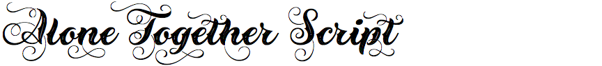
Alone Together Script – Roland Hüse (Roland Hüse Design)
Is Alone Together Script a digital revival of a classic font, or did you originate the design, and what were your influences?
It's not a revival font and I have tried to avoid looking at a specific reference, but I made the sketches according to what I had in my mind from what I have seen before in this style.
On your Alone Together Script microsite you explain that the font has variable swashes. How does this work, and what’s the best way to use this feature?
I always wanted to figure out how to make swashed characters that don't overlap awkwardly with their neighbouring letters in a context. I came up with this solution where it's possible to adjust them each in a suitable application, such as Adobe Illustrator, so that they lay out nicely in a given word shape.
You describe the font as a tattoo-style script, but it seems equally appropriate for applications such as greetings cards and festive invitations. Did you have any particular applications in mind when you designed it?
Yes, I added spikes to the stems that are typical of this style of lettering. The cutout in the middle is also meant to achieve a tattoo look, as well as reduce the darkness of the letter shapes as it's quite a bold weight. It can be used in any project that it fits – it's the designer's choice of course. The tattoo syle is more like from the creator's perspective – I didn't necessarily want to suggest what its best use is.
The whole concept is that it's something to remember like a tattoo: it stays there forever. And it's a black and white theme. The primary purpose was to create a font that I can contribute to the Covid situation and donate from the sales. On the microsite I share the date, amount, and organizations I have sent money to.