New Additions: September 2016
7th October 2016
We add hundreds of fonts to the Identifont database every month. Most of these are recent releases, and some are simply new acquisitions from foundries who were not yet represented on our site. Stephen Coles gives his take on the most interesting recent additions.
![]()
When Bauer'sche Schriftgiesserei first issued Futura in 1927 it contained some of Paul Renner’s attempts to remove every trace of handwriting from the alphabet. His unusual geometric shapes included multiple variations of ‘a’ and ‘g’, some constructed only of circles and straight lines, and an ‘n’ and ‘m’ that were merely open-ended rectangles. Many of these concepts were too bizarre for practical use and soon disappeared from the market. But others, like the stick-and-ball ‘r’, didn’t stick out so much, performed remarkably well even in running text, and could have remained in the standard character set. For over fifty years these shapes went unused, slumbering in old specimens, until the Foundry revived some of the alternates in the early 1990s as Architype Renner.
Now Neufville Digital, who along with Bauer Types officially owns the rights to the typeface, has produced Futura ND Alternate. Next to Renner’s experimental letters they also introduced some other unpublished forms, such as a curve-tailed ‘l’ and ‘t’ and an Erbar-styled ‘a’. It’s a strange product decision. While there’s nothing inherently wrong with these hooked shapes in this style of typeface, some might feel they clash with the rigid geometry of the 1920s alternates, making this “Futura” a less cohesive concept. This was something Heinrich Jost (Bauer’s art director) seemed to understand at the time of Futura’s initial release when these shapes were abandoned. Fortunately, one can selectively switch off the tailed alts and keep the other experimental alts, but there are no OpenType Stylistic Sets to make that possible on a macro basis – each glyph must be toggled one at a time.
![]()
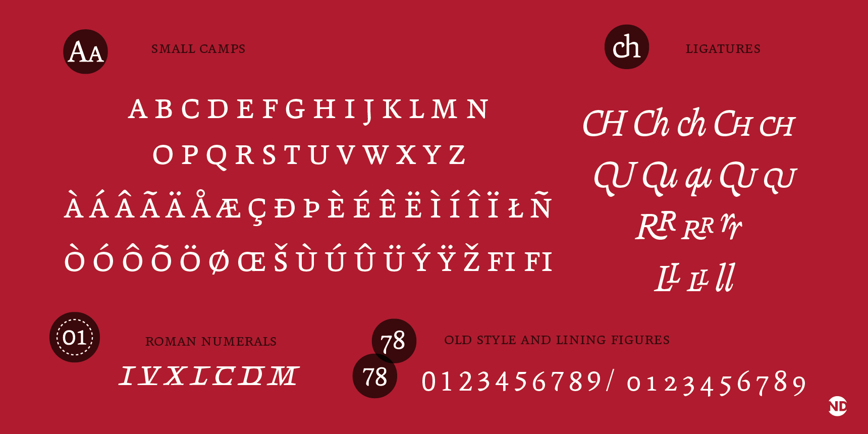
Many other Neufville faces have just now arrived on Identifont. Most are revivals of their metal type holdings, from foundries like Bauer, Ludwig & Mayer, and Fonderie Typographique Française, but a few Neufville designs are digital natives. The most interesting of these is probably Andralis ND by one of the pioneers of South American type design, Rubén Fontana. It’s a chunky, angular text serif that looks as if it was cut out of wood or stone. Don’t miss the unconventional ligatures.
![]()
![]()
![]()
![]()
![]()
![]()
Handelson is one of the many new collections of related “handlettering” styles released under a single family name. These sets vary in quality and most of them are not worth writing home about. Usually they suffer because their creator is a lettering artist without type design skills, or a type designer without lettering experience. In this case, however, Mika Melvas shows that he’s studied up on both disciplines. His typefaces have steadily improved since he hit the scene in 2010, and Handelson showcases his abilities in five different styles, from connected and casual scripts to handwritten and industrial sans serifs (the last of which comes in two weights). Unfortunately, while the designs have a convincing hand-rendered spirit and natural flow, in some cases there aren’t enough versions of each character to truly emulate real hand-lettering. This reduces the use of these fonts to situations where the text is limited or where repeating letters aren’t noticeable. When it comes to reproducing the look of lettering with a font, one wonders why a type designer shouldn’t do everything they can to simulate irregularity. Otherwise, there isn’t a compelling reason to mimic rough, handmade letters. I’d like to see an update of Handelson with more than 2 glyphs for each character and some ligatures for the connecting scripts.
![]()
Last year, the Japanese designer who is best known for reinterpreting classics like Metro and Haas Unica for Monotype, finally found a home for his own Masters project. Toshi Omagari’s Marco is a virtually effortless translation of calligraphy into a contemporary serif. It’s one of the fresher designs to be inspired by the well-trod 15th-century Venetian models. As is typical with TypeTogether fonts, the family is more than just Latin: bundling a Greek and award-winning Cyrillic into its “Pan-European” version.
![]()
![]()
Bely is another recent TypeTogether release just arriving on Identifont from the young and talented Roxane Gataud. It’s the debut of a designer who seems unbound by the standard type design conventions. Bely Display, with its ultra high contrast at a strong angle, gets a lot of attention, but I am most impressed by the text styles. The head serifs are sharp triangles and the baseline serifs are blunt rectangles, yet despite these geometric elements there’s nothing cold about the design. In some ways that are akin to FF Scala, Bely is a truly modern take on the oldstyle serif.