New Additions: April 2021
30th April 2021
From the hundreds of fonts we add to the Identifont database every month we chose a selection of the most interesting recent additions, and interviewed the designers about their approach to each design:
![]()
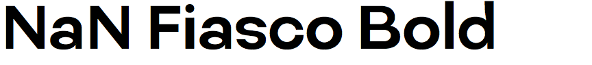
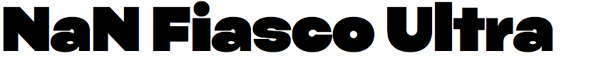
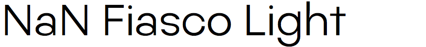
Nan Fiasco – Luke Prowse (NaN)
On your website you describe NaN Fiasco as a "disobedient sans-serif”. Do you mean that you have intentionally disobeyed typeface design principles, and can you give some examples?
On the one side there was a deliberate move away from a more typical process but equally from the reader’s (or viewer’s) point of view there are interventions or unusual rhythms that are kind of unexpected and give the font a bit of a cheeky tone.
Fiasco started as lettering for a logotype with something geometric built in to the brief. I’d drawn a lot of geometric stuff already at this point late 2016 and couldn’t bring myself to do another without adding some flavor and I remember sitting down and literally just doing the opposite of what I’d normally do. Ok, the three stems in an ‘m’ should match width (each is different), geometrics are pretty monoline (so I added contrast), you should be consistent with where contrast goes (I wasn’t), the horizontal on an ‘H’ shouldn’t be mathematically centered (it is), the tittles (dots) on the ‘i’ and ‘j’ should be the same size (they're not), etc. I started to notice parallels in all manner of real-life type fails and started building this language in to the font more broadly. It’s very carefully managed clumsiness.
Another typeface that comes to mind to compare with NaN Fiasco is Evert Bloemsma’s FF Balance, which plays with one's expectations of a sans-serif typeface in a similar way. Were you influenced by this or any other typefaces in designing NaN Fiasco?
No, but I would say he had a big influence on me when I was younger. He was sadly taken from us too soon, a real one of a kind.
A lot of the influences for Fiasco are some of the most ubiquitous fonts you can think of; Futura, Helvetica, Antique Olive, Gotham, Arial… It’s kind of an amalgamation of populist source designs, cut-up and stuck back together the wrong way with some of my own invention thrown in. It’s an unpopular word but it’s quite a vernacular design in lots of ways.
Despite the broken rules Nan Fiasco never goes as far as fonts intentionally based on bad lettering, such as Leslie Cabarga’s Bad Typ, and it manages to retain a harmonious design. I can imagine it being used in quite formal publications. Were you conscious of not wanting to take the rule-breaking too far?
Funnily enough I came across Leslie’s font pretty close to releasing Fiasco and was surprised at how many similarities there are! There are a lot of shared lettering misfires with Bad Typ such as the reversed stress on the ‘M’ or the top-heavy ‘S’. I tried really hard to do the most professionally amateur job I could. Which is funny because I’ve spent a lot of time doing a professional job as an amateur. There was a point at which I decided to tone it down and aim for something that could be used more broadly. The belly of the family works fairly comfortably in text, but I allowed myself to be more obvious in the thin and ultra ends of the family. I must say it was quite a challenge hanging it all together with so many systems within systems. If I put it down for more than a few weeks I’d usually lose track of them.
![]()
![]()
AT Aguzzo – Kasper Pyndt Rasmussen (Approximate Type)
On your website you say that Aguzzo is inspired by Augustea Open, an open caps-only typeface designed by Alessandro Butti and Aldo Novarese for the Nebiolo foundry. What gave you the idea of creating a complete typeface based on this?
Aguzzo was first conceived back in 2015, when I did my MA in Visual Communication at The Royal Academy of Architecture Design and Conservation in Copenhagen. I didn’t know of Augustea Open back then, and was pleased to discover it in a type specimen at the school’s library. It struck a nice balance between the classical elegance of its roman capitals and the raw geometry of its triangular punctuation. At the time, I didn’t have much experience designing serif typefaces—which was my main incentive to make one—and using the ethos of Augustea Open as a jumping-off point allowed me to work with a traditional genre while adding a twist.
As Augustea Open is a caps-only typeface, how did you approach adding the lower case in Aguzzo? Were you inspired by any other typefaces?
The Nebiolo Foundry released “Nova Augustea” (by Aldo Novarese) in 1964, which saw the addition of a lowercase character set, so I considered the challenge already completed. Instead I chose to step away from the engraved style of Augustea Open in the sketching process to explore something more transitional. Ultimately, the process of drawing Aguzzo was quite open (no pun intended) in the sense that I didn’t let other references have too much influence on its development.
Augustea Open has several idiosyncratic features, such as the closed ‘2’ and the triangular punctuation. You’ve retained the style of the ‘2’ in Aguzzo, but did you decide that the triangular punctuation was going too far?
All of the above features are included in the typeface, but the triangular punctuation as a stylistic alternative to be used for display purposes which is where it truly shines. While Augustea Open is decidedly a display font, Aguzzo is drawn to exist somewhere between utilitarian and display, and therefore I deemed a more conventional-looking punctuation appropriate as default. That said, the typeface is called “Aguzzo” (Italian for “pointy”) for a reason, and while the geometric punctuation might not be default, it’s all but forgotten!
Currently Aguzzo has only regular and italic weights. Do you have any plans to extend it into a larger family?
Yes, definitely! As we speak, I’m working on two new masters: a thin and a bold, with italics to follow. When these new weights will be released is an entirely different conversation. I like to take my time with these things…
![]()
![]()
![]()
![]()
Reply – François Rappo (Optimo)
You’ve written that Reply is inspired by Vogue Intertype, a typewriter font that architect Frank Lloyd Wright used for his correspondence. Presumably, though, the typewriter version of Vogue was a fixed-width font?
The typewriter version of Intertype Vogue, which was available on the Royal Typewriter, was slightly different from the linecaster version, with a different ‘R’, ‘K’, and ‘t’. And yes, it was a monospaced font, but with some problems: for example, the ‘M’ and ‘W’ were actually slightly wider than a space. I tried to keep the visual atmosphere displayed in Frank Lloyd Wright’s letters while adapting it to a proportional font, adding some digital rounding to the strokes, with a relatively wide spacing.
Did you work from facsimiles of Frank Lloyd Wright’s letters?
No, I worked loosely from some accurate type samples I found online on a blog about classic portable typewriters X over it.
The only other digitisation of Vogue Intertype I’m aware of is Richard Miller’s Intervogue, and Reply is significantly different: in particular, the slanted ‘Q’ tail, the crossed ‘W’, the low ‘R’ junction, the more steeply sloped ‘M’, and the ’S’-shaped question-mark (compare the differences).
I don’t know Richard Miller’s Vogue very well, but Reply has OpenType alternates for the ‘K’, ‘M’, ‘Q’, ‘R’, ‘a’, ‘e’, ‘j’, and ‘t’ based on the alternates in Intertype Vogue.
![]()
![]()
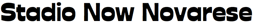
Stadio Now – Cosimo Lorenzo Pancini (Zetafonts)
It seems amazing that Aldo Novarese’s striking reverse-contrast typeface Stadio has remained virtually undiscovered until now. How did you come across it, and what led you to deciding to publish a revival?
It all began in 2019 when we visited Archivio Tipografico in Turin, Italy, a collaborative space for the preservation, study, and practice of the typographic arts, set in a printing office that hosts a design studio and a huge collection of specimens and lead fonts dating back to the era of letterpress printing.
There we discovered Novarese's “fantasy” typefaces: experiments such as reverse contrast, unusual cuts, and unicase alphabets while remaining faithful to classical shapes and historical conventions. The most surprising discovery for us was - indeed - Stadio, which he described as a “decorative display typeface, in the so-called nineteenth century ‘Italian’ style, but sans serif. Horizontal proportions have been visibly enlarged, offering a very intriguing graphic effect”. We were immediately hooked by Stadio’s unique appearance and personality.
I understand it was originally only available as dry transfer lettering. Is that still manufactured and available?
Stadio seems not to have been previously digitised, but was available from Reber in their rub-on transfer brand R41. Reber was created in 1960 by Renato Bernardi, a brilliant entrepreneur from Verona, who developed his own version of the rub-transfer technology invented by Letraset. Bernardi worked with Nebiolo, when Novarese was its studio director, with the result that the R41 range featured many of Novarese’s classic fonts. When Novarese retired from Nebiolo he kept a close connection with Reber, both as a graphic designer and as a type designer, and proposed they include Stadio.
In the end Stadio was published by Reber in six different formats: with a range from 4.3 mm to 13.5mm height in the smaller sheet format, and a giant 30mm size in a bigger 25×35 format. The different sizes are all derived by the same base drawings through photographic reduction, and show no differences apart from the swelling in the smaller formats caused by the physical characteristics of the adhesive transfer film.
Reber still belongs to the same family after three generations, and the R41 rub on transfer sheets are being marketed online, alongside a collection of digital revivals engineered by Onice Design. We were pleased to discover that Stadio had not been considered yet.
We proposed a collaboration to Caterina Piatti, granddaughter of Reber's founder and now CEO, with the idea of releasing a revival of Stadio for the birth centenary of Aldo Novarese. Our aim was not only to digitize the original designs, but also to expand the typeface in glyph range, weights and styles, to express all the possible potential of Novarese’s design ideas.
Novarese originally only designed one weight of Stadio, so how did you go about extending it, and does one of the weights you have developed match Novarese's original typeface?
On the one hand, a digital revival meant for us the chance to give exposure to the original lost design by Novarese. This is why we created the Stadio Now Novarese style, which is a very faithful digital replica of the 1975 original. On the other hand, we felt that today the concept of what a typeface is has evolved: from a fixed design to the development of a concept in a multidimensional design space. Novarese had in his life continuously reimagined, reinvented, and expanded typeface ideas from the past, and we felt that we would be justified in applying his method to his own work.
For example, Stadio is very bold and usable only at display sizes, but with multiple master technology we could add weight and optical size axes, allowing for lighter, text-oriented variants, and expanding the possibilities of Novarese's reverse-contrast intuition by trying more extreme contrasts, tighter spacing, and sharper design details.
We then chose combinations of weight and optical size that would be right for particular applications. For example, for text usage Stadio Now Text is a low-contrast, low-weight version with a more relaxed spacing to make it more readable. It also sports a more regular design of the legs of the ‘R’, ‘K’, and ‘k’, and a bold version, essential for body text typesetting.
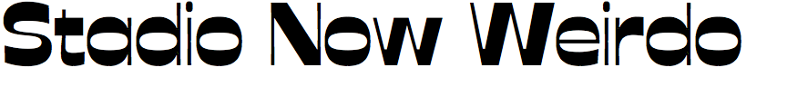
For display use we developed a range of display weights, including an ultra thin Stadio Now Sottile, two poster versions (Stadio Now Banner and Stadio Now Poster), a medium contrast Stadio Now Display alternate to text, and a high contrast Stadio Now Weirdo version.
The final project fills the space around the original typeface with a constellation of variants. Further variants can be obtained thanks to the variable versions, which cover the whole design space.
The name Stadio literally means “football stadium”, perhaps reflecting its dynamic design. Do you anticipate applications in the areas of sports publishing and merchandise?
Yes, indeed, thanks to its name you can easily see the connection between its sturdy shapes and sports. While the reverse contrast and the extra bold weight gives letters a powerful energy, the unusual curved shapes of ‘Y’ and ‘K’, the playful shapes of ‘C’, ‘G’, and ‘S’, and the slight tapering of all stems give Stadio a unique dynamic feeling.
To honour its football-inspired name and its vintage look Zetafonts foundry has organized the first Italian football poster tournament: Coppa Stadio (Stadio Cup). Twenty of the best Italian graphic studios and digital illustrators were invited to play with Novarese’s letters to create a poster dedicated to a football team from their home region, or an imaginary team. The games have been played weekly on the Zetafonts Instagram channel, where all the followers and fans went wild voting for their favorite poster or favorite team.