New Additions: October 2014
30th October 2014
We add hundreds of fonts to the Identifont database every month. Most of these are recent releases, and some are simply new acquisitions from foundries who were not yet represented on our site. For several years we noted these new additions on a dedicated page, but this basic listing lacks information and analysis. With the mandate to bring context and meaning to these new fonts, we’ve asked type critic Stephen Coles to provide his insight in a monthly report. Stephen will select a handful of the most interesting or relevant fonts from each batch and discuss their merits, as well as their place in the current type landscape. Stephen’s opinions are his own and do not necessarily reflect those of Identifont – DJD.
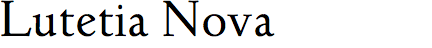
Lutetia Nova is Ralph M. Unger’s revival of Lutetia, designed by Dutch designer Jan van Krimpen and originally published by Enschedé in 1925. It is based on van Krimpen’s handwriting, which shows in some of its slightly eccentric lettershapes, strokes, and widths which are less regular than most of the serif typefaces we use today. It is also quite delicate for setting text — anything below 18 pt is not advisable. Those who like van Krimpen’s classical style might be better served by a more versatile family like Monotype’s revival of Van Dijck or the more hardy DTL Haarlemmer by Frank Blokland.

Thomasschrift is an odd hybrid of uncial and roman styles, first released in 1957 by the East German foundry Typoart. Most of Typoart’s designs were forgotten to the design world after German reunification. This is one of the less usable of the Typoart revivals, but it’s interesting. The font has two uncommon ‘A’ forms: one with a round top and parallel verticals, and an alternate with a left-sided serif.
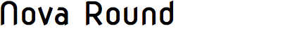
Nova Round is the kind of typeface design concept that is tempting for many beginners: modular, geometric, with very little stroke variation. It is easier to let the grid do the work for you. It seems that was the case here. The ‘G’, for instance, began from the ‘C’, with a bar height copied from the ‘E’ and ‘F’. The resulting shape is awkward and cramped, unlike any other letter in the typeface. Wojciech Kalinowski tries to make make Nova Round more interesting by trimming ends at an angle, but there are more mistakes here than bright spots. If spurless, ovular shapes are desired, they can be found in better faces like Plau, Netto, or Neo Tech.

BC Vafle is an instructive contrast to amateur geometric type because it accomplishes similar goals much more effectively. In this case, the core shape is a rounded rectangle, yet designers Tomáš Brousil and Marek Pistora made adjustments to keep things legible and consistent without sacrificing the constructed, industrial aura. The advantage of a simple model is that an array of effects and variations can be applied: BC Vafle Egyptienne, Stencil and Tape are each strong on their own, but they can also work interchangeably because they are all machined from the same mold. There are Condensed and Extended widths, too. Vafle was previously available from Brousil’s Suitcase foundry, but was transferred to the fledgling Briefcase, a spinoff label created to promote other Czech designers.
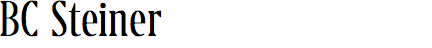
Among the new typefaces released by Briefcase is BC Steiner by Vojtěch Říha. It was difficult to find candidates for the “Similar fonts” sidebar on this one because BC Steiner has so many unusual characteristics: triangular serifs and ball terminals on a very narrow build with a very tall x-height. Surprisingly, this is not just a single-weight display novelty, but a family of six weights, each with italics, which is where BC Steiner really shows its spirit. Do not miss the ebullience of the Black Italic.

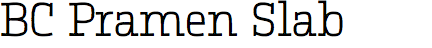
Also by Říha are BC Pramen Sans and Slab, which are characterized by sharp, cornered counters contrasting with curved outlines. This is not a new concept (see the fonts similar to BC Pramen Sans), but these families have an almost wild playfulness absent in others of this genre, and they are especially expressive in their italics. There are some decisions that I question — such as the symmetrical ‘K’, or the very short, curved leg on the ‘R’ — and the Black Slab is not as successful as the others (there’s just no room for those massive serifs) — but, overall, BC Pramen has a lot of potential for contemporary, informal uses.
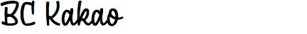
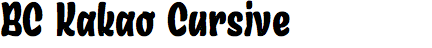

Říha’s BC Kakao, Kakao Cursive, and Kakao Black are another shot at a current trend: bouncy, casual scripts inspired by the mid-20th-century sign writer’s brush. Specifically, there might be immediate comparisons to Underware’s type, such as Bello, Sauna, Auto 3 Italic, and Liza. But, again, Říha’s flair is fresh, and the three Kakaos, while related, are clearly a set of individuals, each with their own distinct design. Rather than three styles from a conventional font family, they are like three different bits of lettering on a sign produced by the same sign painter.


Jan Novák has two familes in the Briefcase library that share a similar experimental approach: start with a sober sans serif and toss in an unexpected kink. With BC Falster Grotesk the base sans is based on the Univers model but with the shock of an abrupt diagonal here and there. The ‘g’ is also bizarre. It becomes apparent that Falster Grotesk’s name was well chosen and it seems more appropriate as a tongue-in-cheek one-off than a utilitarian face. The BC Liguria experiment holds more promise for the end user: the quirks are more obvious and consistent, but most importantly Liguria has a more original design at its core. This real-world usability is evidenced by the accomplished examples documented at Fonts In Use. The unique segmented curves are visual stutters, but they don’t distract unless you want them to (when large), and the fonts offer conventional shapes as alternates for when you need to keep things clean. To me, Liguria is one of the more exciting releases of 2014.
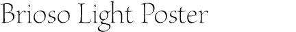
The common thread among the more interesting fonts in this month’s selection is scarcity — type that does something most type doesn’t do. This certainly applies to the uncommon category of extra light oldstyle serif. Adobe’s Optical Size families offer a few of these rarities, and Brioso is the most lively. The calligraphic pen is quite obvious in the heavier weights and smaller sizes of Brioso, but the strokes are so thin in Brioso Light Poster that it has a very different feel. This a graceful font with obvious demands: it must be set large with lots of space around it.