New Additions: June 2019
10th July 2019
We add hundreds of fonts to the Identifont database every month. Most of these are recent releases, and some are simply new acquisitions from foundries who were not yet represented on our site. David Johnson-Davies reviews some of the most interesting recent additions.
![]()
Aziga from Schizotype is a font that's hard to classify. The designer, Dave Roland, describes it as a "high (occasionally reversed) contrast, postmodern, deconstructed-reconstructed, serifless (mostly), fashion didone"! It's like a love child of Lust Didone and Karloff Negative Bold, but the distinctive diagonal strokes on letters such as 'B', 'C', 'O', and 'U' are entirely its own. I can see it finding regular use in fashion magazines and glossy product brochures.
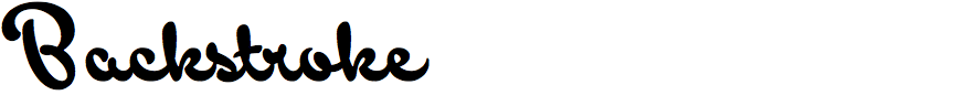
Backstroke is another recent release from Dave Roland's Schizotype foundry. There is already a huge choice of slanted brush scripts, the most famous of which is perhaps the eponymous Brush Script. Backstroke is a characterful example, but what makes it particularly worthy of mention is that it slopes backwards. Such brush scripts are extremely rare; in fact there is only a handful of backward-sloping fonts of any type on Identifont, so if you need a brush script that leans to the left, this is probably your best bet.
![]()
![]()
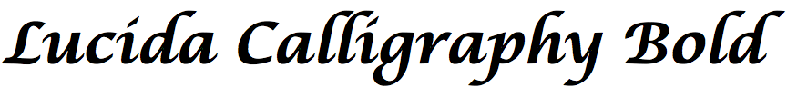
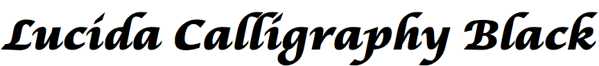
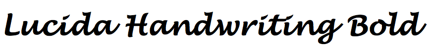
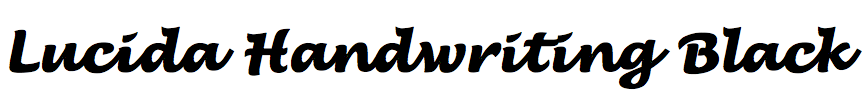
The Lucida family, designed by Charles Bigelow and Kris Holmes, will be familiar to anyone who has used a Macintosh or Windows computer: Lucida Grande was one of the system fonts included with MacOS, and Lucida Console and Lucida Handwriting were included with Windows. The family of fonts began in 1985 with Lucida, later renamed Lucida Serif.
In 1992 Bigelow and Holmes designed Lucida Handwriting, a handwriting script, and Lucida Calligraphy, a chancery cursive script, and these were extended with additional weights in 2014 which were only available from their site LucidaFonts.com. A selection of the most useful weights of each font, Thin, Light, Bold, and Black, have now been released by Monotype.
![]()
![]()
![]()
Talking of Lucida, Martin Vácha's typeface Reckless is a modern take on the characteristics that made Lucida, and its successor Lucida Bright, such popular serif fonts: large x-height, open bowls, and relatively compact capital letters: compare Reckless and Lucida Bright. This makes it ideal for use in applications where readability is important, especially at small text sizes or on low resolution devices.
Martin designed Reckless during an internship at the London University of Arts, and he says that Plantin Infant was among his inspirations. Perhaps this explains why Reckless manages to convey a friendly character that should make it useful for applications such as children's books.
![]()
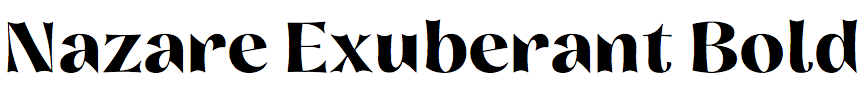
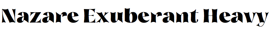
Nazare Exuberant is an embellished version of Natanael Gama's 2018 typeface Nazare. The ends of the strokes are scalloped, the contrast is increased, and the spurs on letters such as 'a', 'd', 'm' and 'r' are sharply pointed. The result is an unusual, elegant typeface that should work especially well at poster sizes.
By David Johnson-Davies