New Additions: October 2016
4th November 2016
We add hundreds of fonts to the Identifont database every month. Most of these are recent releases, and some are simply new acquisitions from foundries who were not yet represented on our site. Stephen Coles gives his take on the most interesting recent additions.
![]()
We’ve seen an uptick in classical serif stencils over the last few years, including Dala Floda (2010), PF Regal Stencil (2010), Bery Roman (2012), St Croce (2014), and Parmigiano Stencil (2015). Gabriela Stencil takes the category in a more ornamental direction. The curled terminals fit well with the style, recalling the brass stencils for fancy 19th-century labelling. It’s especially effective in the heavier weights. Don’t miss the alternate glyphs. Gabriela is the debut retail release from art director Antonio Mejía Lechuga who has made lettering and custom type for a variety of clients in Mexico City.
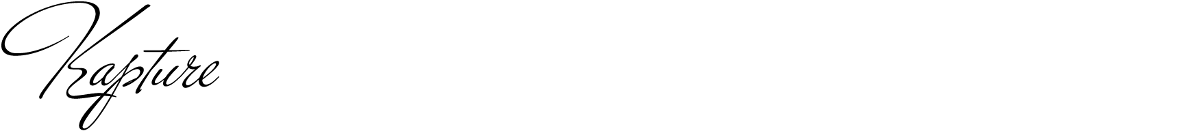
The first time I saw Stiggy & Sands’ new Kapture I thought of Alejandro Paul, whose successful scripts like Ministry and Adios are inspired by the spirit and elegance of 1930–40s commercial lettering. Paul’s fonts tend to emphasize his numerous twirling swash options which give his designs more of a contemporary than retro look. Kapture, on the other hand, feels like it comes straight out of some ad for a 1936 luxury sedan. Rather than swashy add-ons, there are still plenty of stylistic and contextual alts to keep things interesting and maintain a natural calligraphic rhythm.
![]()
![]()
![]()
Mala is the MA project of Barbara Bigosińska a promising Polish designer who graduated in 2013 from the Type and Media program at Royal Academy of Arts in The Hague (KABK). The concept takes the engraved hand-lettering style of traditional cartography and modernizes it to the 21st century. Its core purpose is map typography, as beautifully illustrated in its printed specimen and the images on the Bold Monday site, but the large range of weights and widths and sturdy quality make it useful for all sorts of things. It’s the kind of loose, informal slab that would add a bit of levity to a magazine or corporate identity.
![]()
![]()
![]()
Erbar-Grotesk – one of the first and most popular geometric sans serifs of the 1920–50s – is a prime example of an important metal typeface that hasn’t really been given a thorough digital revival. Linotype did only a single Condensed style and URW’s 5-weight family lacks the refinement of the original. CJ Dunn’s interpretation offers three sub-families which differ mainly by x-height. Dunbar Low has the most in common with Erbar’s typical character, while Dubar Text reflects the proportions of the metal’s smallest sizes. To these Dunn added a more personal variant, Dunbar Tall, whose extreme x-height, truncated extenders, and vertical stroke endings update Erbar’s personality and enable compact headlines. This mutation is inspired by 1960s–70s phototype mods of classic faces, such as Erbar Neo, Futura Maxi, and ITC Kabel. Dunbar is the premiere offering from Dunn’s new label CJ Type and is the first commercially available font in the nascent OpenType Font Variations format, allowing future users limitless weight and x-height options between the family’s extremes.
![]()
Pathos gives us the opportunity to admire Rui Abreu’s courage. In a time when many type makers homogenize and water down their concepts to make them as versatile (and commercially viable) as possible, this Portuguese designer-on-the-rise allows his newest idea to stretch out in strange ways. The ‘E’ has a severe underbite, the ‘a’ is top-heavy, the jutting serifs are unexpectedly prominent, and corners often appear where curves oughtta be. But Pathos isn’t weird just for the sake of it; there is a balance and confidence to the idiosyncracies. Its weight remains visually constant between stroke and serif – even in the Black – making it like an odd younger brother of Silica, another admirable and underappreciated monoline slab.
![]()
Keeping on the theme of type without stroke contrast, I was delighted this week to discover Jonesy. It is a set of two unassuming fonts – Capitals and Script – meant to set happy little bits of copy. At first glance there isn’t much to the design, but the effortlessness of the Script in particular demonstrates how much effort Ksenia Belobrova put into its underpinnings. The ligatures ensure that the strokes flow through letters uninterrupted. Without fanfare, it sets words as if each one was lettered by hand. Jonesy is the second release from newcomer Ksenia Belobrova, following the equally charming Di Mare from earlier in the year. I hope to see more of these well-crafted yet unpretentious typefaces from her in the future.