New Additions: August 2023
31st August 2023
From the hundreds of fonts we add to the Identifont database every month we chose a selection of the most interesting recent additions, and interviewed the designers about their approach to each design:
![]()
![]()
![]()
![]()
Andrej Dieneš – Cosan (ADtypo)
Cosan is a large type family with four contrast styles from G1 (low contrast) to G4 (high contrast), nine weights from Hair to Fat, and two styles: Cold and Warm. What prompted you to embark on this project?
Since there is no reason that would justify the creation of another Helvetica clone, it is necessary to go about it differently – to offer new options. My intention was first to variably connect open and closed apertures in one sans-serif font – ie actually smoothly transition from Helvetica to Myriad, and to make matters worse, also variable contrast. In short, to offer everything that is possible in a sans-serif font. It turned out, however, that the different construction principles of neogrotesque and humanist grotesques would make the interpolation very complicated, so I decided to make them into two separate families that have some features in common. Since they are equivalent, the whole system is suitable for typesetting bilingual text.
There are several character differences between Cosan Cold and Cosan Warm: Compare Cosan Cold with Cosan Warm. Would you characterise the difference as formal vs. informal?
The names Cold and Warm were derived from their psychological effects. It could also be characterized as formal vs. informal, but they are largely combinable with each other. So it is not two closed worlds. They also contain many stylistic sets, with which they actually exchange glyphs with each other.
Cosan is quite unusual in providing a range of contrasts in a single typeface family: from G1, which is monoweight like Helvetica, through to G4, which is high contrast like, say, Britannic. Did you have applications in mind for this flexibility?
I thought it was similar to the optical sizes – the bigger the text, the higher the contrast can be used, but I didn't want to automatically and strictly limit it in the font (because you may want, for example, a gigantic headline with no contrast and body text with slight contrast). However, this freedom presupposes at least a basic knowledge of typesetting on the part of the user. And in order for it to become a truly comprehensive tool for everything, it would still be necessary to add a width axis in the future.
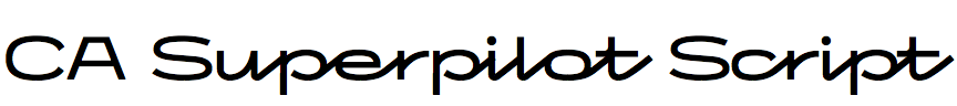
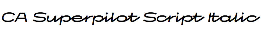
Thomas Schostok – CA Superpilot Script (Cape-Arcona)
CA Superpilot Script is a monoline script font which, you say, takes inspiration from vintage camera equipment logos and other lettering from the 1950s. Were there any particular logos you were inspired by?
Yes, there are a number of logos that served as inspiration, namely the Calypso, the Edixa-Mat and the Lordox cameras, the exposure meters Triblux, Rotolux, Revue and, above all, the Gossen "Super Pilot" exposure meter, from which the typeface also inherited its name and the basic idea.
I’m finding it hard to find other fonts on Identifont to compare it with; the closest is Leslie Cabarga’s Raceway. Was this or any other font an influence on its design?
No. There is an Instagram account named @viennacitytypeface which shows a series of old store signs, mostly script-like signs, which also served as a source of inspiration, but existing fonts were not a source of inspiration.
CA Superpilot Script is a companion to your sans-serif font CA Superpilot Sans, and there are clear similarities between the capitals of both fonts. Was one designed first, or did you envisage them as a pair?
We started working on the script a year before the sans-serif.
When we created the first graphics to show the Script style, we used Futura because it was such a typical combination. In other words, Futura was often used in advertisements and brochures for cameras and exposure meters at the time. Stylistically, it was a perfect fit for us, but we didn't want to use Futura for our final graphics, so we came up with the idea of creating our own, more modern interpretation of Futura to fit the script. As a result, there are not quite as many different widths and weights of the Sans Serif as there are in today's sans serif fonts.
In fact, the Sans used to have a different name, but for marketing purposes we decided to make it a subfamily to emphasize the association.
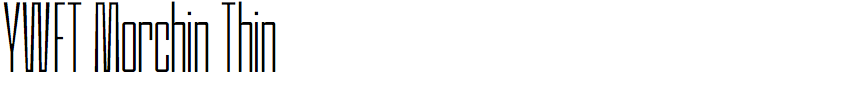
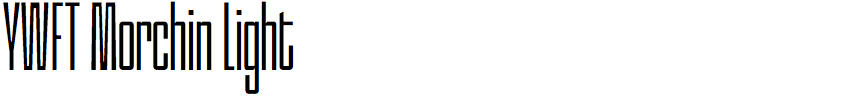
Michael Paul Young – YWFT Morchin (YouWorkForThem)
You’ve written that YWFT Morchin was inspired by your earlier design Cinderblock. What made you decide you to develop another typeface based on the same fundamental design?
You know, design trends are fascinating things. When we worked with Stefán Kjartansson to create Cinderblock a while back, we tapped into something unique. Now, it's coming back in style, especially in the world of social media. Have you noticed how condensed and tall designs are becoming a hit? Think about the new vertical content formats, like reels and short videos. That's where the magic is happening. We saw that trend, and we decided to ride the wave with YWFT Morchin. It's like revisiting an old friend, but with a fresh perspective.
Cinderblock is a compact bold sans-serif font with five widths, from 50 to 400, whereas with YWFT Morchin you’ve kept the width approximately the same as Cinderblock 150, but varied the weight from thin to regular. Was this in response to feedback about Cinderblock?
Not exactly a response to feedback, but more of a creative exploration. We wanted to keep that tall sans characteristic, but also play around with variability, something Cinderblock didn't offer. It's about keeping that aesthetic we love but giving it a fresh twist. Think of it as cooking with a favorite recipe but adding a new spice – it changes the whole flavour profile.
One unusual feature of YWFT Morchin is the way that the strokes of characters such as the ‘M’ and ‘W’ are tapered to keep the characters narrow, while giving them enough internal white space for legibility. What gave you the idea of doing this?
We collaborated with the talented type designer Febri Catur for Morchin, and he brought some really cool insights. He said, "I like to make logotypes, and I still bring some of those aesthetics to the typeface design process. When it came to the ‘W’ & ‘M’, I needed to keep them tight, so I decided to make some inktrap-like features, with good space to keep the legibility".
Febri also added some iconic symbols to give the typeface a playful touch, perfect for streetwear brands and logos. It's about having fun with the design while drawing from the rich inspiration we've found in clothing design and logos over the years.
![]()
Gaëtan Baehr – Fat Black (Black Foundry)
Fat Black is a display typeface with almost square characters and hairline counters. Was it designed for a particular project?
Fat was an experiment aimed at pushing the boundaries of boldness in a typeface while staying within a normal width, all while preserving sensitivity to avoid becoming a modular typeface.
The strokes of many of the curved characters, such as the 'B', 'C', 'P', and 'R', are implied by curved hairline gaps, giving the illusion that the strokes are in two layers. How did you arrive at this technique, and did it involve a lot of experimentation to get the correct visual effect?
In the pursuit of maximum boldness, the characters became as wide as they can (by staying on a normal width), but that wasn't enough; the goal was to go even bolder, even fatter. To achieve this, a technique was employed to create an illusion of volume in the letters. By introducing these hairline gaps, an almost 3D effect was achieved, visually making the letters appear even larger. This departure from the 2D realm of a classic typeface into a quasi-3D space was a key element.
The typeface is surprisingly legible given that the counters and gaps are so minimal. Was that one of the objectives of your design?
By avoiding a purely modular typeface, Fat retained some small details, finesse, and subtlety, which proved to be valuable assets for readability.