New Additions: October 2022
31st October 2022
From the hundreds of fonts we add to the Identifont database every month we chose a selection of the most interesting recent additions, and interviewed the designers about their approach to each design:
![]()
![]()
![]()
![]()
Alessio Leonardi – Change (Fontwerk)
I understand you originally designed Change as the official typeface for the City of Berlin. How did that commission come about, and what applications were the typeface used for?
The contract came from the design agency Fünfwerken, which took part in a competition for a new marketing campaign for the city of Berlin. Fünfwerken first used the typeface Schering Letter, which I designed for the pharmaceutical company Schering AG in 2000, as a placeholder for their design suggestions. After Fünfwerken won the competition, I was commissioned to design the promised new typeface. And only had three months to do it.
First, Change Letter was realised and used for the marketing campaign “be Berlin”. This included websites, posters, investments, brochures, books and even coins. The campaign ran nationally and internationally.
In 2010, the Senate of Berlin, headed by Governing Mayor Klaus Wowereit, decided to use the font for the entire visual appearance of the city. Change Sans was developed for this purpose and was used in all areas of urban communication, from business cards to certificates. Especially exciting was the fact that the Berlin Fire Brigade and the Berlin Police adopted the typeface. That made me particularly proud. Change Sans is what has been released by Fontwerk as Change. The original Change Letter is planned to be released later.
One of the most distinctive features of Change is that many characters conventionally constructed from straight lines in other sans-serif typefaces have curved strokes in Change. For example, For example, the ‘A’, ‘M’, ‘V’, ‘W’, ‘X’, ‘Y’, ‘v’, ‘w’, ‘x’, and ‘y’. What was your aim in doing this?
I was looking for ways to translate the contrasts and diversity of the city into the forms of writing. Berlin is a city that thrives on its contradictions, as between Plattenbauten and neoclassical buildings, between concrete and nature, rich and poor, youth culture and opera. The connection between straight and broken, curved lines I found a good solution.
Some curved lines are also found in other fonts, but that only affects some letters like the ‘R’ and sometimes the ‘K’. I have transferred this element to similar lines.
There are some interesting adjustments to the stroke weights in the heavier weights, such as Change Black, such as a tapering of the ‘M’ verticals, and an ink trap in the ‘h’ vertical. Were these designed to achieve particular visual effects?
I tried to make the font run relatively tight in the black weight as well – a requirement that the original Change Sans had too. The bolder the weight, the less space left for the punch. This fascinated me to try to use this space creatively in order to represent the contrasts and differences of the city (typographically) vividly. Since the black was more used for headlines, I had a bit more freedom here. These weights would be more striking and distinctive. By the way, even the space between the letters becomes narrower with the bolder weights. Change Extra Black runs narrower than the Hairline.
Do you feel that you have been successful in what you originally set out to achieve with Change?
Change has very striking details, but I wanted it to remain suitable for a wide variety of applications. That was challenging. All features should be visible, but not so extreme as to interfere with legibility and clarity. The whole thing must have a balance between recognisability and legibility in order to be able to use the typeface well.
In the years in which the typeface has been used by the city and its institutions, Change has had to be applied in a wide variety of areas: from the economic challenge to the culture, from the police to the school.
As I mentioned, I am particularly proud to see the writing on the fire brigade vehicles, but even more proud to see how brochures, posters, and leaflets with important information for the citizens of the city were designed with Change. This took place in all the languages spoken by migrants in the city: German, English, Turkish, Russian, Italian, Greek, Vietnamese … Change is therefore also available in Cyrillic and Greek variants – and not only for its international application – and supports all European languages that use Latin letters.
![]()
![]()
![]()
![]()
Fabian Dornhecker – Grotunda (La Bolde Vita)
What inspired you to design a new Blackletter typeface, given that they are not wildly popular nowadays?
The original idea came from experimenting with aspects of form mixed into typefaces from other genres – the decorative capital letters leave plenty of room for new and exciting results here. When I found some kind of shape principle and tried it out on a few letters, it quickly became clear that I wanted to make a complete typeface out of it.
Of course Grotunda is not suitable for broad and everyday use (although the style overlaps with some trends in display fonts). In the heyday of the (bland/corporate) Grotesk, however, that might be exactly what is needed. For La Bolde Vita, I also impose the following rule on myself: Every functional, rather conservative release is followed by one that doesn't care about trends or possible sales figures. This is how I keep my desire to experiment and play with typography alive without completely losing sight of the user.
Grotunda captures the feel of a classic Blackletter Rotunda typeface, like San Marco or Weiss Rundgotisch, in a modern way without actually copying any individual features. Is that a fair description?
A very apt description of the aesthetic! And indeed, Weiss Rundgotisch was a significant reference in the process; Emil Rudolf Weiss treated the broken letters here less decoratively and (in comparison) almost brutalistically. For my goal of a monolinear blackletter, I picked up that general vibe but also renounced features like angled terminals and contrast.
In addition, the difference between upper and lower case letters has been made much more pronounced: while the latter appear almost familiar in terms of construction, the upper case letters are a typical nod to the genre and challenge our reading habits. Here, too, the construction was more closely based on historical references.
You’ve also provided Inktrap, Rounded, and Squared styles, which take the experimental aspects of Grotunda a step further, and these look like that they might inspire product names and company logos. Are those applications you had in mind?
I'm curious if Grotunda is actually used in these areas – I bet it's used more on posters and editorials.
But the possibilities are given by the other styles. It was only logical (also conceptually) not to take the typical expansion via weights or width, but to provide the characteristic aesthetics in several variations; making it more trendy and detailed (Inktrap), smooth and friendly (Rounded) or even more constructed (Squared).
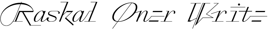
Emmanuel Rey – Raskal Oner Write (Swiss Typefaces)
What inspired you to design Raskal Oner Write? Was it for a particular project?
The idea for Raskal came from the need for a script font at Swiss Typefaces. Back in 2012, while I was in charge of developing the corporate identity of the Kunstmuseum Luzern, we needed a script font for gala invitation cards. All fonts used by the museum were custom-made by us but we did not plan a script font, and I had to use Bickham Script at the time.
Two years later, in 2014, I started to work on Raskal Oner, with this question in mind: What would a true Swiss Typefaces script look like?
The characters look as if they were written with a fine-nibbed pen. Did you sketch the characters on paper before digitising them, or was it designed on the computer?
The hand-drawing stage came late in the process, in 2021. The initial drawings were done digitally, but they were inspired by a calligraphic model: a calligraphic script used on the top of Louis Simonneau’s copperplates showing the Romain du Roi design, 1695.
Although I can’t find any other typeface to compare it with on Identifont, there are echoes of monospaced typewriter fonts, such as Letter Gothic Slanted, in the lower case. Were these an influence on Raskal Oner Write?
No, not at all.
The characters vary from relatively conventional, such as the ‘N’, ‘T’, ‘U’, ‘a’, ‘p’, and ‘q’, to the totally eccentric, such as the ‘D’, ‘V’, ‘Y’, ‘c’, and ‘e’. Did you have a guiding principle in designing each glyph?
Some characters are inspired by the calligraphic model which was used as a starting point to Raskal Oner. All other shapes were drawn only with visual result and efficiency in mind, and some designs came out to fulfill the monospace aspect of the typeface. Of course, not all the final shapes came from the first draft. It was back and forth with testing the font in real-life setting, and building all contextual alternates which organically lead to some design decisions.
If you want more context on the 10-years long process that led to Raskal Oner Write and have a look at how it has evolved from a traditional script font to a LAB font, you can have a look at the article written by Dan Reynolds and illustrated with many archive images describing the different steps that led to the final result: https://www.swisstypefaces.com/read/raskal/.
![]()
![]()
![]()
![]()
![]()
Richard Lipton – Collier (Lipton Letter Design)
You've described Collier as a flare serif, occupying the rare zone between serif and sans serif. What inspired you to design it?
Collier owes its existence to a chance encounter with an Ex Libris (bookplate) found in The Art of Lettering by Carl Lars Svensen, published in 1924. The bookplate was delicately hand-lettered by the Austrian lettering artist Hertha Ramsauer, who was either a colleague or student of Rudolph von Larisch, the Austrian archivist who lectured on lettering and typography in Vienna in the early twentieth century. The capitals exhibited an elegant contrast and subtly flared serifs that struck a chord with me. Those few letters provided the seed for Collier’s design.
The closest fonts I can find to compare with Collier on Identifont are Berthold Wolpe's 1932 font Albertus, and Arthur Baker's 1965 font Baker Signet. Were these an influence on the design?
Not directly, any more than Hermann Zapf’s 1958 Optima was, an iconic and subtly flared serif. Because I had direct source material to work from, I tried not to be influenced by related type designs.
The whole Collier family is quite massive, consisting of 12 weights from extra thin to ultra, 7 widths from compressed to wide, and Roman or Italic, giving a total of 168 fonts. You've also provided two variable fonts, Roman and Italic. Did you design Collier as a variable font from the outset, or was the variable font created as a final step?
The Collier family was designed as a variable font from the outset. I provided the many fixed styles as sort of pre-variable offering for those users who didn’t want to tangle with this new font format for whatever reason they had. The family was re-released this year including the two variable fonts.
Collier occupies a magical space between serif and sans serif, combining the best of both worlds. Because of its balanced proportions and moderate contrast, as well as the lack of intricate details in its letterforms, it doesn’t need optical sizes. The tapered finials and flared serifs look refined in display settings. Those serifs ground the characters, creating a comfortable text flow, while the open apertures keep Collier readable in text sizes.
This versatility means that it should be equally at home in editorial design, identity design and branding, corporate use, and packaging — the applications for the family are virtually limitless.