New Additions: March 2018
19th April 2018
We add hundreds of fonts to the Identifont database every month. Most of these are recent releases, and some are simply new acquisitions from foundries who were not yet represented on our site. Stephen Coles gives his take on the most interesting recent additions.
![]()
![]()
![]()
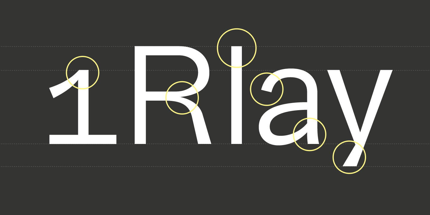
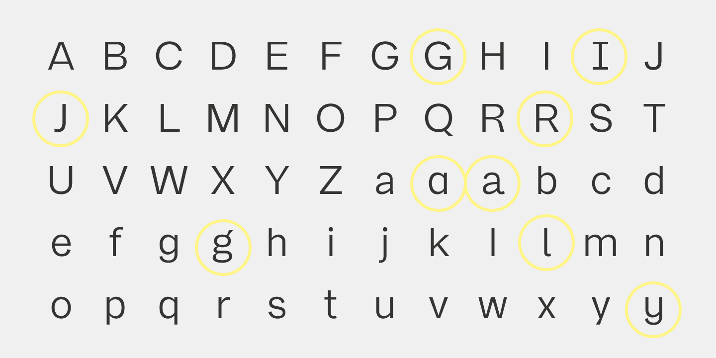
While Franca’s name comes from a combination of (Fran)klin and Helveti(ca), the result feels even more like a contemporary take on the clean workhorse Gothics (think News and Trade) from earlier in the 20th century. René Bieder brings a fresh finish to the genre, such as circular dots, and a subtle contrast and flaring. Don’t miss the many alternate glyphs which significantly extend Franca’s vocal range. Compare also to Urban Grotesk, Benton Sans and Neutral.
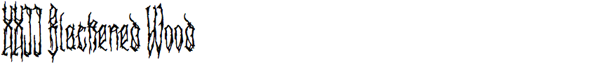
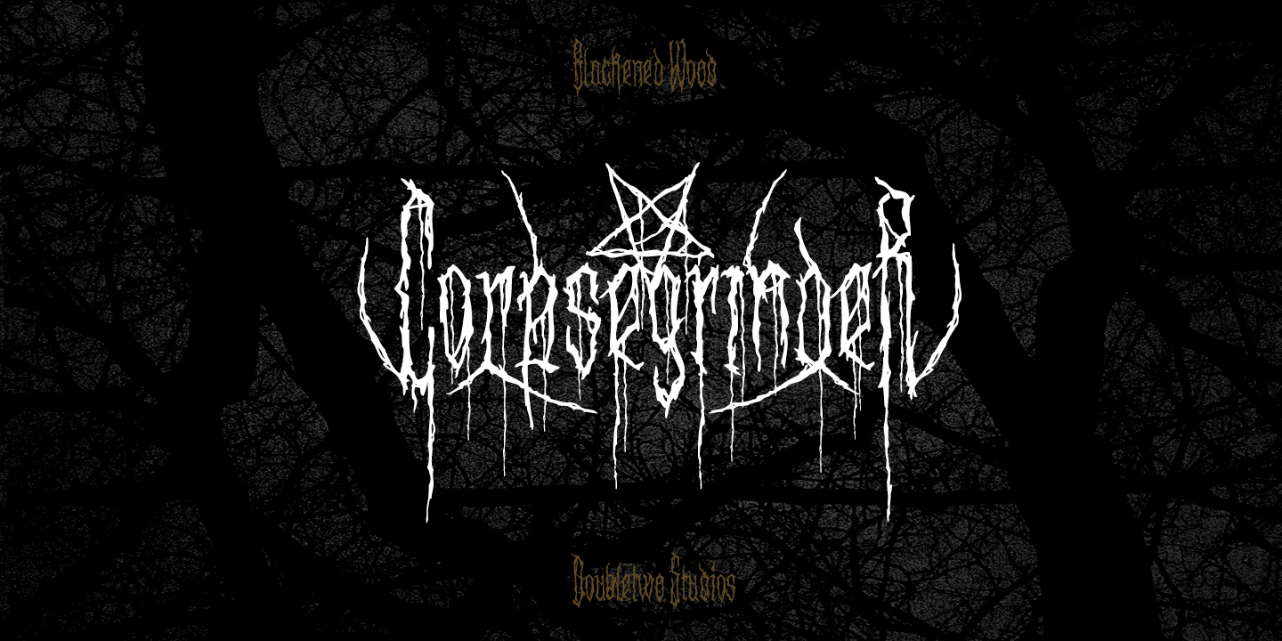
Lecter Johnson designed XXII Blackened Wood in 2013, but it’s new to Identifont and worth revisiting. It is among a series of Doubletwo Studios fonts that convincingly emulate the lettering associated with death metal bands – see also Total Death, Goregrinder, and Gory Bastard. Blackened Wood’s ability to achieve that textured, moody effect comes from a rich set of alternates, ornaments, and decorative strokes best seen in its specimen PDF. And, of course, if you want the metal logo look, you gotta aim for symmetry.
![]()
Johnson isn’t just about the aesthetics of the occult; XXII CoolScript shows he has a lighter side. It’s just as well considered as his death metal fonts, though, with a similar looseness and organic quality achieved by an irregular baseline and plenty of OpenType features. Again, don’t miss the detailed PDF specimen.
![]()
![]()
![]()
![]()
Peristyle is high-contrast Art Deco in the spirit of 1930s type like Corvinus and Radiant. This style has already been thoroughly explored by Giorgio, Niagara, Couture, and Skyline, but Hoefler & Co. always have something unique up their sleeve. Here, the descenders are extra short, the curves extra taut, and the ocassional ball terminal adds sparkle to a line, but Peristyle’s real crowd-pleaser is the Layers variant with fonts that “automatically adjust the assignment of colors from shape to shape, in order to maintain an even rhythm”.
![]()
![]()
![]()
Monotype’s Alfie is a group of related scripts with an upright stance and perky bounce. The set includes a mostly connected Script, a disconnected Casual, an Informal that incorporates serifs and a roman lettershapes, and a set of Small Caps. All the styles can work together on the same page for more complex typography than most handlettering fonts can deliver. It might be considered a one-of-a-kind concept if Underware hadn’t created Liza in 2009.
![]()
![]()
With its fine tapering lines and complex vectors Dream Team is the kind of font family that would have crashed computers and laser printers in their early years. (At nearly 1MB per style, the file size alone would be problematic.) Fortunately, we now have the processing power and resolution to display this intricate design. You can’t really see the detail in the above sample, but it’s visible here. I appreciate that there are two “weights” which not only give you two options for overall darkness, but also offer the optimal gradient effect at different sizes. Resistenza’s Dream Team is a more mature follow-up to their Afrobeat from 2011, whose circular forms are even more eyecatching in isolation but less effective in words.