New Additions: July 2023
31st July 2023
From the hundreds of fonts we add to the Identifont database every month we chose a selection of the most interesting recent additions, and interviewed the designers about their approach to each design:
![]()

Ricardo Esteves Gomes – Ponta Text (Outras Fontes)
What was the development process for Ponta Text?
The first sketches started in 2019 with the design of the regular and italic fonts of what would be called Ponta Text. Then during the pandemic the project was paused due to various external factors. Then, back in 2022, the process was restarted and I designed all the other weights and styles with the intention of having a type family that works both as static or variable fonts. The end result was a text family composed of 18 static fonts in nine weights (from thin to black) and two variable ones (Roman VF and Italic VF).
What inspired the design of Ponta Text?
It was influenced by different Dutch typefaces, but especially by Alverata from Gerard Unger, prompted by reading his book "Theory of Type Design". Even though the two families are considerably different from each other, that was the main insight: to have what we can call an incise or flare if you prefer. intended for long-form texts such as books and magazines, in print or digital media.
Another characteristic that I had in mind was to have slightly condensed letters so the typeface can easily adapt to the modern conditions of reading, as we have for example in our smartphones, where the column of text is always tight – so it can increase the number of characters in each line of text.
Finally another formal attribute that I wanted to explore was the sharp edges. That's what the word "ponta" means in Portuguese (my natural language): a sharp tip or edge.
Ponta Text has some similarities with Berthold Wolpe’s classic typeface Albertus. Was that an influence on its design?
I'm sure that Albertus is one of the masterpieces of the 20th century in this category, so it is almost impossible to say it hasn't influenced me in this project on a subconscious level, and we can go back until the Roman Empire here. But I believe that I was most directly influenced by recent type designs as mentioned before, as well as the will to have something unique in a certain way.
The fact that you’ve called it Ponta Text suggests you may be considering a display style for larger sizes. Is that a possibility?
You can bet on that! Definitely Ponta Display is in the plans for the future; I just can't tell when it's going to be ready. Probably soon.
![]()
![]()
![]()
![]()
Ján Filípek – Natri (DizajnDesign)
Natri is a pen-drawn typeface in three weights and five widths. What led you to design it?
Yes, it is pen drawn, but it is even more influenced by broad brush and wide chalk marker. The brush influenced mostly the bottom of rounded letters, marker gave an idea to geometrical stroke shapes (beginnings and endings).
When I was starting with sign painting, I did not really find an exact alphabet model which I could practice. Or maybe I wanted my own and I developed an alphabet based on various faces.
My hand was not steady enough so I made a digital version. That served me as starting point to practice the letters. The digital version influenced my handwriting and shapes quite a lot. The entire font was made afterwards.
For examples of calligraphy works which later evolved into Natri see Development sketches.
A distinctive feature of Natri is the low middle strokes of many letters, such as the ‘B’, ‘E’, 'H’, ‘a’, ‘f’, ‘g’, and ‘y’. What was the inspiration for this feature?
Natri is mainly influenced by American speed stroke caps (casual sign painting style). I liked the lowered middle strokes. I think I saw this feature first in some art nouveau typefaces, or maybe subconsciously wanted to keep a little bit of retro feeling.
Did you begin by sketching characters on paper with a calligraphic pen, or do you work directly on the computer screen?
I tend to sketch some of my fonts in the computer first and then come back to paper.
This was not the case when I was designing Natri. I made many sketches on paper, blackboard, and glass with various tools like broad nib, chalk marker, and broad brush with acrylic and oil colours.
Natri is also available as a variable font with width and weight axes. Did you design the normal regular style first, and then develop the variable font from that as a starting point?
I designed Natri Narrow and Natri Bold Narrow first. But years later, when I was making the shop window for a grocery store, I found that one width was really not enough. I was combining sign painting with plotter-cut foil, and was a little limited with one width. For this job I designed a few letters with a wider width.
After this experience I decided to have more freedom and expanded the family to a variable format as well.
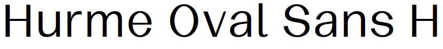
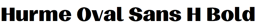
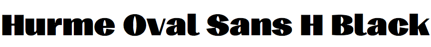
Toni Hurme – Hurme Oval Sans (Hurme Design)
Hurme Oval Sans is large collection of fonts with four widths, seven weights, and two families: Low Contrast (L) and High Contrast (H). Did you plan it as two families from the start?
Yes, I had a quite clear plan in my mind when I started. I drew the four extreme styles of width and weight first and then went on with intermediate masters and contrast axis.
Hurme Oval Sans High Contrast is reminiscent of Robert Hunter Middleton’s typeface Radiant Condensed: Compare Hurme Oval Sans High Contrast Condensed Bold with Radiant Condensed. Is that fortuitous, or was it an influence on Hurme Oval Sans Contrast?
Hurme Oval Sans wasn’t directly inspired by any particular typeface, but by a lot of the (what I believe was) hand-painted typography from early 1900s I’ve seen over the years. I came across these styles in books, comics, photographs, posters, and old movies, mostly of American origin. I was attracted by the casual friendlyness many of them shared and wanted to achieve something similar but also make it more modern and rational at the same time.
I didn’t want the new font to look like from a certain period or old in general. I anticipated that incorporating stroke contrast would lend a sense of age to the design, while maintaining a rational approach would balance that effect to some extent. Also many of the old hand-painted references were too quirky or even comic for my taste so I tried to steer away from that. What stayed with me was the recurring oval shape found in many of these references, as well as the varying levels of contrast. So I set out to draw the new font that would incorporate the two.
You’ve also made Hurme Oval Sans available as a single variable font, with weight and width as two axes, and the two families as a single Contrast axis. This gives the interesting possibility of choosing intermediate contrast settings; do you anticipate applications for this?
I’ve often wished some fonts would have a possibility to adjust contrast. A plain sans, aiming for monolinearity, can often look too sterile for the purpose and could benefit from increased contrast. However, excessive contrast easily brings to mind typefaces from the early 1900s, like Broadway or the aforementioned Radiant Condensed. It can depend on the context. Therefore, I thought the ideal solution would be to provide users with control over the contrast based on their personal preferences.
Of course one could combine low-contrast and high-contrast styles, implementing high contrast for headings and low contrast for body text. Initially, I hadn't considered other potential use cases, but now that you mention it, perhaps the contrast slider could even be utilized to fine-tune the gray level of a text block. Or it could be employed to match the thin stroke thickness of different text sizes. It is always so interesting to see what graphic designers come up with and how they employ fonts in their work.


Måns Grebäck – White Lotus (Måns Grebäck)
White Lotus is a casual handwriting font, a bit messy and with a slight slant, just like typical handwriting. Is it based on your own handwriting, or do you look elsewhere for inspiration?
White Lotus is a font created to look like a quick scribble while being legible, and without appearing nonchalant. While it does not have a direct inspiration, the goal was to make an open-hearted type, a work of optimism and warmth. I am imagining the type on a personal invite, for example.
I am inspired by all letters that are outside of the norm. Some of the first fonts I created were based on variations of my own handwriting, but after a few styles that quickly got repetitive. So I am always looking at how people unconsciously solve typography when writing.
Like many of your handwriting fonts, White Lotus makes use of OpenType features to select alternate characters depending on their position in a word, and you also allow the user to type underscores for swashes. Are there any other special OpenType features users can select?
I am often trying to push the limits for what a font is, and White Lotus is a great example of that, as I have included swashes as actual characters. I have also built a function to make flowers in the same font; write an asterisk ‘*’ to make a flower, or multiple asterisks for different flowers. Depending on how playful a font is, I may try out different ideas and offer the user some Easter-egg type functions which can create cool effects for those who are willing to experiment. My fonts also come with alternates, so I'd recommend having 'contextual alternates' activated when using my work!
You’ve also provided two alternate fonts with White Lotus. Why did you decide to do this, rather than providing OpenType alternates in the main font?
This is always a tricky decision. Nowadays, fonts have the potential to contain all variants, even different weights and widths, in the same font file. While I love experimenting with this (see Variable Fonts) I do think that accessibility for the common user may suffer if everything is very technical or a font is only fully usable with the right professional software. This is the reason that I sometimes build an alternate version of a font: I want you to be able to use my work even if you're using MS Paint. The alternates are often present in the original font as well.
In your biography you describe yourself as specialising in script fonts. Do you start each project with an idea of a particular style of handwriting?
I usually begin with trying out different styles, by drawing a few letters. It can be in a strict script style, or quickly handwritten in order to get a genuine fast look. If I discover a style I like, I try to see if I can expand the look to more letters, maintaining the feeling the first few emitted. At this point, I usually sketch and draw the letters very carefully directly as vector, rather than actually handwrite. One of my favorite challenges in font design is to make type seem dynamic and handwritten, and look as far from a font as possible.