New Additions: August 2022
31st August 2022
From the hundreds of fonts we add to the Identifont database every month we chose a selection of the most interesting recent additions, and interviewed the designers about their approach to each design:
![]()
![]()
![]()
![]()
![]()
![]()
Natalie Rauch – Rumiko (TypeMates)
Where did the idea for Rumiko originate?
The initial starting point for the type family was a slab serif that contained all the strong features and personality now visible in the sans. At some point the sans overtook the slab and some of its new ideas are currently being brought into a serif counterpart which is still in the making. I wanted to design a warm and useful type family; something functional yet personal and kind. The sans took over because it was somewhat clearer to first bring out those aspects there.
Rumiko is a family of two styles: Rumiko Sans and Rumiko Clear. Did you plan it that way from the start, or did you decide to add a second style at a later stage?
Actually I did not. Within the process I realised that it might be helpful to add a version that grasps the main character but is slightly toned down. Often those exact details make a big difference and are decisive for the use of a typeface.
I’m trying to characterise the differences between Rumiko Sans and Rumiko Clear: Rumiko Sans seems more informal, with linking strokes on some letters, and some letter shapes such as ‘a’ and ‘y’ are like handwriting, whereas Rumiko Clear is more typographical (compare Rumiko Sans with Rumiko Clear). Is that a reasonable description?
Yes. The Sans is flowy and reflects writing. The Clear is robust and typographically fine-tuned. Yet they are both unified through their legibility, overall appearance and italics.
Rumiko is a Japanese girl’s name; why did you choose that, and are there any Japanese influences in the typeface?
I was looking for a name that reflects the essence of the typeface. I was searching for names with certain meanings rather than something particularly Japanese. The Japanese Kanji characters for Rumiko mean “flow” and “kindness”. Coincidently, and luckily, the name also includes very characteristic letters for both the Sans and the Clear.
![]()
![]()
![]()
![]()
![]()
![]()
Yorlmar Campos – Atlante (TypeTogether)
Where did the idea for Atlante originate?
The first sketches were inspired by some maps made by the cartographer and geographer Abraham Ortelius between the 16th and 17th centuries. Initially we were interested in the development of a flourished cursive typeface with a great deal of expressiveness.
You’ve written that Atlante was inspired by two different writing tools: the flexible pen and the flat pen. Can you explain what the difference is, and how this influenced the design of Atlante.
The most noticeable difference is the way in which the contrast is expressed with each instrument, by translation in the case of the flat pen and by expansion in the case of the flexible pen. In the maps, we found the hybrid structure of the letters fascinating, and the particular way the strokes were extended. For this reason we tried to integrate it and express it. This hybridisation was approached as an integral system, which is why the roman and italic are so different, to emphasise their differences while letting them coexist naturally.
A distinctive feature of Atlante is the spur of the ‘G’, which seems to follow the curve of the bowl, rather than pointing forward as in classic fonts such as Van Dijck and Janson. Where did the inspiration for this come from?
There is a lot of influence from the cursive, because it always seemed excessive – in a good way - and in order not to lose it in the uprights, we decided to transfer those gestures, which are an interpretation of the continuity of rapid writing through the least number of strokes.
The italic is unusual in that it looks almost handwritten, almost like a chancery italic rather than a typographical italic. Were you aiming for a more fluent appearance than with most text italics?
The italic was the first we designed and we sought greater expressiveness and fluidity in its strokes, because from the beginning we were interested in integrating it well with capital swash letters. As the italic is so expressive, we decided that the upright style would be calmer and more serene, so we were interested in making the contrast between both styles very noticeable.
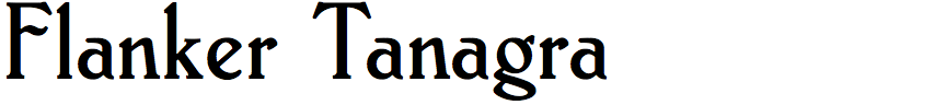
Leonardo Di Lena – Flanker Tanagra (Flanker)
Flanker Tanagra is a rather unusual typeface, originally designed by the Italian designer Natale Varetti in 1924; how did you encounter it, and why did you decide to create a revival?
I came across this font for the first time when reading “Questioni di carattere. La tipografia in Italia dal 1861 agli anni Settanta” (Matters of character. Typography in Italy from 1861 to the Seventies), where I found a reproduction of some of the letters of the font itself, taken from “Archivio typografico” (an Italian typography magazine) of 1924.
I was immediately struck by its clean and slender lines, its elegance and, last but not least, its retro style which give it a strong personality. Another factor that contributed was the fact that this font has been practically ignored until today, which doesn't do it the justice it deserves. The same thing had happened with Alessandro Butti’s Semplicità, with the aggravating circumstance that Semplicità was a well-known and widely used font in Italian typography until the 1970s.
Actually, although Tanagra was created in 1924, the design was executed in 1911 (the original name was “Ancora”, or “still” in Italian), for a competition held the year before. The 1910 competition, promoted by Nebiolo itself, was intended to give new impetus to the Italian typographic art. In those times the predominant style in Italian publications was Liberty or Art Nouveau, and it is by taking inspiration from this style that, most likely, the font took shape.
What historical materials did you work from; were you able to find original drawings?
We come to the crucial point of the story: I have never found Varetti's original drawings, and, with the closure of Nebiolo, I would not have even known where to look for them. Over the Internet the font was practically absent, very little material could be found on some expert forum (for example, I found a nice useful image of the italics on Typophile, a forum that is no longer online).
Fortunately, I found an issue of “Archivio Tipografico” in Buenos Aires, written in Castilian and printed for the Argentine market, and I bought it immediately. I then relied on the high resolution scans of the shapes of the 16pt size (the other dimensions have significantly different contrasts and proportions). I then found other issues of “Archivio Tipografico” on Google Books (if you want to take a look, find the issue I bought at this address).
As designers will know, when copying a font you still have to make some decisions, for example interpreting the original design by reading through the print artifacts and establishing the simulation of ink expansion, and paper softness and absorption, and so on.
Several of the letters in Flanker Tanagra, such as the ‘N’, ‘P’, and ‘R’, look distorted compared to more conventional fonts. Do you know what influenced Natale Varetti to design them in this way?
I do not know what influenced Varetti for the construction of these letters, probably the style of the early twentieth century, given that in this period (1910) the Italian production of characters, friezes, and illustrations is still very much influenced by the Liberty style.
In the announcement of the contest it was specified that the new font should be easily readable, but with fancy components that could allow its use even in more decorative compositions.
I wanted to modify the ‘N’, together with the ‘Y’, ‘f’, ‘t’, ‘z’ and others, to make the font less extreme and excessively decorative.
In addition to your historical revivals, like Flanker Tanagra, your work includes several original typeface designs, such as Elettra, Selene, and Selene Book. Which work do you find most challenging?
In my opinion, creating a new font that is not trivial and, at the same time easily usable and readable, is always a difficult undertaking. I worked a lot on Selene and Selene Book to make them as clean and tidy as possible.
To cite another example, I have been working for many years on a sci-fi font that is very difficult due to the too many constraints I have given to myself: it must have only one inclination, be stencil, futuristic, and gothic at the same time. It's going so slowly that I wouldn't be surprised if it is my last font.
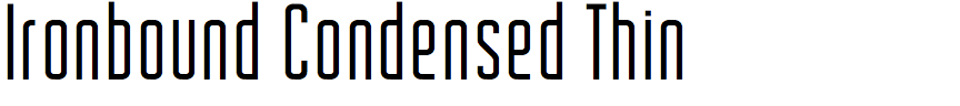
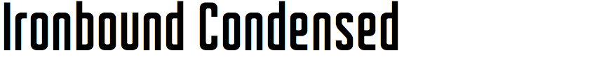
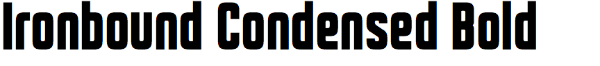
Jason Carne – Ironbound Condensed (Carmel Type Co.)
Ironbound Condensed is a retro-style sans-serif font in nine weights; did you design it for a particular project?
My reason for designing any typeface usually comes down to two things – does it fill a need, and is it something that I personally would want to use? If it meets both of those criteria, I know I have something worthwhile on my hands. While there are admittedly plenty of typefaces in the same arena of Ironbound Condensed, none of the ones I found on the market checked all of the boxes for me personally. Some would get close to what I was looking for in a few categories but fall short on others. Perhaps they'd have the look, but they wouldn't have the weight range, or they'd have rounding on the exterior corners but not on the interior (which would create problems for neon-styled treatments to the type and other stylizations) – so I saw there was an opportunity to combine what was missing from the other options into something new and useful.
You’ve written that Ironbound Condensed was inspired by the cast metal letters of classic storefronts in New York City. To design the font did you work from photographs of actual signs?
Those storefronts were definitely a major influence, but I didn't want to reference any one individual source too heavily, so instead I went into this project with a more generalized approach where my aim was to evoke the essence of that style and era without directly lifting anything from anywhere specific. When I was a kid in the 90's, I remember New York City being replete with shops that had unique window displays and beautiful buzzing neon signage, but today it seems like every few years (or sometimes, months) these stores are changing hands and being torn down or covered up in favor of something more temporary and with less personality. Some of these great places still remain – like Katz's Delicatessen or Radio City Music Hall – but if you go looking for them away from Times Square and the more tourist driven sections of the city you can still find other beautiful examples of this style of lettering adorning buildings.
The characters appear to be drawn on a grid, although there are some exceptions that break out of the grid like the leg of the ‘K’ and ‘R’. Did you have a system for designing the font, and were there any characters that caused particular problems?
That's mostly correct, this particular typeface was a mathematical exercise and one that used a modular system of elements to make up the majority of its character set. When it came to breaking this formula, it was mainly out of necessity to keep characters from being too closely related and potentially being mistaken for a different character. For example, a few pain points were the ‘B’ and ‘8’, ‘A’ and ‘R’, and ‘K’ and ‘H’, and these were especially apparent in the lighter weights. To remedy that issue the little kick at the foot of the R and K were brought in to differentiate them from their straight-legged counterparts. As an added bonus, they visually tucked nicely into the negative space of round characters if they were adjacent. For the ‘B’ and ‘8’ pair, the converging points of the two bowls were brought further inward for better clarity of the negative form, making them some of the few characters where optical adjustment superseded mathematical precision.
There are some nice examples on your website showing inline text, a 3D rendered neon sign, and 3D metallic letters (see Ironbound Condensed | Carmel Type Co.). Presumably these are all created using the standard typefaces?
One of the main things I try to achieve with the promotional imagery for all of my typefaces is to show what's possible beyond basic typesetting. I want to inspire ideas in my customers of what they can make with my type to help them or their clients truly stand out from the crowd – so whether that's doing something simple like adding a drop shadow or inline effect, or something more elaborate like the 3D rendered “Sandcastle Motel” neon sign design, I think it goes a long way towards showing the potential the type contains.