New Additions: February 2023
28th February 2023
From the hundreds of fonts we add to the Identifont database every month we chose a selection of the most interesting recent additions, and interviewed the designers about their approach to each design:
![]()
![]()
![]()
![]()
Emmanuel Besse – Malamocco (Formagari)
I understand that Malamocco was inspired by signs in Venice, Italy. What made you decide to design a typeface based on these?
Whenever I go to Italy I’m amazed by the quality and diversity of street signs. I think it comes from the period in the 1960s and 1970s where industrial design was so strong; it has to have inspired the visual landscape. If you look at signs, posters, and catalogs from that era there is something special going on.
What materials did you work from when designing Malamocco? Did you take photographs of examples you found interesting?
There is one particular sign that inspired the design because it has a particular lowercase ‘a’ and ‘e’, and also because I found the contrast interesting. I started from there but keeping it only in mind, without putting the image on a background layer and drawing over it or something that precise. I was just interested by a general feeling that led to the global art direction for the family.
Many of the characters in Malamocco are similar to those of a familiar sans-serif typeface such as Helvetica, but some are distinctly idiosyncratic, such as the flattened ‘D’, the forward-leaning ‘S’, the flat-bottomed ‘U’, and the thin-waisted ‘8’. Were these all inspired by examples you’d seen?
For the rest of the typeface, I wanted to draw inspiration from several other street signs that I photographed, in Italy but also in France, Germany, and other places mainly in Europe. Like many type designers, I’m very fond of vernacular typography, because of the little graphic accidents initiated by the visuals environment or the amateurism of their creators. ‘S’ are spontaneously flipped, the styles change from one letter to another, etc. It creates something vibrant and pleasing to the eye.
It’s also the way we draw typefaces nowadays, in my opinion. On the one hand, contemporary designers are less concerned by certain dogmas (in terms of letter relationships, proportions, roundness, etc.), and on the other hand there are so many fonts on the market now, that you have to stand out by injecting tiny visual variations.
Does Malamocco’s individuality make it most suitable for headings and display use, or do you intend it for text use too?
I think it can do well in both scenarios. The idiosyncratic details you pointed out sure make Malamocco interesting for display use in titles or posters. It works also perfectly for branding. That said, I intended the typeface to look good in small sizes. It has a rather small x-height coupled to confortable spacing, which makes it elegant for captions and text. My friend Marc Armand designed a whole identity and catalog for an exhibition on Italian Design using Malamocco for titles and text (see Futurissimo, l’utopie du design italien on Fonts In Use).
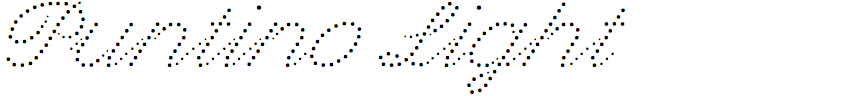
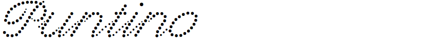
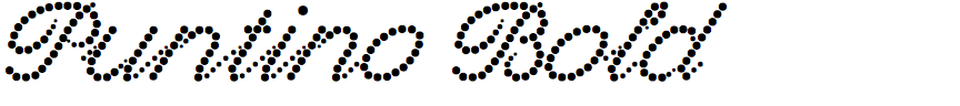
Arne Freytag – Puntino (Fontador)
Puntino is a script typeface in which the strokes are formed from dots. What gave you the idea of designing it?
The idea actually came out of the design of an application, I was looking for a dotted script for a Christmas card; it should be a bit reminiscent of wintertime and snow and so typographically fit into the motif. Then I didn't find a suitable one, or rather I found out that there are almost none. The latter is probably rather rare today, because it is becoming increasingly difficult to find small niches.
I’ve seen one or two dotted script fonts before, such as Dot Script, but Puntino is unique in that the dots vary in size to give an impression of stroke thickness. Did you plan that from the outset, and was it difficult to achieve?
Yes, this was planned from the beginning and I already had this idea with Punto. The design problem with punctuation is the distribution of the distances between the dots, ie to always end with the same distance exactly on the point, regardless of the shape and length of a line. Which is actually not possible. In order to achieve this anyway, some dot fonts simply reduce or increase the distances between the dots. Characters with different distances in the dots give an unharmonic overall picture, in my opinion. I wanted to avoid this, and in Puntino (as well as Punto and Punto Poly) I did not vary the spacing, but the dot sizes. In addition, there is a flexible blank space for dipping curves such as ‘a’, ‘b’, ‘d’, ‘g’, ‘p’, and ‘q’ as a visual balance and to harmonize the overall look of the font.
The most difficult part was actually to program the different possible letter combinations as OpenType features. A handwritten letter such as ‘u’ has different connections at the end of a word than at the beginning or in the middle. But this is only possible by activating Standard Ligatures and Contextual Alternates in an application program.
The typeface is constructed purely with components and can thus be modified and extended in a few simple steps. The dots are fixed in the whole font, they form the ductus. However, they are components, so each dot is virtually only a link to a master template, in which only the original dot is located, which is used in the whole font. If I replace the dot in this master with an star, for example, it is immediately replaced and visible throughout the font. There's a lot of room for experimentation there. Punto Poly follows the same principle and of course the different styles can then be stacked as layers.
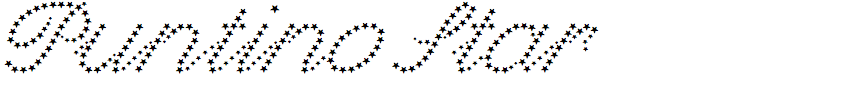
Did you have any specific applications in mind for Puntino, and in particular the fun Star style in which the strokes are composed of stars?
I think Puntino is suitable for all applications for which other script typefaces are suitable. The fun star style was especially for Ziggy Stardust …
![]()
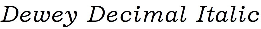
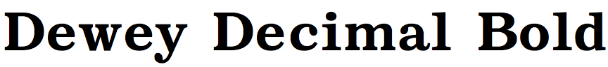
Frode Helland – Dewey Decimal (Monokrom)
You’ve written that Dewey Decimal is based on Documentary, a single-weight proportional typewriter font for the Friden Flexowriter teleprinter. What sort of applications was the Justowriter used for, and what inspired you to revive one of its typefaces?
The Flexowriter, and its successor the Justowriter, were released at the same time as the earliest computers, providing an intermediary step in the transition from manual typesetting to digital desktop publishing. Paired up with a recording unit, space characters of varied width could be recorded on a paper tape and inserted in the final text to produce justified columns. It was often used in short-run publications, instruction manuals, manifestos, but also in newspapers. Later on American Type Founders produced their ATF Typesetter built on a modified version of the Friden platform for phototypesetting.
I was researching text faces for a website redesign when Documentary came to my attention. There was just something very appealing about the slightly off-kilter proportions. An earlier, as of yet unpublished, design of mine explores the same transition period from analogue to digital typesetting and the typographic approximations employed to bypass the shortcomings of the tools – things like mathematical slanting, computer-generated faux bold, doublestruck blackboard bold, underlining italics, combining two existing characters to create a new one, etc. Dewey Decimal was developed to work alongside this design.
Compared to Chauncey H. Griffith’s Excelsior, on which Documentary was based, you’ve chosen a more open character spacing: compare Dewey Decimal and Excelsior. Does this reflect the teleprinter heritage of Documentary?
The loose spacing is a byproduct of the unit system, where the narrowest characters are drawn on the two unit width and the widest – such as the ‘M’ – span five.
Documentary was only produced in a single weight, but you’ve extended Dewey Decimal into a family of three weights with italics. What did you use as a guide for the additional styles?
The only direct reference material I have in my process folder is a specimen showing of Morris Fuller Benton’s Century Expanded Italic from Adcraft Typographers Inc. My design is less flamboyant, so it was more of a loose guideline. I probably also referenced other designs to establish the contrast between thick and thins in the bold. For the most part, I would draw intuitively. The Ionic and the earlier Didones are quite well established models that I am somewhat familiar with.
The name Dewey Decimal suggests the widely-used library classification system. Were you anticipating possible applications in book design and publishing?
I have no idea how people will use it, or if they would even want to. I have been using it myself to produce some business documents, small publications, and it is quite comfortable as a default browser font. It is probably too sober to make a big splash, but that’s fine by me. I have no interest in winning anyway.
The name mainly reflects my appreciation for the public library service and the archivists and librarians that make all this knowledge available to me. In Norway my local library offers remote loans and the National library in Oslo expands this service to reach outside our borders. That means I can access rare, and often expensive, books from all around the world.
![]()
![]()
![]()
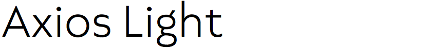
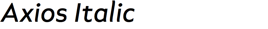
Rodrigo López Fuentes and Sergio Leiva Whittle – Axios (TipoType)
What was the original inspiration for designing Axios? Was it for a particular project?
In the search for new ideas I was sketching letters in different styles but always based on this specific number, direction, and sequence of strokes (the Humanist ductus) trying to convey the classic elegance of this timeless structure through the appearance of a different model. I realised that the purity of forms provided by the geometric sans-serif model was ideal for the interpretation of the ductus. Also, the strong DNA link between this model and Roman square capitals made the transition pretty organic, and suddenly everything seemed to make sense. Soon the sketches on paper turned to vectors on screen and the self-imposed requirement of the humanist ductus became the perfect fit for the geometric simplification of forms and counterforms. From that moment on the design process became less instinctive and Euclidean logic took over the project.
An earlier version of Axios was released by your Untype foundry in 2018. What has changed since that version?
The opportunity to revisit the design appeared when we started to explore the idea of making a variable version. Most of the design decisions on the first version of Axios were taken into the borders of a strong conceptual frame. This time the approach was to reshape forms and counterforms just looking for a better visual balance, and that equilibrium makes a huge difference; it now looks less noisy, more steady, more mature if you like, especially in the italics. The set was expanded to more than a thousand glyphs per style and includes many resources and OpenType features to increase its possibilities and functionality. It's a typeface that you can explore and be surprised by, it can be pretty fun to use, and last but not least, this new version is available in variable format.
Axios is reminiscent of ITC Johnston and Gill Sans by the British designers Edward Johnston and Eric Gill. Were they influences on the design?
Of course, in every creative process you have to take a look to the past and search for references. The designs of Johnston for the London Underground were a huge influence, especially at the beginning. The rounded diamond shape on the lowercase ‘i’ and ‘j’ on Axios are the evidence of this admiration and stands there as our humble tribute to his work. Anecdotally we can add that Edward Johnston was born in Uruguay like the publisher foundry TypoType, so everything was somehow connected!
Distinctive features of Axios are the low bar of the ‘F’ and the low bowls of the ‘P’ and ‘R’. What inspired these aspects of the design?
I have this weird theory that the Latin alphabet has some kind of tectonic sense, that like Roman ancient buildings relies on a structure with their foundations well established on solid ground. In our case, letters stand over the baseline with some sense of gravity over them, and in order to avoid any visual tension and be comfortable for the reader, they must reflect structural stability. The low bar on the ‘F’ and the low bowl on the ‘P’ are the result of this intention to give structural stability to the letters; in the case of the ‘R’ it is just to keep consistency.