New Additions: September 2024
30th September 2024
From the hundreds of fonts we add to the Identifont database every month we chose a selection of the most interesting recent additions, and interviewed the designers about their approach to each design:
![]()
![]()
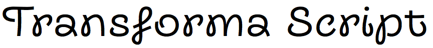
Vika Usmanova – Transforma (Fontfabric)
The Transforma family consists of Sans and Script styles, and an unusual Mix style which incorporates some script glyphs into the sans style. What gave you the idea of creating a family like this?
The idea for Transforma sparked from a desire to create a typeface that could seamlessly transition between different styles. We envisioned a font where letters would morph from a unique starting point to a clean sans-serif style. However, as we developed these initial script forms, we realized they had a distinctive character of their own. The sans-serif versions we created alongside them also seemed to work well as a separate typeface. The combination of these two styles, born from the same creative process, felt like a natural fit for a cohesive font family.
Transforma Script is a loopy handwritten style that reminds me of the old Adobe font Giddyup. Was that an inspiration for the style?
That’s interesting to see the resemblance! While there are definitely some similar playful elements in both fonts, Giddyup wasn’t a direct source of inspiration for Transforma Script. Our aim was to create a font that captured the natural flow and expressiveness of everyday handwriting, rather than referencing a specific existing font. Perhaps during the design process, we were subconsciously influenced by similar aesthetics that are common in handwritten styles.
By default the Mix style is identical to the Sans style, but it uses OpenType Contextual Alternates to mix some script characters in with the sans characters. Why did you decide to use OpenType, rather than make the Mix style a standard font with fixed glyphs from the other two styles?
Using OpenType Contextual Alternates provided us with greater flexibility over the Mix style. This approach allows for more organic and varied combinations of script and sans elements, depending on the specific context of the text. It’s a way to introduce an element of spontaneity and unpredictability while still maintaining a cohesive overall look.
The Transforma Sans style includes four additional heavier weights, from bold to extra black, that aren’t provided in the Script and Mix styles. Did you feel that the heavier weights didn’t work well in the script style?
Indeed, the heavier weights might not have been as suitable for the script style. The script’s delicate, flowing nature could have been compromised by excessively thick lines. We wanted to maintain the balance and character of the script, and we felt that the lighter weights were more appropriate for its aesthetic.
Transforma seems ideal for conveying a sense of fun in consumer products and children’s games; are these the sort of applications you had in mind when you designed it?
Absolutely! Transforma’s playful and distinctive character make it well-suited for applications that require a touch of fun and personality. We envisioned it being used in a variety of contexts, from packaging design and advertising to children’s products and games. Its versatility and ability to stand out while remaining legible make it a great choice for projects that aim to capture attention and evoke positive emotions.
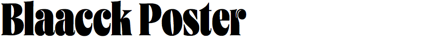
Jérémie Hornus and Solenn Bordeau – Blaacck Poster (Black Foundry)
You've written that Blaacck Poster was created for the rebranding of the Association des Agences Conseil et Création (AACC). Can you give a bit of background to the brief?
The AACC brief was given to Aaron Levin, who is a great admirer of Herb Lubalin. The objective was to place creation and creativity at the core of the brand. AACC required a display font for their headlines that would complement their newly redesigned logo.
We found that Vesterbro Poster, with its bold appearance and similar details, could serve as a starting point. We modified it by incorporating Lubalinesque elements, increasing the contrast between thick and thin strokes, and giving it an even more compact look to further emphasize the counter-shapes.
Blaacck Poster has some similarities to a bold condensed Bodoni, such as Bodoni FB Bold Condensed. Was this or other similar fonts an influence on its design?
Indeed some tricks that appear in Bodoni bold condensed, such as notches in the ‘f’ and ‘j’, are a necessity when heavy-weight typefaces are compressed. However it was not a direct influence for the design of Blaacck Poster; that is actually a derivative work based on Vesterbro Poster.
Blaacck Poster has an unusually large x-height, and small descenders; is this designed to allow tight setting in multi-line display text?
That's exactly the point! We also designed relatively flat diacritics for that purpose. The font was created in close collaboration with Aaron, tailoring it to his needs and preferences as the primary user. Tight setting for multi-line display text was one of his specific requests.
The font includes some rather beautiful arrows and braces, which are featured as animations on the AACC website. Were they designed specifically for that application?
Not exactly. The arrows are very close to the original Vesterbro design, and the graceful braces are directly influenced by Lubalin's work. We carefully crafted every sign and punctuation mark to harmonize with the alphabet, incorporating subtle details from letters like ‘a’ and ‘r’ throughout the glyph set. All these graphical elements were created to give the font a unique voice and embody creativity and vitality.
These elements inspired the design of the AACC website, to create a lively, animated visual communication where words transform into images and acquire a true personality.
![]()
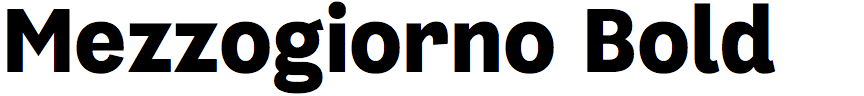
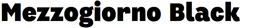
Donald Tarallo – Mezzogiorno (Tarallo Design)
What promoted you to design Mezzogiorno; was it for a particular project?
Mezzogiorno began as sketches during the COVID lockdown. My approach was purely intuitive at first. I was listening to the jazz music of Vince Guaraldi and drawing large scale letters. At a certain point I wondered how sequences of letters could give a sense of the music. It calmed me and I wanted the glyphs to embody its joyful and soothing tone. What emerged was the beginning of a casual sans. Later, I tried to make each glyph as unique as possible and this became a guiding principle throughout the process.
I have always been delighted by the one-off sans-serifs that emerged in the 1900s through the 1970s. These one-hit wonders often have irregularities and particular formal qualities. For example, I watch a lot of Italian cinema and once saw in the opening title credits an acute unlike anything I have ever seen before. These small details inspire me. I often forget where I see such nuances, but things of a quirky and unrefined nature always resonate in me with feelings of human warmth and become a part of my visual reservoir.
I wanted a similar feeling in Mezzogiorno so I always stopped myself from over-refining, which can often be the tendency with digital tools. The intention was to make a face that was expressive, but not a display type, something neutral enough to work in many contexts, but also something with a design unique enough to not get lost in a sea of similar faces.
Mezzogiorno has a few quirky features that set it apart from standard grotesques, such as ITC Franklin Gothic; for example, the tail on the ‘K’, ‘R’, ‘d’, ‘k, and ‘l’, the wide ‘f’, ‘r’, ’t’, and ‘y’, and the open ‘4'. What inspired these features?
There needed to be some element of surprise and a jaunty demeanor akin to the music. The tails give movement. With the ‘f’, ‘r’, ‘t’, and ‘y’, I like how they encapsulate the white space and offer a little variety to the rhythm. That made letterspacing and kerning a challenge, but I’m pleased with the outcome. I’m not sure if I have seen many ‘4’s that open like Mezzogiorno. Designing the numbers is fun as there can be a lot of freedom in how they are shaped. The overall look of Mezzogiorno is the outcome my approach, which was a search for opportunities to pull as much uniqueness out of each glyph without moving the design into an experimental category.
The Mezzogiorno family consists of a range of seven weights, up to a black in which the counters are narrower than the stroke widths. Did the heaviest weights present any particular problems that forced you to go back and rethink certain characters?
I love to draw the bolder weights, as they reveal the personality of a typeface. I drew the black weight first and it came very quickly and organically into shape. The black did dictate some design constraints early on in the process, which led me along a certain direction. I cannot think of problems that forced me to return to certain characters while solely working within the black. However, when I began the light weight some of the qualities that worked well in the black were not as pronounced as I would have liked. So, then I had to work between the light and black weights to find a middle ground so the full range from light to black had a harmonious appearance.
Did you have any particular applications in mind when you designed Mezzogiorno?
I definitely wanted to make a face that gives text warmth without overwhelming the content. I imagine industries like the arts, education, food, and travel would be a good fit for the human tone that this typeface conveys. In a deeper sense, I was thinking about expressing calmness. I think in our fast-paced electronic age there is an opportunity for design to contribute a little warmth and slower pace in our times.
Am I right in thinking that you have a particular affection for Mezzogiorno?
Yes; Mezzogiorno marks ten years of my focused work in type design and it is my favourite. The name means midday, noon, or Southern Italy – a large part of my heritage. Personally, the name sends my imagination to warm and sunny afternoons where one is welcomed to slow down.
My favorite glyphs are ‘a’, ‘g’, ‘s’, ‘e’, ‘*’, and ‘%’. My favorite weight is black. The dizzy spiral of the alternate ‘@’ sign is a critical statement on the hypnotic nature of social media.
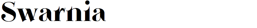
Russell Bean – Swarnia (Type Associates)
You’ve described Swarnia as inspired by Bodoni style typefaces. What led you to create it?
I based my typeface on a wordmark that I had designed some years ago but never got around to completing. It was not until I was well into drawing the lowercase that it appeared to be taking on a Bodoni feel. I have made numerous starts at a Bodoni lookalike in the past but Swarnia did not follow as one of those.
Compared to fonts such as Bauer Bodoni Bold, one of Swarnia’s distinctive features is the scalloped stroke ends on characters such as ‘b’, ‘d’, ‘h’, ‘l’, ‘p’, and ‘x’. What inspired this feature?
This feature was integral to the logo design and worked well on the few letters in the wordmark. It was an accident that this design feature worked so well throughout progressing the production. I considered Swarnia as somewhat free-spirited as exhibited in the wedge-shaped serifs on some capitals, punctuation, and figures. Swarnia breaks the mould whilst maintaining a degree of conformity with tradition.
The slanted serifs and scalloped stroke ends give Swarnia something of a Victorian look to it; were you influenced by any historical typefaces?
No, there was no conscious decision to emulate any particular genre or period. It just happened.
Do you have any plans to extend Swarnia into a family of several weights?
I have not explored the possibilities of additional weights yet. I will leave it to the market to determine if there is demand for other weights. Before I do so I would like to see a cursive italic version.
However I am currently working on a variable font solution that would provide versions that can be used at small sizes without the serifs disappearing. It may also provide an opportunity for other kinds of serifs: perhaps rounded ends, other shapes, or bracketing.