New Additions: December 2022
31st December 2022
From the hundreds of fonts we add to the Identifont database every month we chose a selection of the most interesting recent additions, and interviewed the designers about their approach to each design:
![]()
![]()

![]()
Moritz Kleinsorge – Portheras (Identity Letters)
Where did the idea for Portheras originate? Was it for a particular project?
I started Portheras with a sketch that I chose to expand purely for its visual appeal. Basically, I built upon an aesthetic foundation. Halfway through this operation, I began to form an image of its use. Because that’s always the question you have to ask sooner or later: What kind of project or industry could this be useful for? The rough idea helped me to steer in the right direction. Not exactly straightforward, that’s for sure! But it’s a typical course of action in my design process if no particular brief is at the outset of a given project.
In the case of Portheras, the initial sketch was a geometric, brutalist slab serif. It already had early versions of the trademark ‘f’ and ‘r’ that you find in the final release. The rest of it was completely overhauled in the process. I eventually arrived at the field of humanist sans-serifs.
So, what about those industries or applications I had in mind? At first: leisure, relaxation, tourism—like the branding of a hotel franchise or the signage at a resort. Then again, I wanted Portheras to be serious enough for retail and corporate purposes. However, as is always the case, designers will probably surprise me with the range of uses that they are going to come up with for Portheras.
Portheras is slightly reminiscent of Matthew Carter’s Skia, but without the Ancient Greek connotations. Was Skia an influence on Portheras?
Matthew Carter is a national treasure, but inspiration for Portheras came from his predecessors: traditional British sans serifs from the early 20th century.
As for Skia, I have to admit I never took a closer look at it until you mentioned it. You can expect perfection from a Matthew Carter typeface. So it’s no wonder that the ‘f’ and ‘r’ in particular are solved really well here! And yes, they are rendered in a similar vein as Portheras.
I might revisit the design solutions within for an upcoming project. Thanks for pointing me to Skia.
The italics are particularly curved and flowing compared to the italics of most other humanist sans serifs; examples are the ‘e’, ‘f’, ‘v’, and ‘w’. Were you aiming for a more fluid effect?
I’m glad that you describe the italics as ‘flowing’! I feel that humanist sans-serifs of this genre just have to allude to renaissance-era serif typefaces. The italics of those typefaces were developed from independent designs with a different concept. And they often came from different punchcutters (designers) altogether.
Thus, I virtually had no choice but to render the italics closer to ‘true’ italics. Highlighting text with ‘true’ italics is more conspicuous than doing the same with mere obliques. In that regard, these italic forms make the typeface more versatile, too.
The ‘Q’ is quite idiosyncratic; where did the inspiration for it come from?
The ‘Q’ is certainly one of the lesser-used letters of the alphabet. It may well stand out a bit. In an ideal world, it can act as a little sparkle of joy in the rare instances it is used; both to designer and reader.
I stumbled upon this particular ‘Q’ shape not long ago in René Bieder’s superfamily Magnat. (Magnat is quite an idiosyncatic design in its own right!) I liked it and then began seeing it in other places, too—a classic case of attentional bias, I guess. Eventually, I chose to channel that energy into Portheras.
You mentioned the aspect of fluidity conveyed by the italics. I think the peppy ‘Q’ adds to that feel. It’s just the right kind of ‘Q’ for this typeface!
![]()


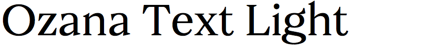
Olivier Gourvat – Ozana (Mostardesign)
What led you to design Ozana? Was it for a particular project?
Ozana was not intended for a specific project. Above all, I wanted to expand my font library with a variable serif family with several axes of variation. I already have a few sans serif families with a variable format on fairly common axes (weight and slant), but not yet serif fonts orientated towards optical size and the contrast of the thicknesses.
From this reflection, I began to think about the design of a new, modern, and variable serif family that would be capable of satisfying the requirements of professionals who wish to put a variable font at the centre of the communication of the brands they create.
This format also offers really interesting possibilities, flexibility of use as well as numerous technological performances for digital creators. Some brands have already understood the value of these variable fonts, but it still represents a small technological challenge on the part of type designers. This is what I also wanted to achieve through this project: to meet this technical and artistic challenge with the entry of this technology into OpenType.
A distinctive characteristic of Ozana is the large, triangular serifs on some letters, such as the ‘C’, ‘E’, ‘F’, ‘L’, and ‘T’, which contrast with the smaller serifs on the other letters. What inspired this aspect of the design?
I do not work directly with references in mind, and I often have a fairly precise idea of the appearance I want to give to a particular character. For these characters, I wanted to bring a touch of personality with lower and sharper terminals to contrast with the terminals of the less closed serifs. It also adds strength to these glyphs. These are touches that I bring into play gradually as I design the font. This allows me to refine some details, which brings more personality to the final glyph.
I also bring a touch of originality to contrast with the stiffer serifs of the other characters, as for example with the design of the tail of the ‘Q’, which is very round, and that of the ‘R’, which has a very rounded and very loose leg. These letters are quite complex to execute, but they also allow for the introduction of some originality, while remaining consistent with the rest of the alphabet.
Among Ozana's OpenType features you've included “case sensitivity”. What exactly does that mean, and how does one use it?
This is an OpenType feature that I usually add to every font family that I create. By default, the punctuation marks (such as parentheses, at-signs, dashes, etc.) of a font are designed to work with lowercase characters. If you are using a capitalised character string, these punctuation marks need to be moved vertically, so that they are vertically centred in relation to the height of these capitals, so that they fit much better when reading capitalised texts. The same is true for lining figures, which fit better when used in capitalised text.
How should they be used? It's quite simple, since you have practically nothing to do and it's the creator of the font who took care of it for you! For most cases, just capitalise your lowercase letters and the software will do the rest! It will automatically adapt punctuation characters to the height of uppercase characters. The capitalisation function will also automatically switch old figures to lining figures, which have a height substantially identical to the height of the upper-case letters. A good example is quotation marks, which will be visually aligned to your uppercase letters. This is the power of OpenType!
![]()
![]()
![]()
![]()
David Williams - Salford Sans (Manchester Type)
What are the origins of Salford Sans; did it arise out of your Typeface Design course at The University of Reading?
The precursor of Salford Sans was a historical revival of a unicase, ornamented type; namely, Stephenson Blake's Sans Serif Shaded No.5. The first iteration was created by one of my friends and a fellow graduate in the Reading MA Typeface Design programme, Lewis McGuffie. He released it as an all-capitals font which supported the Latin script. Much later, after we had graduated, Lewis came to me with a proposal to expand the typeface into a range of weights and scripts. Lewis produced the Greek and Cyrillic, I produced the Arabic, and together we expanded the Latin into upper and lower case. Lewis also had an intern (Elsa Baussier) working with him for a time, and she designed a range of fun symbols and emojis for the typeface. This font was published as a retail typeface and renamed as Salford Sans. That, however, was not the end of the typeface's development.
Lewis and I revisited an earlier idea to create oblique styles across the weight range within the non-Arabic scripts. At this time I also redrew the Arabic characters to improve the quality of the types. Salford Sans 2.0 is the latest version and it has been published in 27 styles and 4 scripts exclusively through Type Network. New OpenType features were also added and Salford Sans is now an extremely capable and compact display type. We hope it will prove to be as versatile as we have intended!
Salford Sans shares some similarities with classic compressed gothic typefaces, such as ITC Franklin Gothic Compressed and Monotype News Gothic Condensed; were these an influence on its design?
Yes and No. In our research for developing Salford Sans we took time to study condensed headline types of the 19th and 20th century. That said, Monotype News Gothic was not part of the canon. Rather, we looked for inspiration in earlier specimens such as Caslon’s Egyptian, Thorowgood’s Grotesques, and Figgins’s sans serifs. In my research for the sloped Roman styles I took cues for curves from mid 20th-century type specimens. For heavy weights I found Tempo Heavy Condensed Italic helpful, and in the light weights Stephenson Blake's Condensed Sans Serifs Italic was a useful reference.
It’s always nice when a typeface has one or two distinctive features that make it instantly recognisable, and in Salford Sans it's the U-shaped top of the ‘5’, the almost closed ‘?’, the slash on the ‘0’, and the wide brackets. What inspired these features?
The design of the ‘5’ is present in the source material (Stephenson Blake Sans Serif Shaded No.5).
The ‘?’ follows a design language established in the curved capitals. Letters such as ‘C’, ‘G’, ‘c’, and ‘e’ close almost completely, creating a heavy imprint as they stamp as much ink on the page as possible.
The slashed ‘0’ is a little quirky; it features a thin slash which we felt creates an interesting contrast and catches the eye. This design feature is also employed in dashes, mathematical symbols, and parentheses. The Arabic script also creates contrast by employing small dots in characters such as ‘ت’ and ‘ي’.
An unusual feature of the Salford Sans family is that you’ve provided two alternative italics; semi slanted, with a slant of about 5°, and slanted, with an angle of about 10°. Do you have applications in mind for this?
Yes, we do. 19th and 20th century sans serifs and grotesques featured extreme angles in their types and we wanted to allow for that look and feel to be recreated. At the same time, we also want Salford Sans to be versatile. Contemporary contexts can require different behaviour in a slanted type. The slanted axis allows for fine tuning in the variable font format. Users can choose any slant angle from 0-11° and we feel that this makes Salford Sans a more flexible and dynamic typeface.
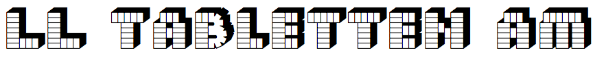
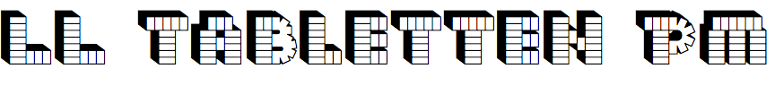
Laurent Benner – LL Tabletten (Lineto)
What first gave you the idea for a typeface based on the logo of the popular PEZ candy?
During my first or second internship with Cornel Windlin in 1997 or 1998 I put up a PEZ dispenser packaging on the studio pinboard. After living with it for a while we speculated if it was possible to generate a whole glyph set, and how much fun it would be and what not…
LL Tabletten was originally called LL PEZ, but you changed it to LL Tabletten after legal action from the manufacturer. Were they happy with the typeface after the change of name?
The legal write-up sent to Lineto was referring to the typeface as ’Tablettenschrift’, which translates as something akin to ‘tablet-typeface’ as in ‘a typeface made from tablets’. It became a new reference point for us and somewhat a source of amusement. It was a way of playing with the legal challenge — doing as told, but at the same time having the cheek to derive a new name from their legalese. The name was later adopted and further reduced to ‘Tabletten’ for the Lineto 1.1 release. I think the international mix of type-designers who had been working on it couldn’t quite get their tongues around its German pronunciation and length.
I’ve encountered several typefaces where a full character set was developed from a short sample of lettering, but perhaps LL Tabletten takes the prize in that you only had the letters ‘P’, ‘E’, and ‘Z’ to start from. Did any letters cause particular problems?
Tabletten is a time-consuming ‘bastard’ of a typeface to draw. Not really a good idea in the first place, nor to develop it any further, ha, ha! For example you can only judge the flow of the bricks in a curved line, once you have constructed and drawn up the whole glyph including its closed shadow path. If you weren’t happy with the result you throw away all that work and start again, and again. And then pretty much everything beyond the obvious letters and numerals is quite a challenge: the infinity sign, ampersand, and at-symbol for example…
The original version of the typeface was released in 1999, and a revised version has been released this year. What are the main changes in the latest version?
The redraw was instigated by the Lineto 1.1 project, whereby the 1999 ‘PEZ’ typeface was selected by the up-and-coming type designers and interns in and around the Lineto Studio in Zurich as one of the case studies. The typeface was cleaned up, redrawn, and extended by an alternative shadow set by Céline Odermatt and Anatole Couteau. Weichi He standardised some of the curve elements as well as adding a fill version, bringing the font up to three cuts. Together we added an alternative ‘brutalist’ glyph set as well, consisting of simple brick constructions without any curves. Check it all out here: Tabletten Specimen.
I’d like to give thanks to Céline, Anatole, and Weichi for picking up the pieces and giving Tabletten a well deserved make-over. And of course thanks to the guys and girls at Lineto too. Sitzen!