New Additions: November 2020
30th November 2020
From the hundreds of fonts we add to the Identifont database every month we chose a selection of the most interesting recent additions, and interviewed the designers about their approach to each design:

![]()
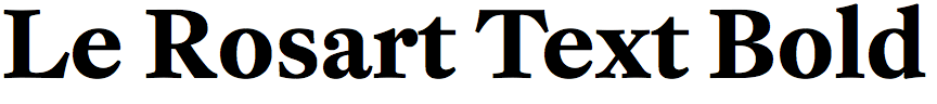
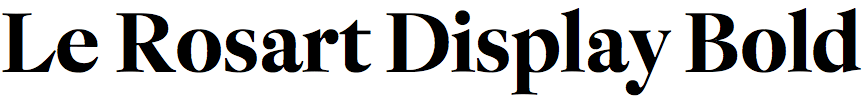
Lukas Schneider – Le Rosart (Revolver)
What inspired you to design Le Rosart? Was it part of your academic work?
Actually I discovered Jacques-François Rosart’s work for the first time several years ago while visiting the printing firm Joh. Enschede in Haarlem, the Netherlands. There I bought a small book titled ‘The House of Enschede’ which features some of his typefaces. At that time I was working on other projects and I didn’t really think about a revival of his typefaces. A few years later I decided to attend the Expert class Type design course at the Plantin Institute of Typography in Antwerp, also to be able to dive deeper into the historical materials archived in the Plantin Moretus Museum. One assignment of the course was a group project in which the students had to develop a revival based on one of Rosart’s types. So basically this was the very first starting point.
You write that Le Rosart is a revival of the types cut by the 18th century Belgian punchcutter and typefounder Jacques-François Rosart (1714-1777). Did this involve studying original punches, type specimens, and books, and if so, how did you achieve this?
The great advantage of this course is that one has access to many historical materials, including specimens and punches, and as a student of the Institute I had the opportunity to inspect and photograph these materials, not only Rosart’s but also from punchcutters of earlier centuries. Two colleagues, who decided to digitize Rosart’s Flourished Capitals and Ornaments, visited the archive of the prestigious printing firm Joh. Enschede where they were able to investigate additional specimens and take pictures of the original punches. As a result, a lot of materials were collected which helped to make decisions about the design of the digital version, and also get a detailed overview of Rosart’s work as well. Not only is the huge amount of work Rosart produced overwhelming, but also the variety is fascinating.
Le Rosart includes Display and Text variants. Did you develop the text versions from the display versions, or are they based on separate historical source typefaces?
The very first starting point of the research and subsequent digitization was the Grand Canon Romain, as this larger model (about 30 point on today’s computer) meant that the finer details of the letterforms were more visible. So basically the upright Roman style of the display version was the basis from which additional weights and the text version were derived. For the text version the parameters of this display version have been tweaked to make the model suited for reading sizes. As a first step the contrast, the difference between the thick and thin strokes, was reduced. Moreover, the spacing was loosened and the proportions adjusted to better match the conventional look of typefaces for body text, and to make both optical sizes (text and display) more consistent in their visual appearance. An advantage of this is that it leaves the option to add another intermediate third size later by interpolating the existing two; for headlines, for example.
The work involved in designing an original typeface, and reviving a historical typeface in digital form, must be quite different. Which do you find the most rewarding?
Both are definitely pretty different processes. If you revive a typeface in a classical sense you try to stick to the original as far as possible, which can be quite restrictive sometimes. As a designer you have a personal opinion, for example, of how a shape should look. If the historical material doesn’t match with your personal ideas, often the question arises how far you can change the shape in the digital version. This sometimes makes it more difficult, or at least more time consuming. Then it also happens that certain letterforms of the same punchcutter vary depending on the type of specimen, which can be quite confusing from time to time. On the other hand, one advantage of a revival compared to the design of an original typeface is that you already have a sort of template for the whole typeface, whereas when designing an original typeface you have to imagine and harmonize all letter shapes completely on your own, which can also be pretty time consuming.
In my opinion both processes are charming and rewarding. I think it is nice to have the option to switch between both disciplines and get a certain variety in the type design process.
For people who are interested in Rosart’s work, and the process behind the development of the digital revival, we have set up a website which can be found here: www.rosart.nl.

![]()
![]()
![]()
![]()
Florian Fecher – Lektorat (TypeTogether)
Where did the motivation for designing Lektorat come from? Was it originally developed for a particular publishing project?
The first version of Lektorat was Redaktion, my graduation typeface family for EsadType, the post diploma course in type design at the Ésad Amiens, France. The student selection process there requires candidates to outline a proposal for a research project. I had wanted to design a grotesque for quite some time and was eager to learn more about early sans serifs and optical sizes. My application followed those interests.
During my studies I decided that magazine news publishing was the environment I wanted my typeface to perform well in. Having a framework helped me define the family’s scope and character: a Display range for headings, expressive but appropriate even for delivering bad news, and a sober Text part for body copy, suitable for long articles.
In your introduction on the TypeTogether website you mention that you were inspired by several grotesque families published by Schelter & Giesecke. Are there any particular ones that were especially influential?
There are two noteworthy ones which became my most important historic references. Both are rather condensed, light weight families. Schlanke Grotesk (thin grotesque) was published in 1882 and has tapered, highly contrasted junctions. Schmale Grotesk (narrow grotesque) is from around the turn of the 19th to 20th century and preserves a monolinear stroke with squarish letterforms. Lektorat combines features of both into a new design with squarish, high raised shoulders and thin joins where curved strokes flow deep into the stems.
Lektorat’s individuality is most apparent in the compressed and condensed black styles. I’m thinking, for example, of the touching strokes in the ‘a’, ‘e’, ‘g’, and ‘s’, the asymmetrical counters in the ‘a’ and ‘g’, and the tapered junctions in the ‘n’ and ‘r’ which give it a much friendier, more accessible appearance than many other compressed fonts. For example, compare Lektorat Compressed Black with Helvetica Extra Compressed. Did the design of the heavier weights come early in the overall design process?
I began designing the Text styles earlier during my studies, a few months before tackling the part of the family you’re referring to (aimed at display settings). Regarding that, indeed, I challenged myself to start with the Black weights. It was a conscious decision. Through the references from Schelter & Giesecke specimens I had an approximate idea of the lighter corners of the design space but was wary of sticking to the historic models too closely. My goal wasn’t to do a revival after all. So it was only after the Black masters’ general appearance had been established that I developed matching Extra Light counterparts.
In addition to the compressed/condensed/narrow widths, most superfamilies include wider than normal widths: wide, extended, and expanded. Why did you decide against including these in Lektorat? Is it because they are less useful in magazine and newspaper publishing?
In fact, that is the main reason. My EsadType project included a Normal range but it was abandoned when I continued developing the typeface with feedback from TypeTogether. Veronika Burian and José Scaglione agreed that horizontal space efficiency would be of more value in the targeted display use environment.
For a distant future I won’t rule out wider styles categorically. They have limited applications but are a lot of fun to draw. I already have some drafts, done during the time I was sketching out possible Black extremes already mentioned. But if we’re talking about an extension of Lektorat, the missing Obliques for Compressed, Condensed, and Narrow are a more urgent need.
![]()
![]()
Fabian Dornhecker – Zukunft (La Bolde Vita)
Where did the inspiration for Zukunft come from? Did you design it with any particular applications in mind?
The origins actually came from sketches done during my studies that I stumbled over again after many years. Back then I tried to squeeze the classic and elegant vibe of Didone fonts into a modular system, which just wouldn't work. So I started again and initially built up on the proportions and shapes of Bodoni in order to then sprinkle interesting shapes and peculiarities into the sketches. That pushed the result a lot more towards usability – even if the Zukunft family is of course primarily a display font and not intended for longer running texts. I didn't have a special application medium in mind, although I've always wanted to make a Didone that doesn't look directly like fashion when you use it in magazines.
To me Zukunft has something of a Cyrillic flavour to it; perhaps it’s the flat tops on the ‘a’, ‘h’, ‘m’, ‘n’, and ‘r’. Were you aware of that when you were designing it?
Well observed! In my research for similar designs, I kept coming across Cyrillic letters and was able to draw many parallels to the original, modular sketches. At the same time, from my point of view, the Cyrillic script has something of a brutal vibe; this influence effectively counteracted the aforementioned “fashion” look. Also the few ascenders and the resulting accentuated x-height is something that I somehow wanted to incorporate – ultimately through the flat tops and alternative shapes with closed lines for ‘k’ and ‘ж’. And eventually some letters from both scripts ended up being pretty much similiar, like ‘r’ and ‘г’ or ‘n’ and ‘п’. It also lead to me digging further into Cyrillic – and to Zukunft being the first font published by La Bolde Vita with support for the Cyrillic writing system for now.
Zukunft means ‘future’ in German; do you see it as a futuristic typeface?
If you mean futuristic in terms of how the future is often stylized, then definitely no. But you can draw certain parallels to (Italian) futurism, although that was more of a felt than a planned direction. The approach to naming is also felt: while researching the style, I came across many Cyrillic signs and lettering from the days of the Soviet Union. From the past time point of view, the resulting shapes could certainly have looked futuristic. Besides, the word – regardless of the language – simply has a certain energy, as Futura or Avenir have already shown.
It’s a sign of the originality of Zukunft that I’m finding it hard to find any similar fonts to compare it with on Identifont. Are there any other typefaces that you know of that are similar in approach?
I take that as a compliment! To be honest, I've never enjoyed using found specimens or well-known typefaces as references that much, so I can't really tell if there are similar approaches. But to draw key glyphs like ‘a’, ‘n’, or ‘r’ in grotesque fonts with flat tops is almost a contemporary thing to do – even if it's only alternatives. So I think that I was definitely influenced by it, but just transferred it to a different typeface classification.

George Triantafyllakos – Aegithalos (Atypical)
What was your inspiration in designing Aegithalos? Did you design it with any particular applications in mind?
Aegithalos follows on from some ideas I first explored in Dolce Noir, a custom text type family designed for the Greek publishing house Dolce Publishing. I wanted to design a more condensed, display typeface based on some of the prominent characteristics of Dolce Noir, for use as an accompanying title typeface. My main focus was on the design of the Greek script as I am constantly attempting to design more informed, useful and interesting Greek typefaces. Even though the design of Greek typefaces has made huge and important progress the past decade, this is not actually reflected in the Greek design scene, and the old, usual suspects are still the main weapons of choice for Greek designers, with few exceptions. When it comes to books and/or magazines, the choices are truly limited to a handful of mainly traditional typeface designs.
Why did you call it Aegithalos?
The design of Aegithalos coincided with the first lockdown in Greece. During that time we used to read a lot with my daughter, and especially a small book describing all the birds living in the Mediterranean, all of them with weird and beautiful names. Aegithalos was one of our favorite names.
Aegithalos is an unusual typeface, and I’m finding it hard to find any similar fonts to compare it with on Identifont. Were you influenced by any other typefaces, and are there any other typefaces that you know of that are similar in approach?
When I design I almost never look too closely at other typefaces, so as not to limit or influence myself and the design too much. Before I start designing, I decide the basic traits of the typeface, and then let the letters guide me through (for me, type design is more of a discovery process and less of an invention). However, when deciding on these basic traits I had in mind the quirkiness and the overall look and feel of contemporary typefaces like Messer, Margo, Nikolai, Eksell Display, Map Roman Compressed, Manege, Tongari, and maybe most of all, Zangezi. So, I would say that what I was mostly looking for was to achieve a visual impression similar to the one these typefaces made on me, more than actually following in their exact steps.