Alternatives to Helvetica
14th June 2012
More than 50 years after its release, and subsequent leap to popularity, Helvetica retains its place as the designer’s “default” and the world’s most widely known typeface, familiar to typographers and laypeople alike. There is ample evidence of this here at Identifont where Helvetica regularly leads our Popular fonts list, alternating the top spot with Gotham.
The causes of Helvetica’s ubiquity are too complex to do justice here, but are covered pretty well in Gary Hustwit’s 2007 documentary which also gave screentime to its most ardent fans and detractors. It’s enough to say there are good reasons to use Helvetica, and there are good reasons to avoid it. With that in mind, here’s a quick summary of the many versions of the design and some worthy alternatives.
Versions of Helvetica
Like many of the classic pre-digital typefaces Helvetica has seen its share of revisions and reinterpretations over the years. Some of these were adaptations to fit the typesetting technology that was available at the time, others are simply renditions by foundries that didn’t own the rights to the original.
- Helvetica
The original. Though keep in mind that there are various products from Linotype and Adobe that may have slightly different shapes and character sets. - Neue Helvetica
A 1980s effort to unify the family that had grown large and disparate. More uniformity across weights, but sacrifices to individual styles that push it further from the original vision. - Neue Haas Grotesk
Just released, a major effort to restore the original concept that was lost over the last 50 years. In some ways, this is more Helvetica than “Helvetica”. Highly recommended. - Helvetica Textbook, AG Schoolbook, FF Schulbuch
Versions with distinctive forms (‘a’, ‘l’) for young readers. AG Schoolbook is a further departure based on AG Book. - Swiss 721
Though it strays quite a bit from the original, Bitstream’s is one of the better digital interpretations. The italics are well drawn, obliques that are more optically corrected than Linotype’s and Adobe’s Helveticas. - Nimbus Sans
URW’s version. The ‘R’ leg has a little more wiggle. - Pragmatica
Paratype’s version, initiated at the USSR’s state type foundry, Polygraphmash. Recently hinted for web use. - CG Triumvirate
Compugraphic’s version, developed for their phototypesetting machine. - Newhouse DT
Drawn from scratch as a commission for a client, but essentially Helvetica with more consistent weights. The Super Condensed is a unique design and has more weights the compressed variants in other Helveticas.
Alternatives to Helvetica
There are some good ideas in Identifont’s existing similar fonts feature, but here are my favorites in chronological order (more or less).
Here’s a Fontset containing all these fonts so you can compare them easily:
Some of these are predecessors to (or venture away from) the cold, homogenous forms of the Neo-Grotesk genre, while others embrace Helvetica’s perfectionist ideas and take them further into more constructed lettershapes:
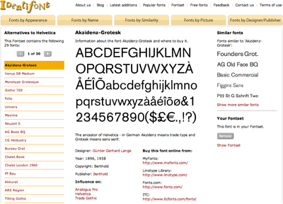
- Akzidenz-Grotesk
- Venus
- Monotype Grotesque and Gothic 720
- Folio
- Univers
- Maxima
- Neuzeit S
- AG Book
- CG Heldustry
- Bureau Grot
- Chalet Book and Chalet London 1960
- FF Bau
- Akkurat
- ARS Region
- Titling Gothic
- Paralucent
- Parry Grotesque
- Theinhardt
- FF Dagny
- Replica
- Reader
- Aktiv Grotesk
- Founders Grotesk
- Fakt
- Supria Sans
- Suisse BP International
- Tablet Gothic
- Adelle Sans
Further reading
- Helvetica and Alternatives to Helvetica, an article I wrote for The FontFeed in 2007. Still useful, though the selections are limited to those available at FontShop.
- Typekit’s Alternatives to Helvetica lists a few of the screen-optimized options available from the leading webfont provider.
- Neue Haas Grotesk Minisite from Font Bureau is linked above but it’s worth another mention. It offers an excellent short history of Helvetica and the story behind the new digital revival of NHG. The history page was written by Indra Kupferschmid who also contributed to the more in-depth tribute “Helvetica Forever”.