Sans-serifs rule the charts
14th December 2011
With the largest independent database of typefaces, we’re in a unique position to shed some light on typographic trends and truths. To that end, this is the first in a series of blog posts that will unveil some of the data from behind the scenes at Identifont.
In the summer of 2002 a thread was spinning on the ATypI mailing list about the declining sale and use of serif type. Foundries and resellers confirmed the reports.
Nearly a decade later, despite some predictions that the trend was simply a temporary phase like any other fashion, the rise of the sans-serif continues and the serif shows no sign of life. This week’s ten most popular fonts here at Identifont are all sans-serifs too. This indicates that users identifying samples or browsing for other reasons are picking sans-serif fonts far more often than not.
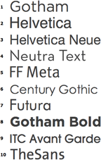
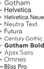
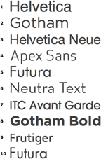
Identifont’s 2011 archives show that though the fonts within the Popular list shuffle around in rank from month to month they rarely let a new typeface in, and it’s never a font from any other classification:
|
Identifont's ten most popular fonts May – November 2011 |
||||
|
May 2011 |
August 2011 |
November 2011 |
||
Sans-serif popularity is reflected by sales, too. The bestseller lists at all the major resellers are filled with sans-serifs, a few scripts, and the very rare serif. With very little monthly fluctuation, the top ten sellers at Fonts.com and FontShop are nearly all sans-serif families from every classification — Humanist, Geometric, and Grotesque. This month’s top selling fonts at MyFonts are mostly sans-serif, too, with a more generous helping of scripts and novelty faces due to their collection’s and clientele’s focus on display type.
So, who or what is to blame for the death of the serif? Here are three possible causes:
Quantity
Certainly sans-serif typefaces outnumber serif typefaces, but not by much. Classification isn’t an exact science — sometimes a typeface doesn’t fit neatly into either the sans or serif (or even decorative/display) bin — but the Identifont database suggests that saturation isn’t a major factor in the sans-serif’s popularity. There are only about 50% more sans-serif entries than serif, not nearly enough to explain sans-serifs’ dominance in the charts.
Versatility
Functional considerations can shape popularity. There is an assumption that sans-serifs are more versatile, that serifs are for book text only. Or, from the opposite point of view, that serifs are more versatile — one or two in your library will do the job for life — while sans-serif designs are followers of fashion with short lifespans — you need a new one for every job.
Contemporary design
Is the computer to blame, with its bias toward simpler, screen-friendly lettershapes? Or is it the prevailing notion that, despite many contemporary serif and slab designs (e.g. FF Scala, Minion, Apex Serif), serif type is "old" type (e.g. Garamond, Caslon, Bodoni)?
Perhaps it’s simply the result of the Latin alphabet’s natural evolution, from handwriting to uncial and blackletter to Roman serif to minimalist forms. Sans-serifs are representative of today’s ideal of pure communication. Typefaces like Helvetica and Gotham present text with a naked clarity, unfettered by what modern readers would deem to be dressing or ornamentation.