New Additions: June 2026
30th June 2026
From the hundreds of fonts we add to the Identifont database every month we chose a selection of the most interesting recent additions, and interviewed the designers about their approach to each design:
![]()
![]()
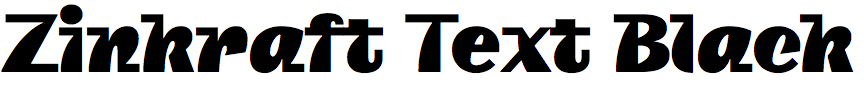
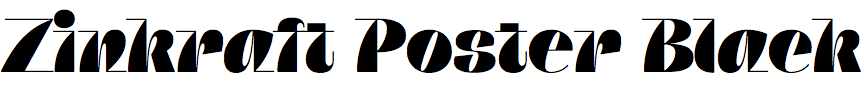
Roch Modrzejewski – Zinkraft (ROHH Type)
Zinkraft is an unusual typeface in five weights and four optical sizes. Where did the idea for it originate?
I love creating typefaces that radiate character. Setting out to design a new editorial family for fashion and lifestyle magazines, I knew it needed to be modern, sharp, and funky all at once. I often explore an eclectic approach to style, and Zinkraft is probably the most eclectic design I've ever produced. The goal was to experiment with letters that take a little bit of everything and fuse those elements into a single, cohesive design language.
Zinkraft is a difficult typeface to characterise: is it serif or sans serif, regular or italic? It’s a sign of its originality that I can’t find anything to compare with it on Identifont. Were you inspired by any other particular fonts?
I didn't have one specific typeface in mind as an inspiration. Usually, an idea just marinates in my head for a while. I spend a lot of time thinking about the distinct personalities I can inject into my typefaces, studying typography books, and observing what contemporary designers are coming up with. I also draw a massive amount of inspiration from hand lettering. Lettering artists are constantly pushing boundaries with style and introducing quirky new ideas, which was definitely the biggest influence on this particular design.
Zinkraft’s distinctive features are most prominent in the Black weight, especially Poster Black. Did you start from the Black when designing Zinkraft?
Early on, I’ll often sketch out a few quick, rough drafts to see how a concept might translate across different weights. But honestly, I just adore designing those super bold, funky styles; it’s incredibly fun every single time. That’s why so many of my type families, even the minimal sans ones, feature heavy weights packed with humour and charisma; it’s easily one of my favorite parts of type design. So to answer your question: yes, the Black weight was one of the very first things I developed for Zinkraft, since it was obvious from the start that its unique features would shine brightest there.
You’ve suggested that applications for Zinkraft could include fashion brands, indie games, and lifestyle magazines. Did you have applications in mind when you designed it, or did the design suggest the applications?
It goes both ways depending on the project, but this time, the intended applications were baked into the concept right from the start. I think visualizing the specific environments where this family would eventually live really helped me craft such a consistent and focused personality for Zinkraft.
Was Zinkraft created for any particular project?
No, but it was created for the 10th anniversary of ROHH Type Foundry. I set out to make something unique, modern, and powerful; an eccentric summary of a ten-year typographic journey. It weaves together fragments of the soul from all the different font styles I've explored over the past decade. The process of getting all those pieces together it was quite an adventure in itself.
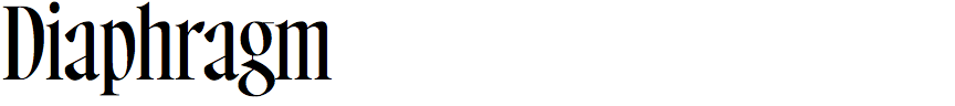
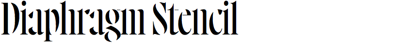
Antonin Bertrand – Diaphragm (Antonin Bertrand)
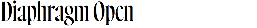
Diaphragm is an elegant condensed serif typeface in three styles: Regular, Open, and Stencil. Did you design it for a particular project?
Hello David, and thank you for inviting me to talk about Diaphragm. I'm happy to be featured on Identifont.
The Diaphragm family was released in March 2026, but its first version actually dates back to 2019. At the time, I was commissioned by the collective Sabir, who were launching the first issue of their literary journal of the same name. They were looking for a display typeface that could also embody the journal's identity. The magazine had a 13 × 20.5 cm format (rather narrow and elongated), and this naturally led me to design a condensed typeface, allowing the word SABIR to occupy the cover with a strong presence.
Each article opened with a title page featuring a solid-colour background, the title set in black using Diaphragm (it didn't have that name yet), and the author's biography. Designing a condensed serif ensured a strong presence on the page while giving the publication its own distinctive tone.
The magazine released its last issue this year, and Diaphragm was kept as its identity through to the end. I'm very proud of that, and also happy to release it as a complete family now.
You've written that Diaphragm was inspired by Howland, a typeface designed by John F. Cumming in 1892. Do you consider Diaphragm a revival of Howland, or was that just an initial inspiration?
Yes, while doing research in 2019, I came across specimen sheets of Howland, and they immediately caught my attention. It's a rather unusual display typeface from 1892 that combines vertical and diagonal stress, and I was fascinated by those peculiarities.
The earliest versions of Diaphragm were much closer to Howland, but over time I gradually moved away from that reference. I eventually ironed out those details, trying to rationalise the design as a whole and give it a more contemporary feel. My intention was never to produce a faithful revival. Rather, Howland provided a starting point: its proportions and overall spirit gave me an initial direction. I also like the idea that a typeface designed in 1892 can continue to live on through contemporary projects.
An interesting feature of Diaphragm is the shape of the terminals in characters such as the ‘a’, ‘c’, ‘f’, ‘r’, and ‘y’. They are neither ball terminals nor sharp serifs. What inspired this shape?
It was precisely while trying to modernise the Howland-inspired starting point that I began looking for a distinctive treatment for those terminals. At the time, rounded ball terminals felt too classical to me, which didn't really fit the experimental spirit I was looking for.
So I started exploring shapes that felt sharper and more tense. After many iterations, I arrived at the current solution, which has indeed become one of the family's defining features. It was also a way of introducing a different kind of calligraphic movement into the design.
In Diaphragm Open and Diaphragm Stencil the characters are progressively eroded to create gaps between the strokes. Were these styles planned from the outset, or did they evolve during the design of the typeface?
Diaphragm is a highly contrasted typeface, and from the very beginning I wanted to explore just how thin the hairlines could become. When I returned to the project, I naturally started experimenting by removing them altogether. After all, at smaller sizes, they almost disappeared anyway.
I also think these versions give large words a stronger visual identity. Serif stencil typefaces are relatively uncommon, so exploring that combination was particularly motivating. Whenever I design a typeface, I naturally imagine how it might eventually be used, perhaps because I'm also a graphic designer.
Since its release, Diaphragm has been used across a different types of media, from album covers to exhibition identities. Of course, one can never predict where a typeface will end up, but I'd love to see this Stencil version on a film poster someday. Who knows!
![]()

![]()
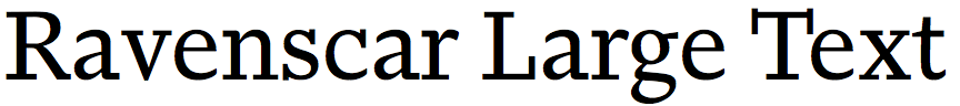
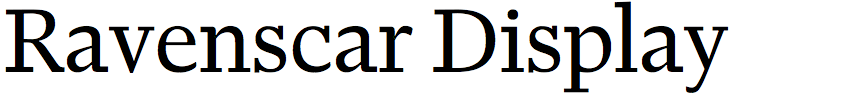
Jeremy Tankard – Ravenscar (Jeremy Tankard Typography)
You've described Ravenscar as a slab-serif typeface designed for book publishing. What prompted you to design it?
I wanted to design a serif text type, but rather than design toward a specific style from the outset I was keen to look closely at a range of set text that I admired (typographically) and try and understand what elements contributed to the visual success of each. This opened up a whole range of questions including letter shape, proportion, stem weight, serif style, terminal detail, fit, as well as reproduction quality and the skill of the typesetter. Some things we are aware of, others less so, and some we don’t notice.
From this round of chin-rubbing nerdiness I closed in on a more robust serif, which in turn developed to a clean slab. Any subtle added warmth (softening of the type image) I spotted was more a result of reproduction (ink squash or halation) and so tied to a specific technology. I decided to design for digital which is clean and predictable, so any added warmth to soften the type image and keep other texture alive had to come from each letter shape and its specific details, such as how a curve or serif is handled. Close examination will reveal that although the serifs appear the same, they are different across the type. This subtle variation breaks the monotony we see in much digital type. I approached Ravenscar with minimal shape repetition for this reason.
Beyond the letter shapes and their interaction, another thing I picked up on was the quality of the typesetting. Once upon a time a person called a typesetter was responsible for the visual quality of the typography, carefully and skilfully adjusting spacing as they set the type. All this has gone, with the result of lower typographic quality becoming the norm. People seem increasingly happy to rely on the application to do the work (hmm), or just accept what they see as job done. There is less and less apparent skill being shown, so when quality work is done it is perceived as elitist rather than normal. So I decided to look into how the typeface could set better. I always pay a lot of attention to the fit and kerning of a type, but this time I wanted to add the skills of the typesetter into the font itself.
When designing a typeface for text setting and book publishing why did you decide to make Ravenscar a slab serif rather than a serif, when many other classic typefaces designed for text setting are serifs?
Well a slab serif is a serif; historically the early types are more slab in their appearance. The important thing is the text image, and slabs applied to an old face model gave the result I was after. Many slabs serifs tend to be geometric, where the hardness of the slab echoes and supports the rigidity of the structure (think Egyptian styles from the 20th century). A subtle contrast of attitudes is created by mixing a slab with the movement of the old face which in turn adds to the visual texture, rhythm, and patterning of text, keeping it alive and attractive to the eye.
In the Ravenscar design notes you explain that Ravenscar includes OpenType contextual spacing that works in addition to the standard pair kerning to give a more visually consistent spacing between words. Can you explain how this works?
As part of the initial research into the set text examples I looked at the methods advocated by master typographers, such as Jost Hochuli, Geoffrey Dowding, and Jan Tschichold. A huge amount of their attention was spent looking and crafting details of space. I remember from my letterpress days (and all those who practice letterpress now will know this), that you had a range of spaces available to use: quad, nut, thick, mid, thin, and hair. Each would be inserted to fine tune the line of text with the aspiration to meet the approval of the famous Jan Tschichold’s “A-okay” image. Low and behold we do have access to all these spaces in digital setting, but they need to be inserted by the user (generally not going to happen). So I looked at automating this principle where the fixed word space unit is adjusted by a range of variables based on the context of use.
Ravenscar provides four optical sizes: Text, Large Text, Display, and Fine. Is your choice of the name “Fine” rather than, for example, ”Poster” for the highest contrast optical size an indication that you don’t only intend it to be used for large text setting?
Conversely if it was called “Poster” then people would think they can’t use it for a book title. When creating the optical sizes I had in mind similar ranges of use that metal type had. So Display is anything large with its design still based on a similar stroke relationship as Text and Large Text, whereas Fine is drawn with higher contrast, narrower proportions and tighter fit. There’s also a Fine Extra Light style offering a more decorative and brighter text image.
You’ve written that in typefaces designed for setting text, no single element should stand out or hinder the flow of reading. However, Ravenscar italic has several endearing features that do stand out, such as the curved upper arm of the ‘K’, the flourish on the top of the ‘T’, and the sloping bar of the ‘4’. Why did you decide on this?
Ha ha. Yes. There are many ways to answer this.
Firstly the approach to italic. I increasingly see people licensing italic less and less; they would rather just slope the Roman (ugh!). So on one hand I like an italic to be a different model to its Roman, not only to add interest and texture but also value. As it now is seen as a ‘supportive’ type style, I take a more liberal approach and like to play with its design. My thinking here is that if it is used less then why not push its design and see what other patterns can be made. Italic has such a fantastic rhythm built in it seems such a shame to kill it as a sloped Roman.
As to individual elements: a type design is built of sets of details that work together; some features are specific to Roman letters, some to italic letters, and some to the figures and other characters and symbols. The trick is to balance these so they feel part of the same family but remain freely interpreted across the character set. For me a problem occurs when there is a strong feature which is not patterned out across more of the set. Remember that each letter is its own thing and has its own requirements that make it legible. As a type designer we are free to play with these specific details but we need to be aware of a letter’s breaking point. If a detail is applied or pushed then similar occurrences need to be considered as well, or the type pattern will be out of balance resulting in something that “stands out”.
The comment about no one element should stand out is a very large topic in type design and is unique and even fundamental to each individual typeface, its design style, and its objective.
![]()
![]()
![]()
![]()
Dieter Hofrichter – Cortona (Hoftype)
You recently released Cortona in nine weights plus italics, together with a reduced contrast Text style. What prompted you to design it?
With Cortona I set out to design a neutral, generic typeface for use in newspapers, close to Times New Roman, but less severe, with a hint of playful details.
Cortona has some similarities to the classic Baskerville typefaces (compare Cortona and Monotype Baskerville). Were they an influence on the design?
Yes, Cortona references the transitional typefaces like Caslon, Baskerville, etc. with their slightly artificial forms.
Like many of your fonts, Cortona is intended for setting text in applications such as book, magazine, and news publishing. What particularly appeals to you about designing typefaces for these applications?
My serious design history began by working with Günter Gerhard Lange as his assistant at Berthold AG. Lange was focussing on text types, and from him I learned the virtues of designing functional text types. Later I started designing typefaces for a wider range of applications, and added display versions of my older types, but still with the quality of readability in mind.