Optical Sizes
13th May 2010
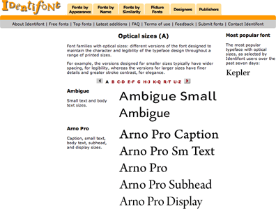
When documents were printed using metal type, each size of a typeface was created with subtle variations to ensure that the character and legibility of the typeface was retained throughout the range of sizes. For example, the 24 pt version of a typeface intended for headlines would have fine serifs and high contrast between the thick and thin parts of the characters, for greater elegance, whereas the 6pt version of a typeface would have lower contrast and wider spacing between characters, for legibility.
Nowadays with digital type we have the advantage of being able to resize a font to any size, but we have lost the ability of a designer to alter the design according to the size at which it's being used. Several type designers have therefore created typeface families with versions of the typeface intended for use at different sizes. These are called opticals, or optical sizes, to reflect the fact that they are intended for viewing at a particular size.
Identifont now includes a section listing the typefaces that are available with optical sizes to help you choose these for a design project:
See it here: